We run the same checklist on every store we take on, and on about nine in ten it finds money. The teams involved are rarely careless. The problem is that these are jobs which belong to nobody once a site has shipped, so they quietly stop being done.
None of what follows is a redesign. It is the unglamorous pass that has to happen before testing is worth starting, and on most stores it is worth more than the first three experiments combined.
First, fix the measurement
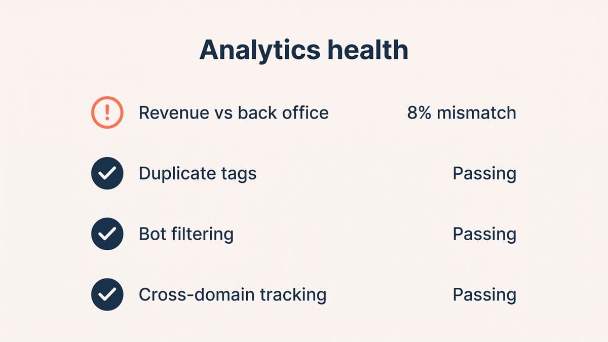
Everything downstream depends on the numbers being real, and on a surprising share of stores they are not. Duplicate tags double-count purchases, test orders sit in production data, and bot traffic inflates sessions. On stores with a cross-domain payment provider, attribution breaks badly enough that a third of revenue appears to come from nowhere.
Before touching a page, we reconcile analytics revenue against the actual order count in the back office. If those two disagree by more than a couple of per cent, nothing else on this list matters yet, because you would be optimising against fiction.
The product page pass
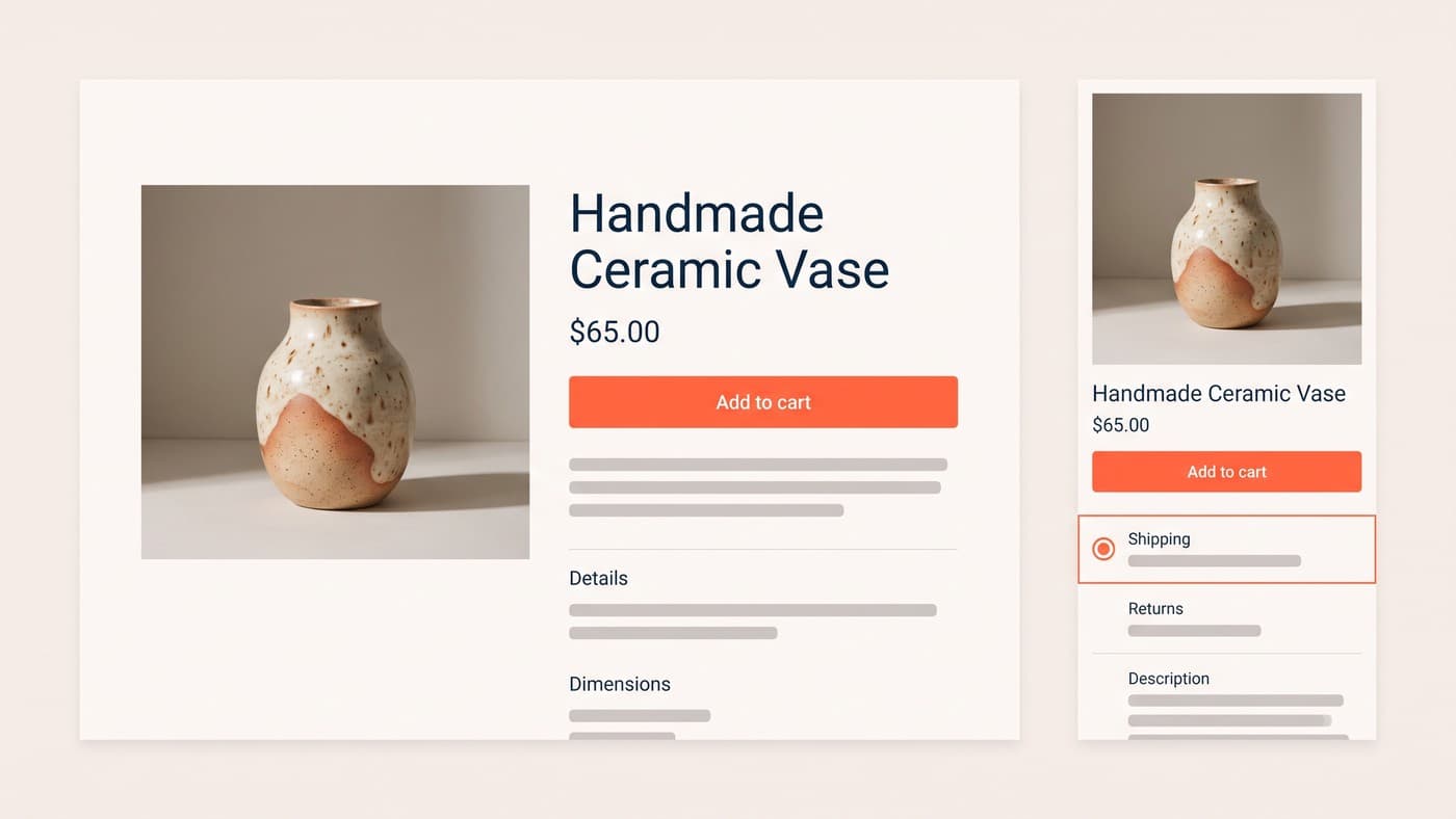
Read the page as somebody deciding, not as somebody who built it. Is the delivery promise visible without scrolling or opening a tab? Is the returns policy answerable in one glance? Is the primary image doing anything other than repeating the thumbnail?
The single most common finding is information that exists but is hidden: buried in an accordion, a tab, or a PDF nobody has opened since it was uploaded. Surfacing it barely counts as design work, yet it is where most of the early wins live. We go into this in more depth in our guide to product page design.
The cart and checkout pass
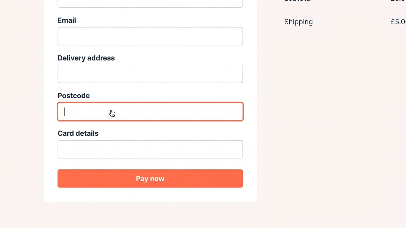
Most abandonment is generated before checkout and merely recorded there. The two reliable culprits are shipping costs that appear at the final step, and account creation demanded of somebody trying to buy one thing once.
Show the shipping cost from the product page onwards, or at least the threshold for free shipping. Make guest checkout as prominent as signing in. Then actually complete a purchase on your own store, on a phone, on mobile data, with a card you have not saved. Most teams have never done this, and it is the single most informative hour available to them.
Mobile is a different website
On most stores mobile is 60-80% of sessions and converts at roughly half the desktop rate. That gap is normal; what is not normal is never looking at it separately. An averaged funnel hides precisely the problem you are hunting.
Check the tap targets, the sticky elements that eat the viewport, and what the page looks like with a keyboard open. Then check load time on a mid-range Android phone rather than the flagship in your pocket.
Read the qualitative before touching the quantitative
Analytics tells you where people leave. It never tells you why, and the why is the part you can act on. That evidence already exists inside the business, unread, in three places.
Session recordings are the most uncomfortable and the most useful. Fifty is enough to see the pattern: people hunting for a size chart, tapping something that is not a link, scrolling straight past the thing you spent a month on. Watch them at normal speed, not sped up, and resist the urge to explain away what you see.
Support tickets are the second. The same question arriving forty times a month is a page that failed forty times a month, and somebody has already written down what the confusion is. On-site search is the third: a list, in customers' own words, of things they expected to find and could not. Any query returning no results is a merchandising gap or a vocabulary mismatch, and both are cheap to fix.
An afternoon on these three usually produces a better test backlog than a month of analytics dashboards, because it produces hypotheses with a cause attached rather than a list of pages with bad numbers.
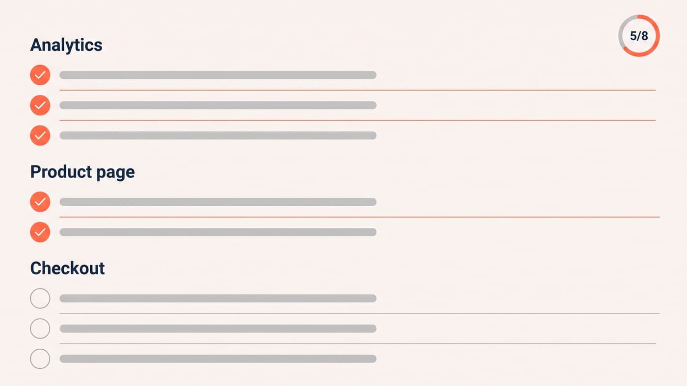
The checklist itself
In the order we run it, because each step depends on the one above being true:
- Reconcile analytics revenue against back-office orders; fix tracking before anything else.
- Split every funnel step by device and find the two worst drop-offs.
- Audit third-party scripts against a load-time budget and remove what cannot justify itself.
- Surface delivery, returns and stock information above the fold on product pages.
- Show shipping costs before the cart, and make guest checkout obvious.
- Read fifty session recordings and a month of support tickets before proposing anything.
- Only then build a test backlog, ranked by evidence and expected impact.
What we deliberately skip
We do not touch button colours or add urgency timers, and we will not install a pop-up to rescue an exit. Those are the things that make a store feel optimised while quietly training customers to distrust it.
The reason this order works is that it moves from cheapest to most expensive. Reconciling analytics costs a day. Reading tickets costs an afternoon. Running an experiment costs six weeks of traffic. Doing them in that sequence means the expensive step is aimed by everything you learned in the cheap ones, rather than at whichever page somebody had a feeling about.
Keep the findings in one document with an owner and a date beside each item, not in a deck. A checklist that produces a presentation produces agreement; a checklist that produces a dated list of owned tasks produces changes, and only the second kind shows up in the numbers a quarter later.
One caveat on all of it: run the list in order rather than in parallel. Every step assumes the ones above it are true, and a funnel analysis built on unreconciled analytics will send you confidently towards the wrong page.
Expect it to take a fortnight on a store of any size, and expect roughly half the findings to be things somebody already suspected. That is fine; novelty was never the point. What you gain is the evidence to prioritise fixes that were previously just opinions competing in a meeting.
The list above is boring on purpose. Boring compounds. If you want us to run it over your store, get in touch. We reply within one working day.