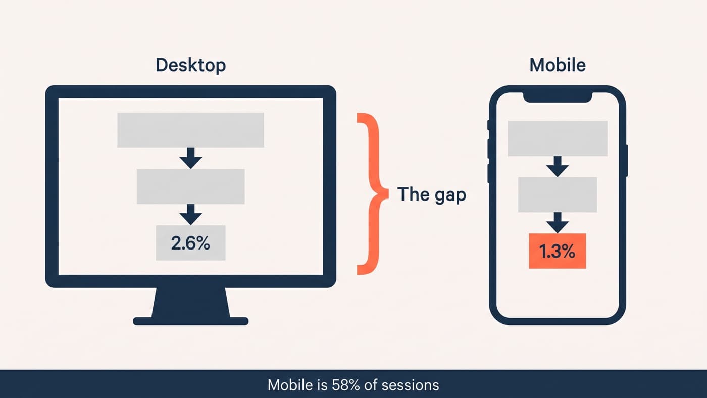
Your mobile conversion rate is probably about half your desktop rate, and at some point your team made peace with that as a law of nature. It is not one. Some of the gap is structural and will never close. Across our archive, the rest of it responds to work faster than almost anything else on the roadmap.
The reason the gap persists is that it is nobody’s number. Desktop is where the team browses its own store, designs its own mockups and demos its own releases. Mobile is where the majority of customers actually are, squeezing a purchase into a bus ride on a mid-range Android over mobile data. The store gets built on one device and used on the other.
Measure your real gap first
Segment conversion by device over at least a full month, and then go one level deeper: split the funnel. The overall rate hides where mobile actually loses. On most stores mobile matches desktop respectably up to add-to-cart and then falls off a cliff between checkout start and payment, which points at forms and reassurance rather than at product appeal.
While you are in the data, check the traffic mix. Mobile carries more paid social and discovery traffic, which converts worse on any device. Part of your gap may be a channel difference wearing a device costume, and no amount of thumb-friendly design fixes an audience that was never going to buy today.
And separate the structural from the fixable, honestly. Some of the gap is permanent: phones are where people research and desktops are where big baskets get finished, cross-device journeys mean mobile does the work and desktop takes the credit, and no design decision changes that. The point of the diagnosis is to stop treating the whole gap as fate. In our experience roughly half of it, sometimes more, responds to the five layers below.
The five layers that respond to work
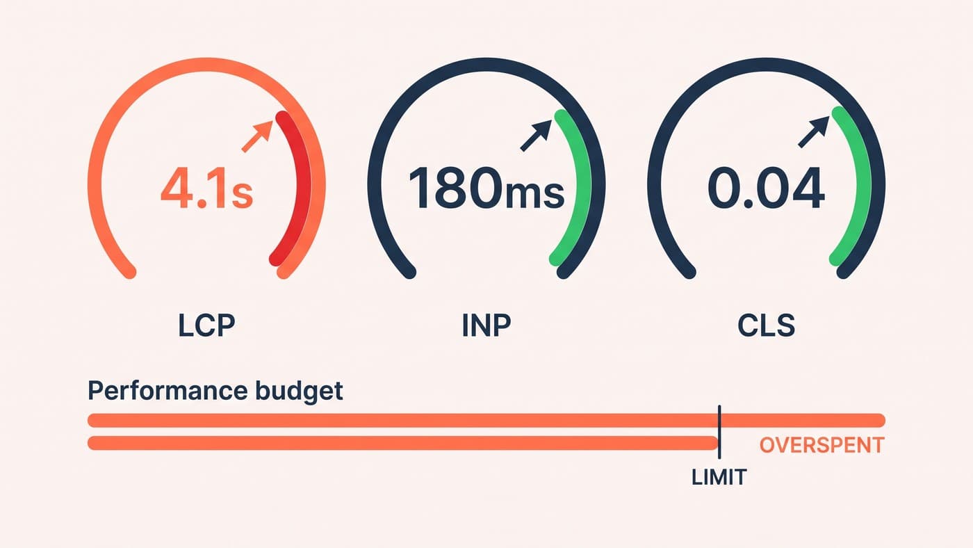
Fix them in this order, because each one compounds the next. Speed comes first: mobile devices are slower and connections worse, so theme weight and script debt cost two or three times what they cost on desktop, and no layout improvement survives a six-second load.
- Speed. Budget it like money on the device your customers actually hold, not on an office fibre connection. This is the layer that lifts every other layer.
- Above-the-fold hierarchy. The first phone screen must carry the product, the price, the rating and a reachable buy action. Every one of those pushed below the fold by a banner is a tax on every session.
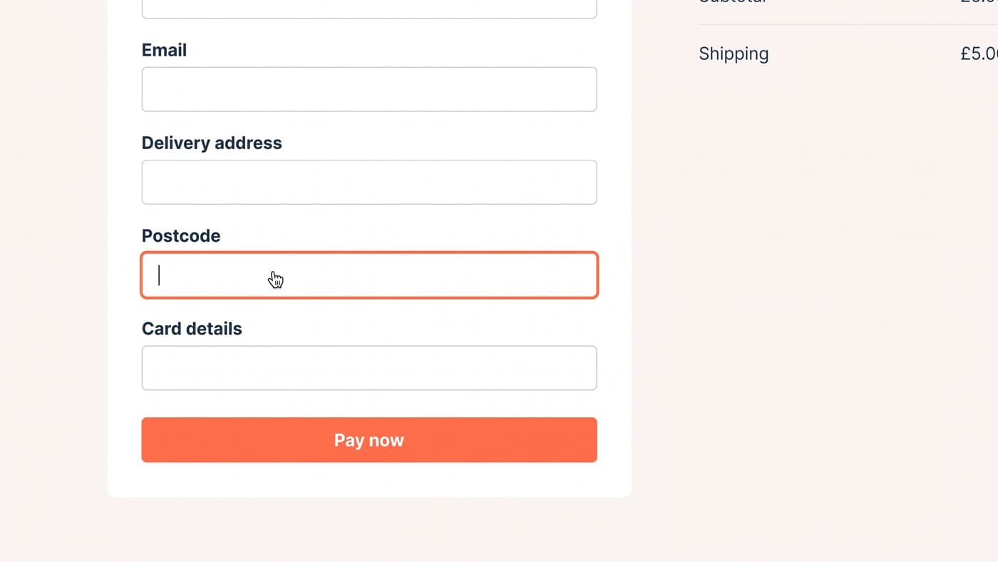
- Thumbs and forms. Actions belong in the bottom half of the screen where thumbs live. Fields want autocomplete, the right keyboards, and ruthless cutting; every form field is twice the work on glass.
- Payment friction. Express payment options exist because typing a card number on a phone is miserable. Offer them, and test where, because placement decides whether they shortcut friction or shortcut information.
- Trust density. A desktop page carries reassurance in sidebars and footers a phone never shows. Delivery, returns and guarantee lines need to reappear in the mobile flow at the moments doubt actually strikes.
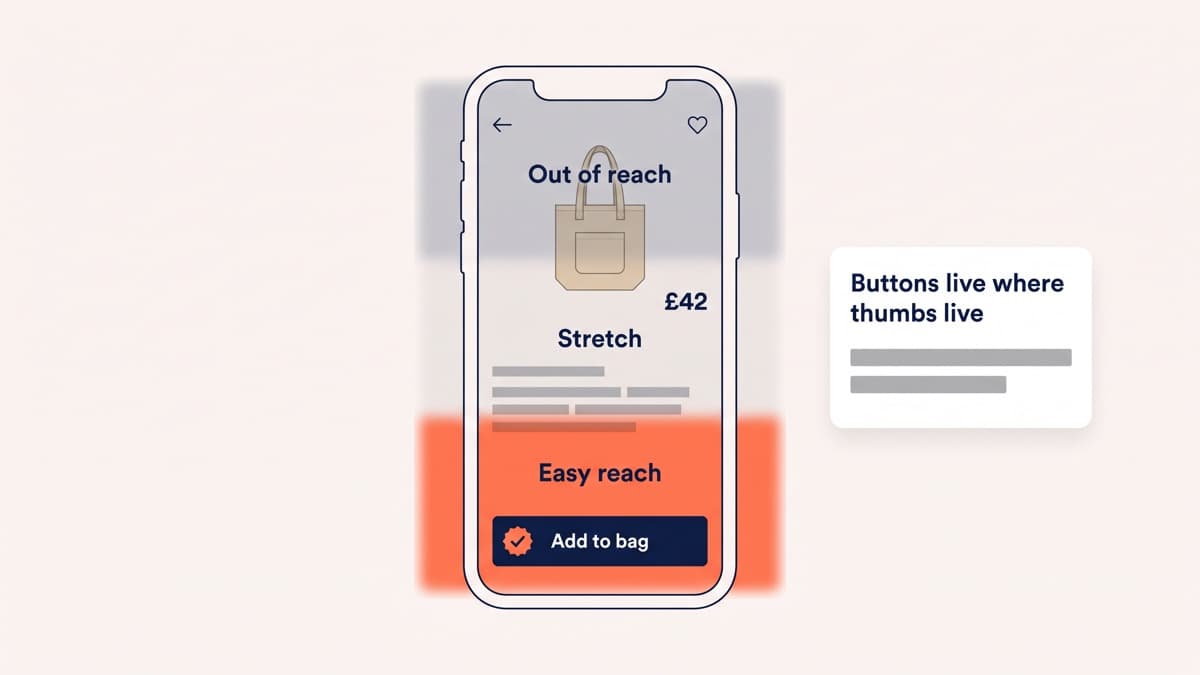
Two of those layers deserve more detail, because they are where we watch teams give up early. The first screen decision is genuinely hard: a product photo big enough to judge fabric by, a price, a rating, delivery reassurance and a button do not all fit in six hundred pixels, so something loses, and the thing that loses should be chosen on purpose rather than by whatever the desktop template happened to send down. Every element promoted above the fold is a demotion for another one; treat it as the zero-sum decision it is.
Forms are the second. The gap between a good and bad mobile form is not visual, it is mechanical: the email field raising the email keyboard, the card field raising the number pad, autocomplete filling name and address in two taps, errors appearing next to the field that caused them rather than at the top of a page the visitor has already scrolled past. None of this shows up in a design review on a projector. All of it shows up in completion rates.
What to test and what to simply fix
Not everything above deserves an experiment. Broken autocomplete, a wrong keyboard on the postcode field, tap targets smaller than a fingertip: fix them, nobody needs a control group for a defect. Testing is for the genuine questions, like whether a sticky add-to-cart bar helps or crowds, where express payment belongs, and how much product information the first screen should carry.
Mobile often supports tests desktop cannot, simply because the traffic is there: 58% of sessions is a common shape. The catch is that mobile tests fail in mobile ways. Flicker lasts longer on slow connections, device QA matrices are wider, and a variation that is flawless in a desktop browser’s phone emulator can break on the real mid-range devices your customers hold. The QA discipline in the engineering half of CRO is not optional here; it is the difference between testing your idea and testing your bug.
Where the biggest lifts hide
In our archive the largest mobile lifts cluster in two places. The first is the product page’s first screen, where hierarchy decisions about what earns those first six hundred pixels routinely move add-to-cart by amounts desktop never shows. The second is checkout, where mobile completion typically starts ten or more points below desktop and closes fast once forms shrink and reassurance reappears; our checkout teardown shows that pattern across forty-two real tests, where mobile did most of the work in an 18% completion gain.
The gap will not close to zero, and chasing zero is the wrong goal. The right goal is making mobile earn its share: if it is 58% of sessions and produces 40% of revenue, every point of that spread is a number you can put a value on. If you want a second pair of eyes on where your own gap actually leaks, our UI/UX design practice starts exactly there, or get in touch with your device-split numbers and we will read them with you.