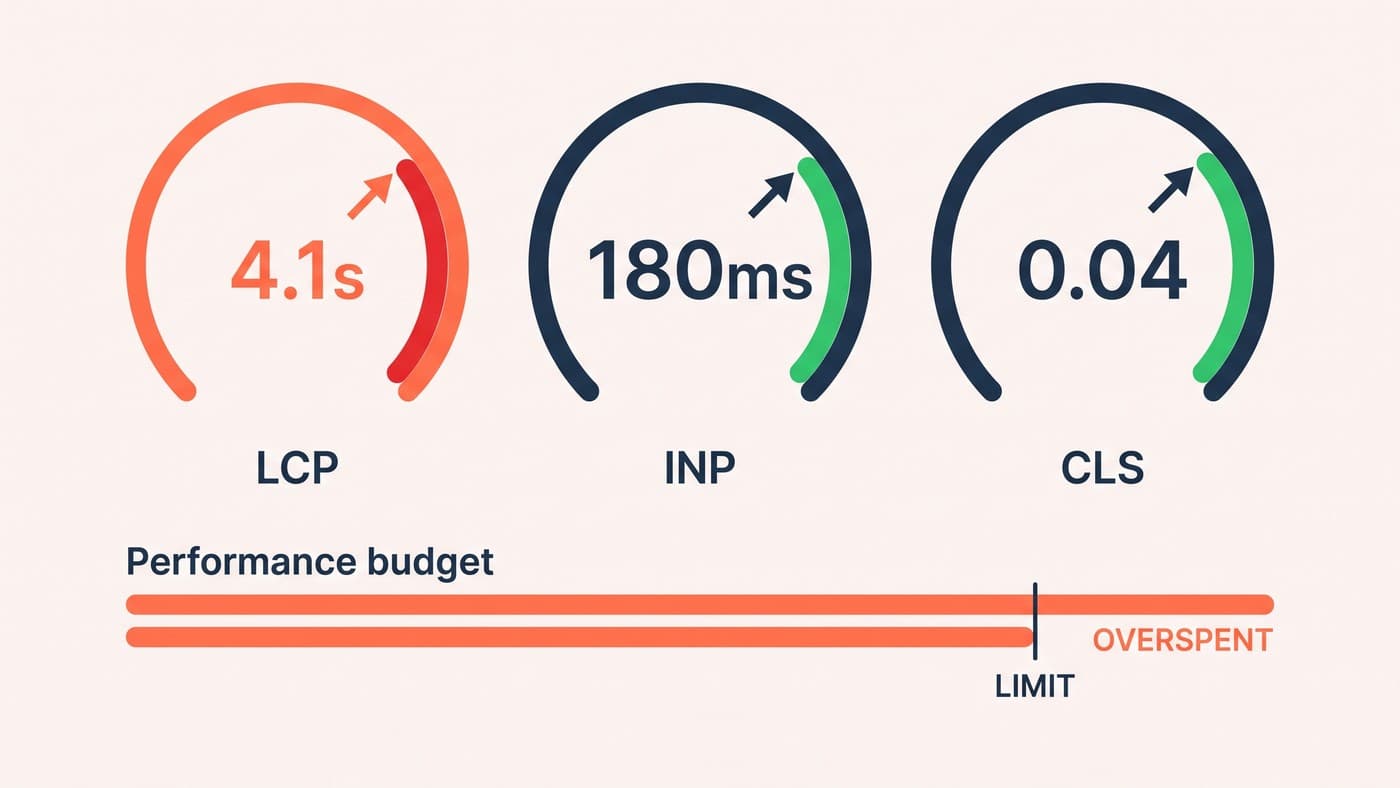
Your product photography is doing two jobs: selling the product, and, on most stores, singlehandedly wrecking your Largest Contentful Paint. Images are typically 60 to 70% of the bytes a product page transfers, and the usual response, compress everything harder, is the one move that makes the photography worse without touching the actual problem, which is that the file being delivered is far larger than the space it lands in.
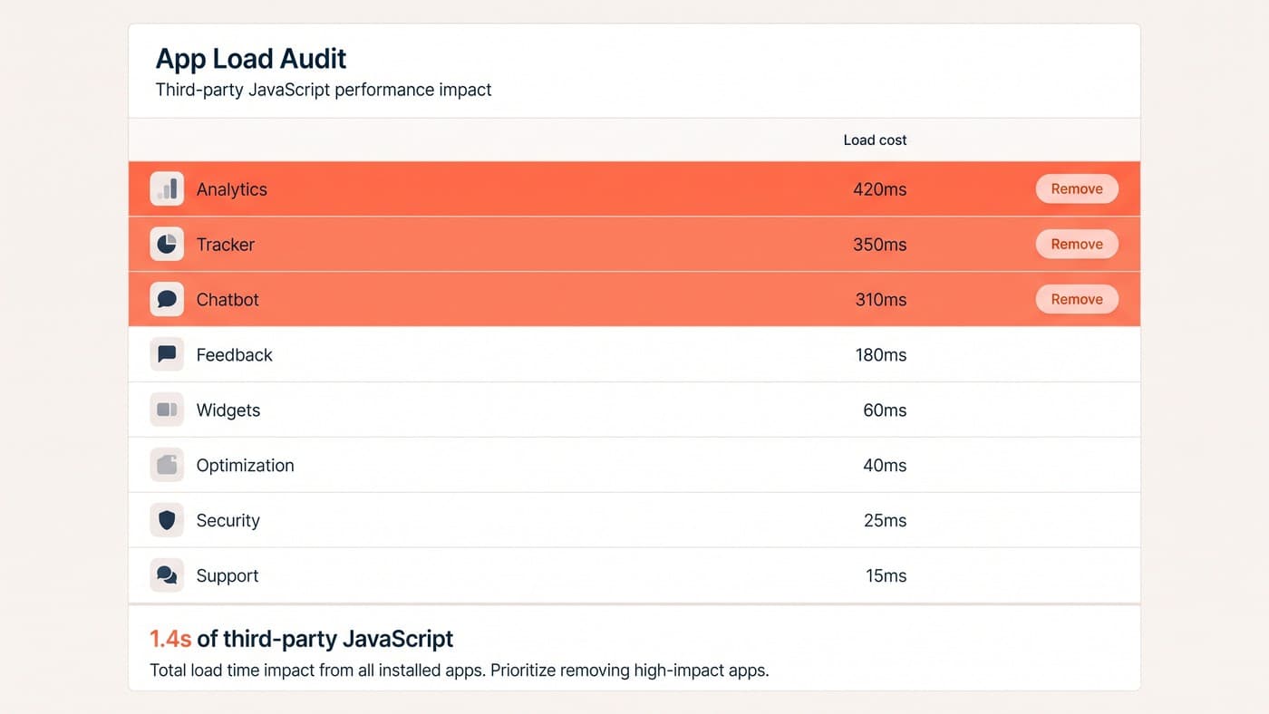
This is a post about images and nothing else. Fonts, apps, render-blocking scripts and the rest of the budget belong to page speed optimisation. What follows is what to do with the pictures, which is usually the largest single line in that budget and the one most often handed to an app instead of being understood.
The CDN is already doing more than most guides admit
Every image you upload is served through a transformation layer, and the two things it does automatically are the two things most optimisation advice tells you to do by hand. It resizes on request: append width and height parameters to an image URL and you get that rendition, generated once and cached, up to a maximum of 5760px in either dimension. And it negotiates format. Shopify detects which formats the client supports, including WebP and AVIF, and serves the best one available without being asked.
That second point deserves stating flatly, because a lot of published advice still contradicts it: you do not convert your catalogue to WebP. The format parameter on the image URL filter accepts only jpg and pjpg, and it exists for converting a PNG that should never have been a PNG. Modern formats are the CDN’s decision, made per request against what the browser says it accepts, and an app promising to "convert your images to WebP" is charging you for a negotiation that is already happening.
Sizing is the job the CDN cannot do for you
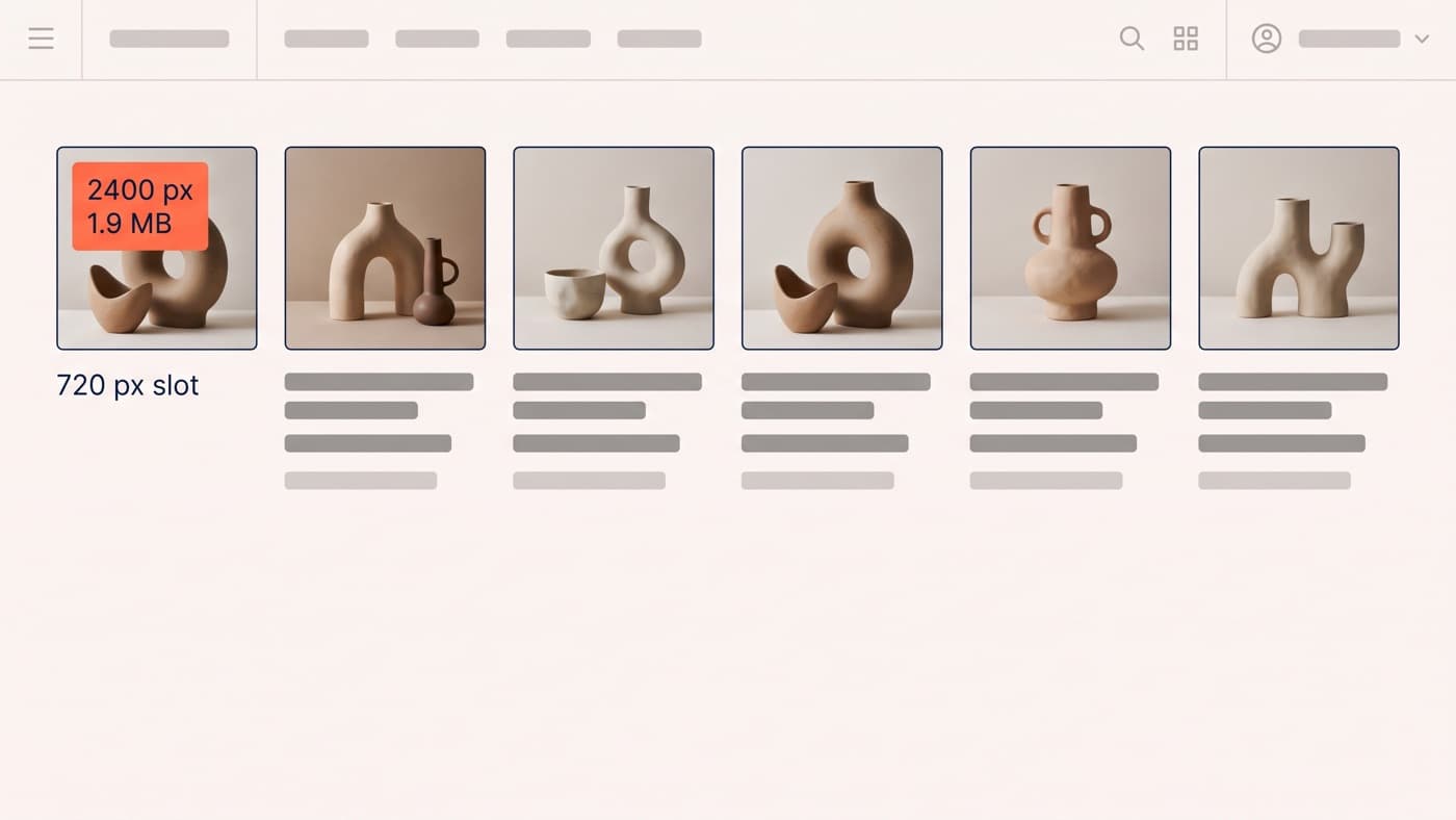
What the platform cannot know is how large the image will actually be drawn. A 2400px file rendered into a 720px slot is roughly eleven times the pixels for no visible benefit whatsoever, and on a phone the ratio is worse. That is how a six-image gallery ends up carrying 1.9 MB in its hero alone while looking identical at a fraction of the weight. The fix is a correct srcset, and the Liquid image tag will generate one for you provided you tell it the truth about your layout:
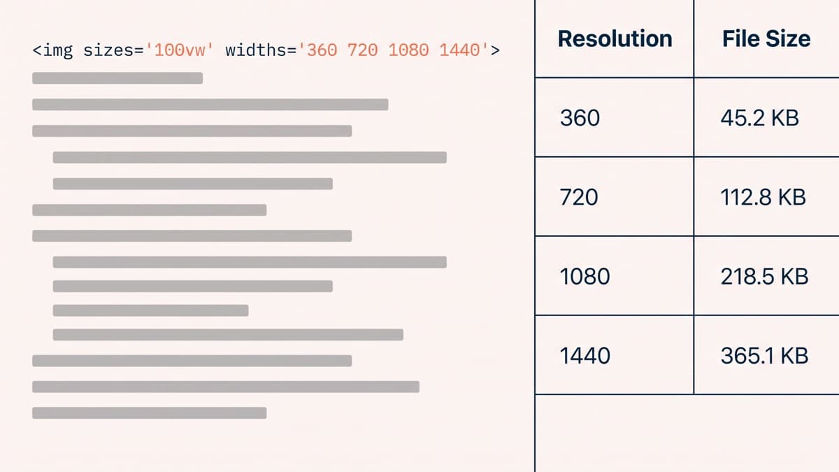
- Pass a widths list that matches your real breakpoints rather than accepting a default ladder. Renditions at 360, 720, 1080 and 1440 pixels cover most product galleries without generating variants nobody ever requests.
- Pass a sizes attribute that describes the slot rather than the image. This is the one people omit, and without it the browser assumes full viewport width and dutifully picks the largest file on the list.
- Let the tag emit width and height attributes so the browser reserves the space before the file arrives. This costs nothing and removes most of the layout shift customers experience as the page jumping under their thumb.
- Cap the ladder at the largest size the slot can ever be drawn at, and treat the 5760px ceiling as a platform limit rather than as an invitation to approach it.
- Give art-directed crops their own sources instead of squeezing one file with CSS, because a square hero and a wide banner are two different pictures rather than one picture at two sizes.
Lazy-loading has exactly one rule
Everything below the fold should be lazy, and the element that is your Largest Contentful Paint must never be. The Liquid image tag sets lazy loading automatically for images further down the page, which is the correct default and also the trap: inherit it on the hero and you have instructed the browser to deprioritise the single file your score is measured on. The tag takes a preload flag for exactly this case, and applying it to the first gallery image is often worth more than every compression setting on the store combined.
The way to check is not to reason about it. Run the page, find which element the browser actually reports as the LCP element, and confirm that one is loaded eagerly and ideally preloaded. On a surprising number of product pages the reported element turns out to be something nobody expected, a background image or a promotional badge, and the hero everybody had been optimising was never the bottleneck in the first place.
The gallery is where the bytes hide
A product gallery is the worst case gathered into one component: several large images, all present in the markup, most of them off-screen. The rules are simple and routinely broken. Load the first image eagerly and every subsequent one lazily. Do not fetch the zoom-resolution version until zoom is actually invoked. And do not let the thumbnail strip request full-size files and scale them down in CSS, which is the most common single defect we find and frequently accounts for most of a gallery’s weight on its own.
Applied properly across a product template, sizing and loading discipline usually removes about 1.5 MB from a first view without changing a single image visually. That is the entire argument: this is not a trade against quality. It is a trade against waste, and the only reason it feels like a quality decision is that the compression slider is the one tool most teams have ever been shown.
Where an app earns its place
Rarely, and for a much narrower job than the marketing suggests. Format conversion is handled. Resizing is handled. What an app can legitimately do is fix the source assets: bulk-recompress a catalogue of oversized originals, strip metadata, and flag the images somebody uploaded at absurd dimensions. That is a one-off cleanup, and a one-off cleanup does not obviously need a monthly subscription permanently attached to it.
The rest is theme work, and it is unusually durable theme work: a correctly written image snippet is inherited by every product that ever uses that template, which makes this one of the few Shopify development tasks that keeps paying without anybody maintaining it. Whether the photography itself is doing its job is a separate conversation with its own conversion argument, made in product page design.
So audit rather than compress. Open one product page, list every image on it, and note the delivered width against the width it is actually drawn at; the work usually names itself inside ten minutes and rarely requires a tool anybody has to buy. If the gap is large and nobody in the building owns the theme’s image snippet, get in touch.