Most A/B testing examples you can find online are a decade old, happened on somebody else’s store, and involve a button colour. The eight below are ours: real hypotheses, real builds, real results, including two that lost, because a test archive you can only learn winners from is just a graveyard with better lighting.
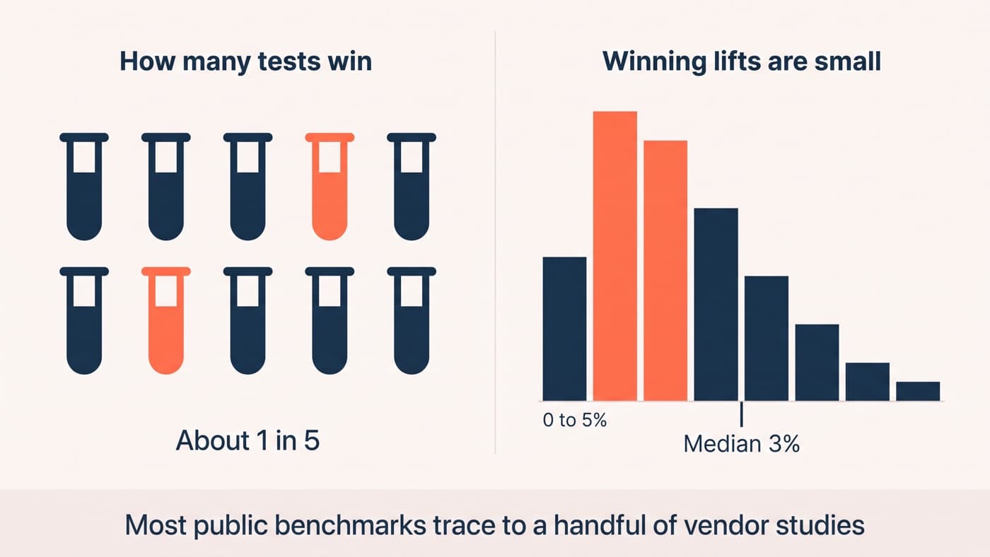
Ground rules before the examples. All eight come from our archive of 1640+ ecommerce tests, anonymised by sector. Baselines sit where real stores sit, between 1% and 5%. Uplifts are stated as relative change, so 2.1% to 2.4% is +14%, not +0.3%, and every verdict quoted here reached at least 92% confidence or is called what it is: flat. The eight are chosen to teach rather than to flatter; the archive’s overall record is far less romantic, closer to one test in four producing a shippable winner.
Product page examples
Product pages are where most programmes should start, and not because a best practice says so: it is simply where observation is cheapest and the traffic is deepest.
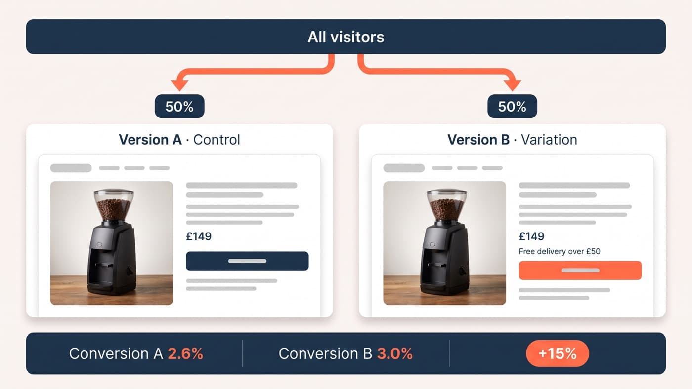
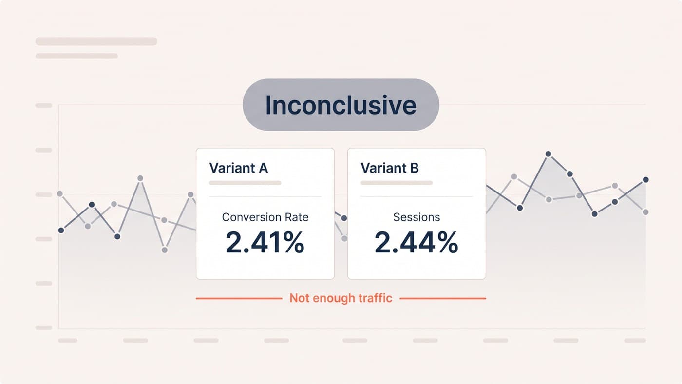
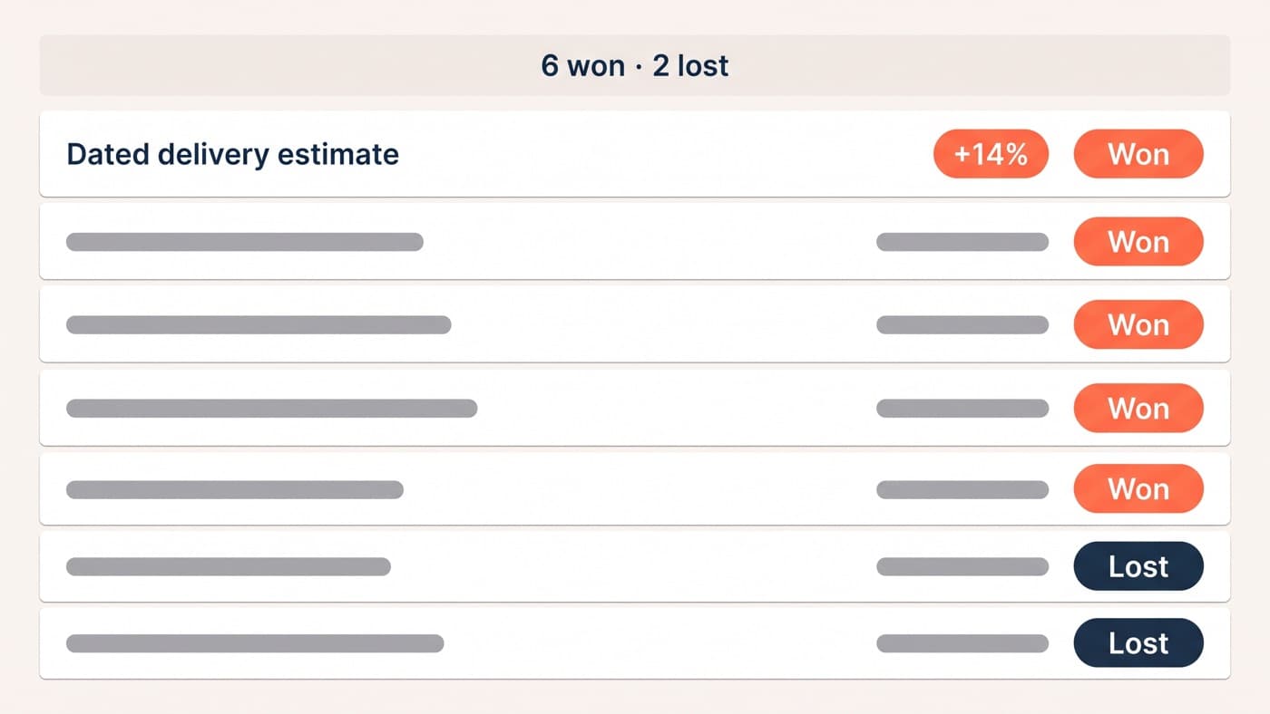
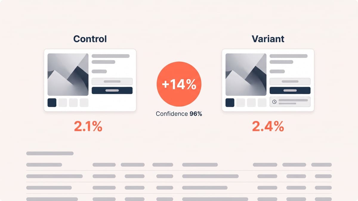
A homeware store’s session recordings showed shoppers leaving product pages for the delivery FAQ and mostly not coming back. Hypothesis: they were exiting to answer a question the page should answer. We replaced the vague 3 to 5 working days line with a dated estimate under the buy button, delivered by Thursday 14th. Conversion moved from 2.1% to 2.4%, a 14% relative lift at 96% confidence. Shoppers rarely object to information; they object to hunting for it.
A fashion retailer led every product gallery with a flat-lay shot. Heatmaps showed swipes clustering on the on-model images further along, which suggested shoppers wanted scale and drape before detail. Reordering the gallery to lead with the on-model image lifted product-page-to-cart progression by 8% at 95% confidence, without a single line of copy changing.
The same retailer then wanted an autoplaying video hero on its best sellers. It lost: conversion fell 6% at 93% confidence. The recordings explained the number, because the video pushed price and size selection below the fold and added most of a second to load on mid-range phones. This is the example we reach for when someone asks why obvious improvements need testing at all.
Cart and checkout examples
Checkout tests run more slowly, because the funnel is thinner and one experiment at a time is the rule, but completion percentages are large enough that small relative gains pay real money.
An outdoor equipment store’s checkout leaked at the payment step, and exit interviews kept surfacing the same phrase: I wanted to check the returns policy first. Restating returns terms inside the payment step, the actual terms rather than a link, lifted completion from 61.2% to 63.6%, a 4% relative gain at 96% confidence. The information existed all along; it sat three taps away at the worst possible moment.
A beauty store’s open discount-code box was working as an exit sign: recordings showed shoppers leaving checkout to hunt coupon sites, and many never returned. Collapsing the box behind a have-a-code link kept it available to shoppers holding a code while removing the prompt for everyone else. Completion rose 5% at 97% confidence, a gentler answer than deleting the field, which would have punished the store’s most loyal buyers.
Collection and messaging examples
The last three sit outside the product page, where fewer teams look and the competition for attention is lower.
A jewellery store’s collections defaulted to newest first, a merchandising habit inherited from fashion. Purchase data showed most orders starting from the same dozen proven pieces, so we tested bestsellers-first ordering. Collection-to-product progression rose 9% at 96% confidence, and conversion followed. Newness is a story the team cares about; proof is the story shoppers care about.
A pantry-goods store added a threshold line with a progress bar to its cart drawer: you are £12 away from free delivery. Conversion held flat, average order value rose 6%, and revenue per visitor, the metric that referees disputes between the other two, rose 5% at 95% confidence. Not every winning test wins on conversion, and this pattern is one of the most repeatable in our archive.
The second loser: a countdown timer on product pages, borrowed from a competitor who was surely testing it. It cost 3% of conversion at 92% confidence, and the post-test survey called the store pushy in more than one answer. A borrowed tactic carries no evidence with it. The competitor may be testing it, losing with it, or simply never measuring it at all.
The pattern across all eight
Line the eight up and one pattern does most of the explaining. Every winner answered a question a real shopper demonstrably had: about arrival dates, drape, returns, codes, thresholds, or which products other people actually buy. Both losers added something the store wanted visitors to feel, urgency or polish, with no observation behind it. Both losers also shared a tell: each arrived proposed as finished, ship it unless the test objects, rather than as a question. How a test is framed before launch predicts its verdict more often than we would like.
The other pattern is where the ideas came from. Not one started life in a brainstorm: recordings, heatmaps, exit interviews and purchase data produced all eight. If the mechanics of how a split test turns an observation into a verdict are new to you, start with our complete guide to A/B testing, and keep the numbers honest with the statistics guide.
Steal the process, not the results
None of these eight results will transfer to your store as answers, and the numbers above should not become your targets. What transfers is the sequence:
- Observe: pull ten checkout-abandon recordings, your top fifty search queries and last quarter’s support tickets before writing a single idea.
- Hypothesise: name the question shoppers are leaving to answer, and the specific place you will answer it instead.
- Build: flicker-free and QA-tested on the devices your customers actually hold, because a broken variant tests your bug, not your idea.
- Measure: pick the primary metric before launch, size the sample before that, and let revenue per visitor referee any dispute.
The build step is where self-serve programmes most often quietly corrupt; half the failure modes catalogued in why most A/B tests fail live there, and it is the half of the discipline that A/B test development exists to carry. The observing, though, needs no specialist and no budget. Ten recordings and an honest question will produce a better first test than any example in this article, ours included.