The most quoted A/B test in the industry is the one where a red button beat a green one, and almost everybody quoting it has the lesson backwards. It was never a finding about red. It was a finding about contrast, and the difference is exactly why your own button-colour test went nowhere.
The circulating version runs like this: a company tested a red call to action against a green one, red won by a large double-digit margin, therefore red buttons convert better. The margin moves depending on who is retelling it, which is the first clue that something has been lost. What gets dropped is the page it ran on. The green button matched the palette of the page around it. The red one did not. The variable that moved was not hue but whether the primary action stood apart from everything else on the screen.
We are deliberately not citing chapter and verse, because the retellings disagree with each other about the numbers and the setup, and a myth correction that overclaims its own sources is just a better-dressed myth. The mechanism is the part that survives, and the mechanism is testable on your own store: change the contrast between the primary action and its surroundings and you will usually see something, change the hue while holding contrast constant and you usually will not.
Why colour-only tests keep coming back flat
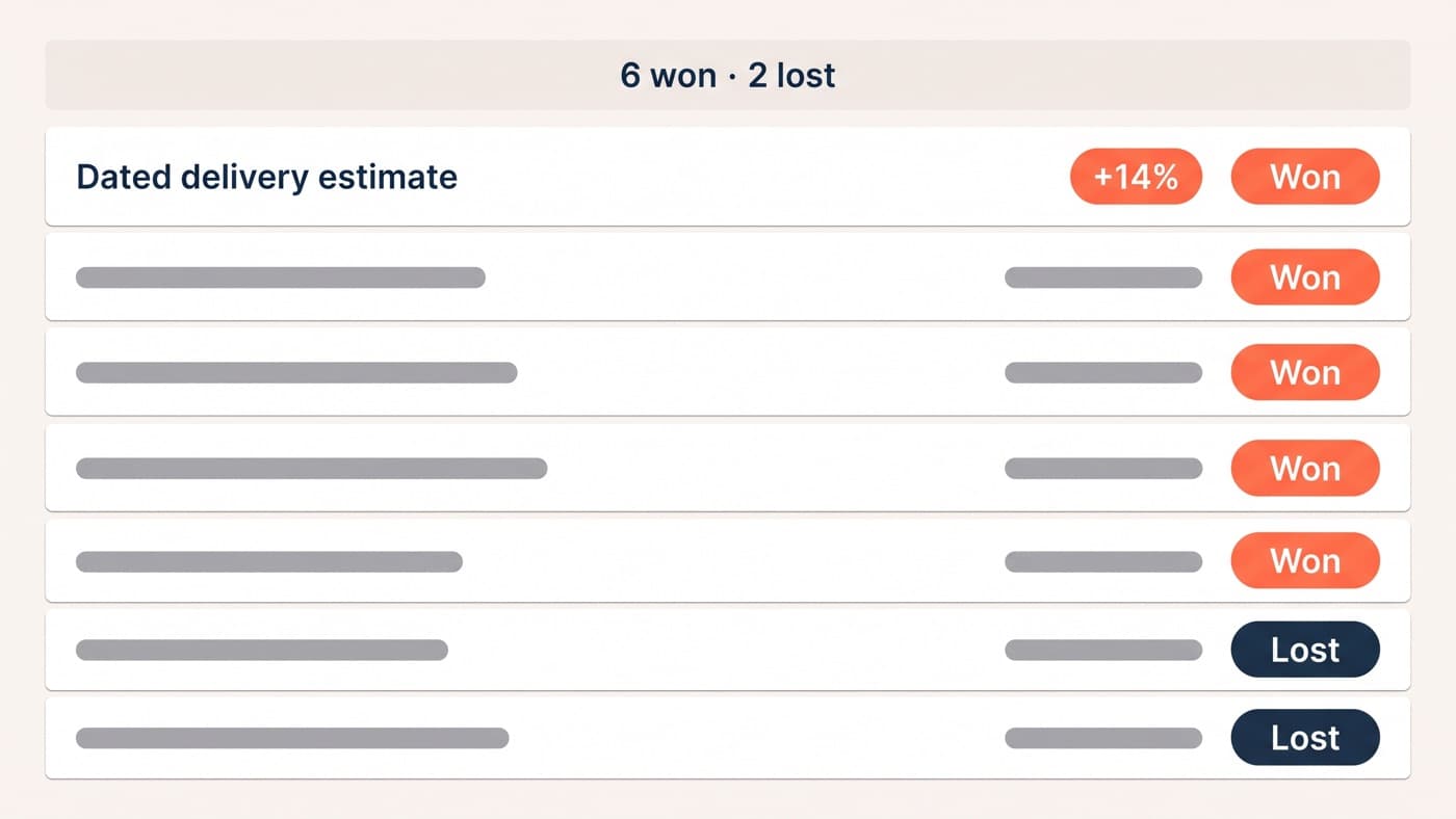
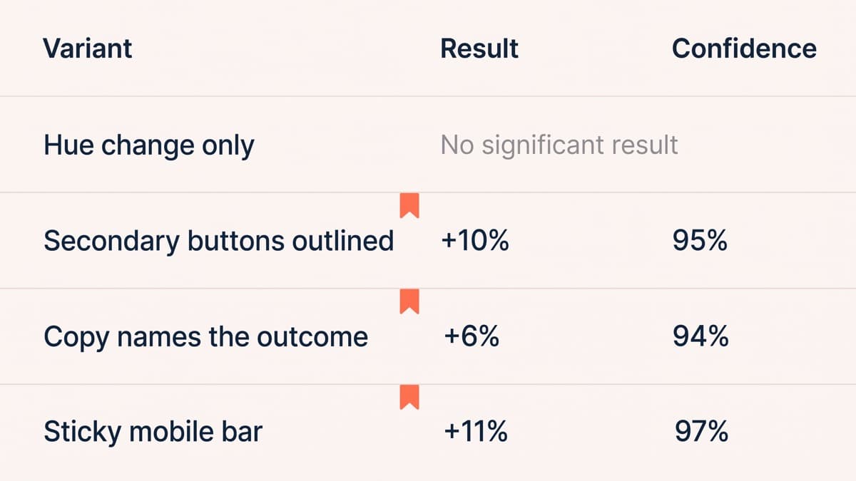
Across the button tests in our archive, the ones that varied hue alone while holding contrast and hierarchy constant are the most reliably inconclusive category we run. Of 41 CTA tests, 12 changed hue and nothing else, and not one of them reached 95% confidence in either direction. The tests that did move numbers changed something structural: what the button said, where it sat, or how far it stood apart from whatever was competing with it.
That is not an argument that colour is irrelevant. Colour is usually the mechanism by which contrast gets achieved, and a primary action rendered in the same tone as three other elements is genuinely harder to find. The argument is that hue is the variable anyone can change without a designer, which is why it is the variable that gets tested, and it sits downstream of the thing that actually decides the outcome.
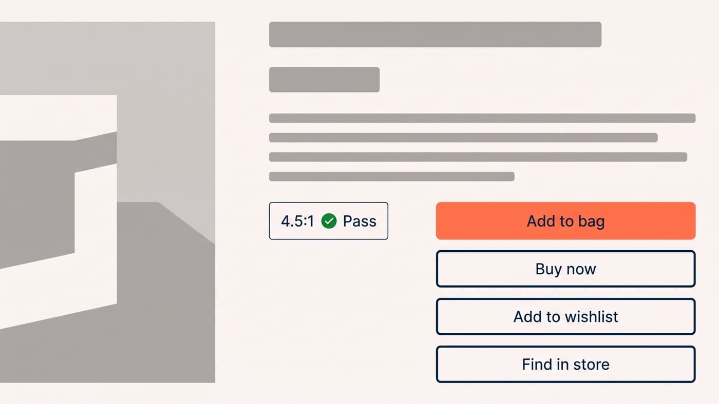
There is one real colour constraint and it is accessibility rather than persuasion. Label text needs a contrast ratio of at least 4.5:1 against the button background to stay legible for most people, and a surprising number of brand-approved buttons fail it. That is a floor to clear, checked with a tool rather than judged by eye, not a lever to pull.
Hierarchy: one primary action per screen
The most common CTA failure is not a weak button. It is three strong ones. A product page offering Add to bag, Buy now, Add to wishlist and Find in store, all rendered as filled buttons of identical weight, has no primary action at all, and the shopper has to work out what the page wants before working out what they want.
Pick one primary action per screen and make it the only element in the interface carrying that treatment. Everything else drops to a secondary style, outlined or plain text, or leaves the screen. On a homeware store, converting the secondary actions from filled buttons to outlined ones, with no change whatsoever to the primary button, lifted add-to-cart rate from 8.1% to 8.9%, a 10% relative gain at 95% confidence. Nothing was added. Three things were made quieter.
Copy specificity beats copy cleverness
Button copy is the highest-leverage text on a page and it is usually written last, by whoever assembled the template. The rule that keeps surviving contact with tests: the button should name what happens next, in the shopper’s words, as concretely as the sentence allows.
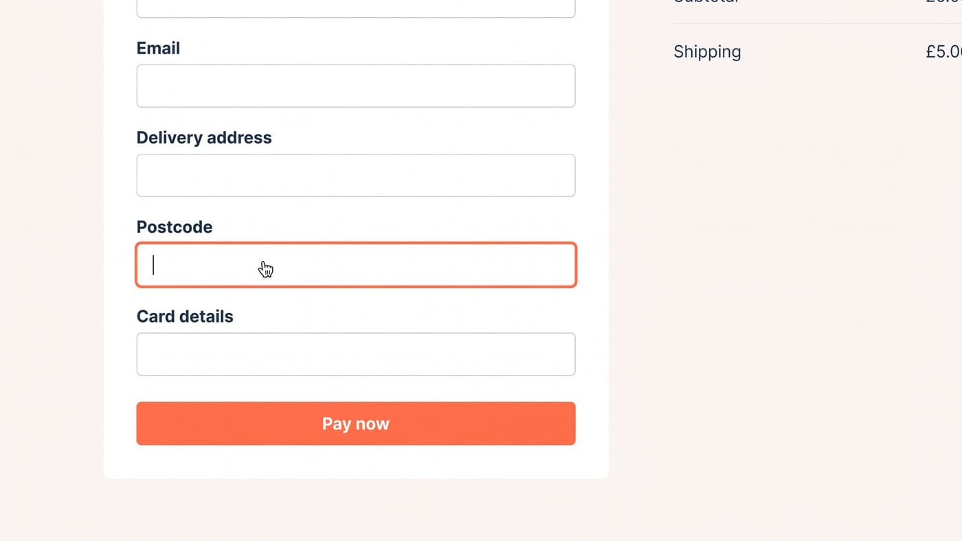
Submit names a database operation. Continue names nothing. Add to bag names an outcome. On a store selling made-to-order furniture, changing a checkout-step button from Continue to Choose delivery date raised completion of that step by 6% at 94% confidence, because shoppers stopped hesitating over whether Continue was the button that took their money.
Two failure modes on the way. Cleverness, the Treat yourself school of button copy, adds a translation step at precisely the moment you want none. And copy that overpromises, the Get instant access school, sets up an expectation the next screen breaks, which costs more later than the click bought you.
Placement, repetition and the sticky bar
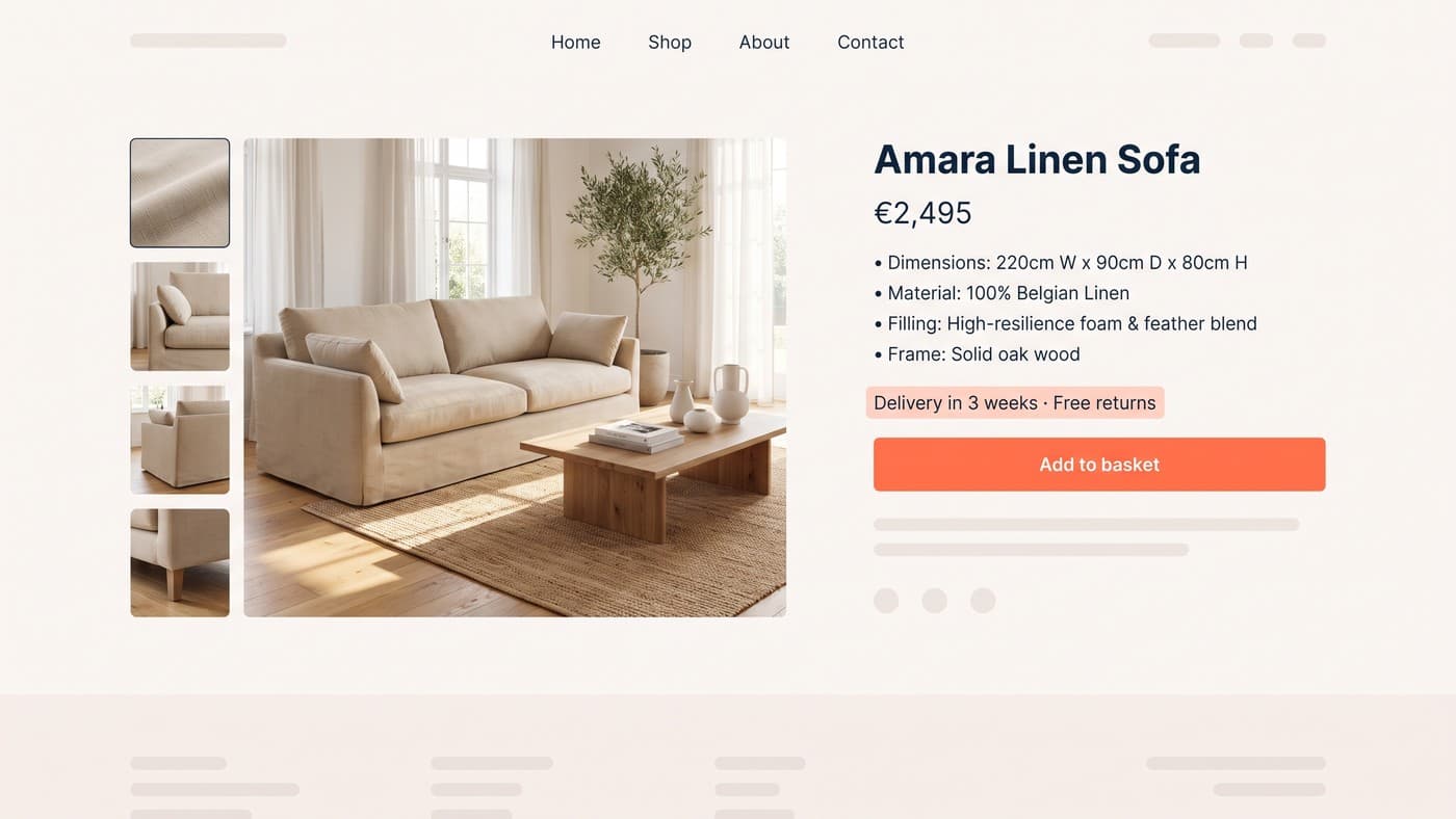
A button that is off screen at the moment of decision does not exist. On a long product page the primary action scrolls away somewhere around the second image and does not return until somebody scrolls back up, and on a phone that is most of the page.
Repeating the primary action after each block of persuasive content is standard and safe. The sticky bar is stronger and more contested: a persistent bar carrying the product name, the price and the primary action, appearing once the buy box scrolls out of view. On a fashion store that pattern raised mobile add-to-cart rate by 11% at 97% confidence, and it remains one of the more dependable mobile patterns we have, with the honest caveat that it costs vertical space on a screen with none to spare.
The rule under both is that the action should be available wherever a decision plausibly gets made, and no more often than that. A page carrying five identical buttons within one screen has stopped repeating itself and started nagging.
State design is half the button
Most button design stops at the default state, which is the state that matters least, because the ones shoppers actually notice are the states that tell them something happened.
- Hover, on pointer devices, confirming the target is live before anyone commits to a click.
- Focus, visible and never removed, because keyboard and assistive-technology users navigate by it and the default outline is usually deleted for looking untidy.
- Active, a brief pressed state, which is the only feedback a touch user gets at the moment of the tap.
- Loading, so nobody taps Add to bag three times while a slow request runs, and so the interface owns the delay instead of looking broken.
- Success, naming what changed (Added to bag) rather than silently incrementing a counter somewhere in the header.
- Disabled, used sparingly and never without saying why, because a dead button with no explanation reads as a broken site rather than as a rule.
The loading and success states are worth more than any colour decision on the page. A shopper who taps and sees nothing assumes failure, and a duplicate submission is a support ticket at best and a duplicate order at worst.
The order to work in
If you were fixing one page’s calls to action tomorrow: one primary action per screen, copy that names the outcome, contrast measured rather than debated, availability at every decision point, and every state designed. Colour comes last, and it comes as a consequence of the contrast decision rather than as a choice about which hue converts.
The worked versions of these tests, with baselines and confidence levels attached, live in our collection of test examples rather than here. And if the argument in your organisation is currently about which orange the button should be, the useful move is to reframe it as a hierarchy question, which is the part of interface design that pays. If nobody can name the primary action on your product page in one word, that is the conversation to have before anybody picks a colour.