Product pages get the optimisation attention, but the collection page decides who ever reaches one. It is the store’s real merchandising floor, and most are laid out by accident: whatever grid the theme shipped with, whatever order the platform defaults to, whatever filters an app installed on its own terms.
This is about the template itself: what a product card should carry, how filters should behave, what your sort default is quietly saying, and how far anyone should have to scroll. What happens after the click is a separate problem with separate rules, and the shoppers who type rather than browse belong to site search. Both are linked here rather than restated.
Card information density is the whole game
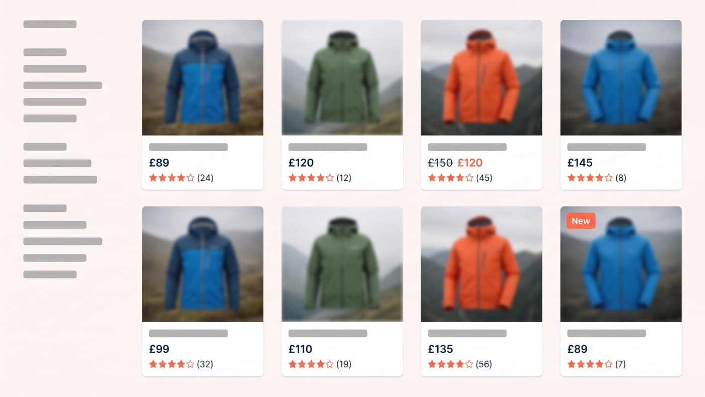
A product card is a decision aid, not a thumbnail. The shopper is running a cheap triage: is this roughly right, is it in my price range, is it any good, is it worth a click. Every element on the card either serves that triage or crowds it.
The set that keeps earning its place is short. An image that shows the product rather than a mood. The name. The price, with any discount shown as both figures rather than as a percentage badge alone. A star rating with its review count, because a rating without a count reads as a claim. And an availability or variant cue where it genuinely changes the decision.
Second image on hover is the one addition that consistently pays. On a fashion store, swapping the card’s hover behaviour from a zoom to a second image, a worn shot where the primary was a flat lay, lifted collection-to-product click-through by 9% at 95% confidence. It works because it answers the triage question one step earlier: the shopper learns how the garment sits on a body without spending a page load to find out.
Badges are where density goes to die. A card carrying New, Best seller, Only 2 left and Free delivery has communicated nothing, because everything is emphasised. Cap it at one badge per card, and make the store earn the right to use it: if more than about a fifth of the catalogue is badged, the badge has stopped meaning anything at all.
Filters are the feature, and most are hostile
Filtering is the most valuable behaviour on the template. A shopper who applies a filter is self-identifying as a buyer rather than a browser, and filtered sessions convert at a visibly higher rate than sessions that only scroll. Which makes it strange how many filter systems actively fight the person using them.
The failures repeat across audits: filters hidden behind a mobile link that gives no clue what is available, values that return nothing, no counts against the options, a full page reload on every selection, and applied filters that evaporate when somebody presses back. Each is a small tax and they compound. What to demand of any implementation:
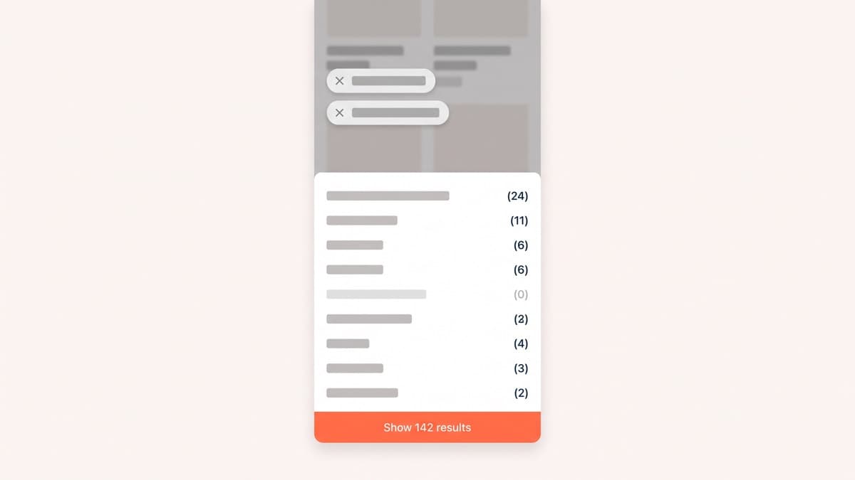
- Option counts shown before selection, so nobody filters their way into an empty grid.
- Zero-result options disabled rather than hidden, because the absence is itself information about your range.
- Applied filters shown as removable chips above the grid, not only inside a drawer the shopper has closed.
- Results updated in place, without a reload and without throwing away scroll position.
- Filter state held in the URL, so a filtered view survives a share, a bookmark and the back button.
- On mobile, a full-height drawer with a sticky apply button that names the outcome: Show 142 results tells a shopper something, Apply does not.
Mobile earns the extra line because it is where filters are used most and designed least, and the wider mobile constraints land on this template harder than on any other.
The sort default is a merchandising decision
Almost nobody changes the sort order. That makes the default the order in which the overwhelming majority of shoppers see your range, which makes it a merchandising decision most stores have never consciously taken. Featured usually means the order the products happened to be created in.
Best-selling is the honest default for most catalogues, because it is a recommendation assembled from evidence. Newest suits stores whose customers come back for drops. Price ascending is almost always the wrong default: it leads with your cheapest, least representative stock and anchors the entire range low before anyone has seen what you actually sell.
There is a version of the sort question that matters more than the dropdown: what happens to sold-out and low-stock lines. Pushing out-of-stock products to the end of the default sort is close to a one-line change, it improves every collection on the store at once, and it is one of the few conversion changes with no downside worth arguing about.
Pagination, load more, infinite scroll
Infinite scroll feels modern and behaves badly on a store. It breaks the footer, breaks the back button unless somebody has been careful, and takes away any sense of how far through a range a shopper has got. It suits feeds, where there is no end and no goal. A collection has both.
Load more is the pragmatic middle: an explicit button, a preserved scroll position, and a visible sense of progress. Real pagination still earns its place on very large collections, where being able to jump beats continuity. Whichever you pick, the number that matters is how many products a shopper meets before the first decision point, and a first screen showing four products on a phone teaches nobody anything about your range.
In-collection content, without wrecking the grid
Collection pages carry a search burden as well as a merchandising one, which is how they end up with six hundred words of introduction stacked above the grid. Put the copy below the grid, keep at most a short orienting line above it, and let the products lead. Somebody who arrived from a search for waterproof walking jackets came to see waterproof walking jackets.
Editorial tiles inside the grid work when they are rare and relevant: a buying-guide card in the third row of a technical category, a fit note in a category where returns cluster. They stop working the moment there is one in every row, because they break the scan rhythm the grid depends on to be readable at speed.
What to test on a collection page
This template usually carries enough traffic to test properly, and the tests are unusually clean because the outcome metric sits one click away. Card hover behaviour, sort default, filter presentation on mobile, badge policy, and column count on a phone, where two narrow columns often beat one wide one because the range becomes legible. What is rarely worth a slot is grid spacing, which is where these arguments normally start.
Collection pages are underrated because nobody presents them. They have no hero, no launch moment and no stakeholder, and they carry more browsing traffic than the pages that get redesigned every other year. Fixing the template is among the highest-leverage jobs in ecommerce interface design, and if yours is still whatever the theme shipped with, watching ten sessions on one will tell you more than another product-page audit.