Every accessibility fix has a shadow benefit. The contrast that helps a low-vision shopper helps everyone squinting at a phone in sunlight. The labels that let a screen reader announce a field are the same markup that lets a browser autofill it. The focus states designers delete for looking untidy are what keyboard-first shoppers navigate by. Compliance is the floor. The overlap is the upside.
That is the framing this article owns: where accessibility work and conversion mechanisms are literally the same edit. It is not a compliance product, it will not estimate your litigation risk, and it refuses the sales tactic the category is famous for, which is to open with a lawsuit and close with a subscription.
The overlap map
Assistive technology and conversion tooling depend on the same property: an interface that machines can read. A screen reader and an autofill engine are both parsing your markup for the same answers. When a developer replaces a real form label with placeholder text, both lose. When a button is a styled div, the screen reader cannot name it and the keyboard cannot reach it, and the analytics never see the tap that did not happen.
So the honest pitch is not that accessibility lifts conversion by some flattering percentage. It is that a specific list of accessibility defects are also usability defects with a conversion cost, and fixing them once pays into both accounts. That list is shorter than a full audit and it is where an ecommerce team should start.
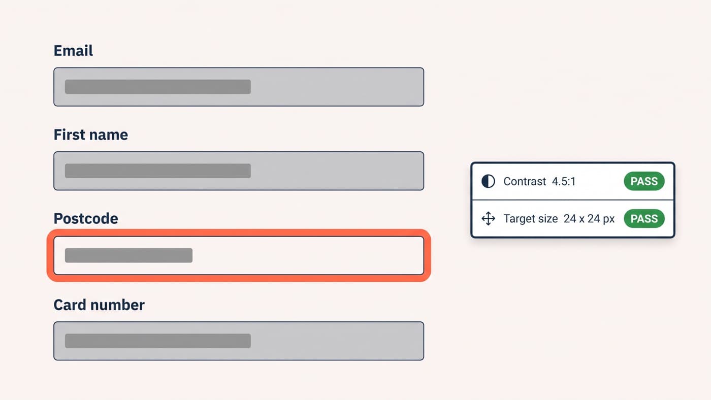
- Text contrast of at least 4.5:1 for normal text, and 3:1 for interface components and their states, which is the same threshold that makes a price legible on a train.
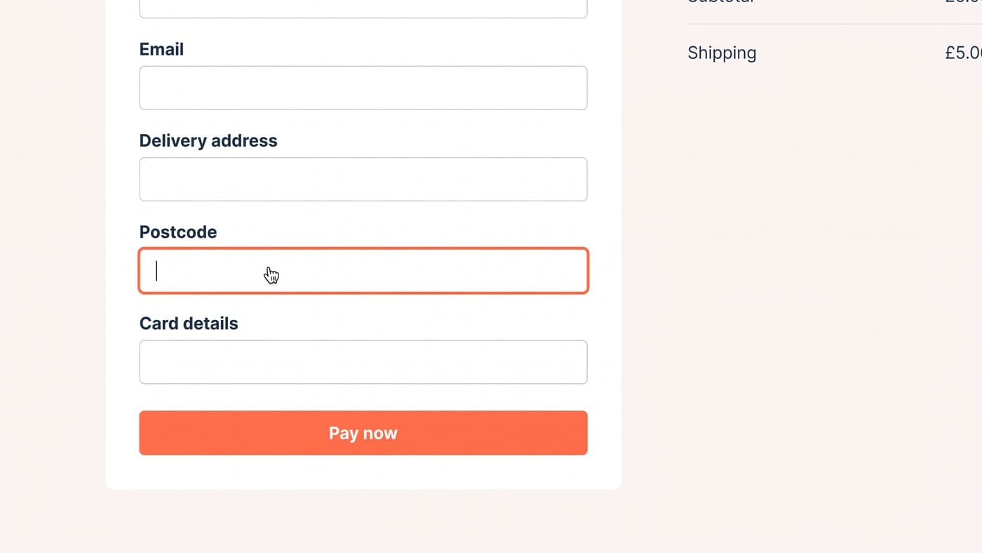
- A visible focus indicator on every interactive element, never removed, because it is the only way a keyboard user knows where they are.
- Programmatic labels on every input, not placeholder text that disappears the moment somebody types and takes the question with it.
- Alt text on product images that carries product information rather than the file name, which is also the text an image search reads.
- Target sizes that survive a thumb: WCAG 2.2 sets a Level AA minimum of 24 by 24 CSS pixels, and the Level AAA version asks for 44 by 44, which is closer to what a phone actually needs.
- Errors identified in text rather than by colour alone, positioned next to the field they belong to.
- Real headings and landmarks, so both a screen reader and a scanning shopper can skip to the part of the page they want.
- Motion that respects the reduced-motion preference, because a carousel that cannot be stopped is a problem for far more people than it is a feature for.
The keyboard-only purchase test
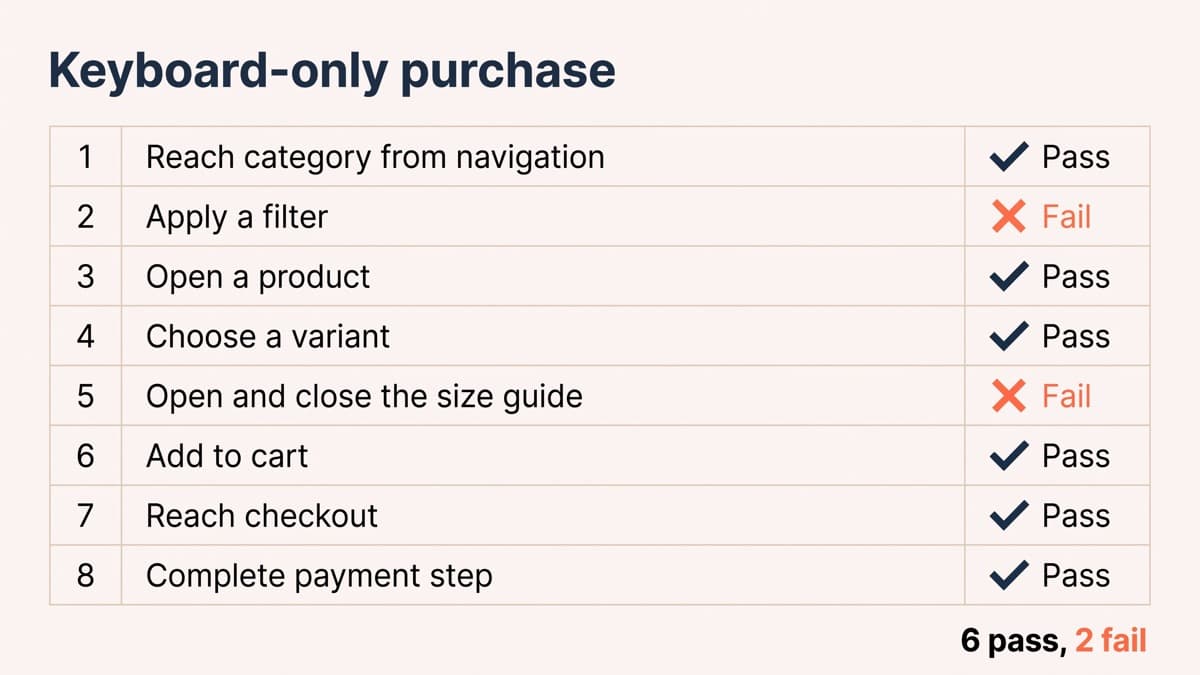
The fastest self-audit costs nothing. Unplug the mouse, or put it out of reach, and buy something from your own store using only the keyboard. Tab, shift-tab, enter, space, arrow keys. There are 8 steps in a typical run: reach a category from the navigation, apply a filter, open a product, choose a variant, open and close the size guide, add to cart, reach checkout, and complete the payment step.
Most stores pass 6 of the 8. The 2 that fail most often in our audits are the filter panel, where custom checkboxes built from divs cannot be reached at all, and the size-guide modal, which opens without moving focus into it and cannot be closed with escape, leaving the shopper tabbing through the page behind it. Both are also mobile usability problems, which is the point of the exercise.
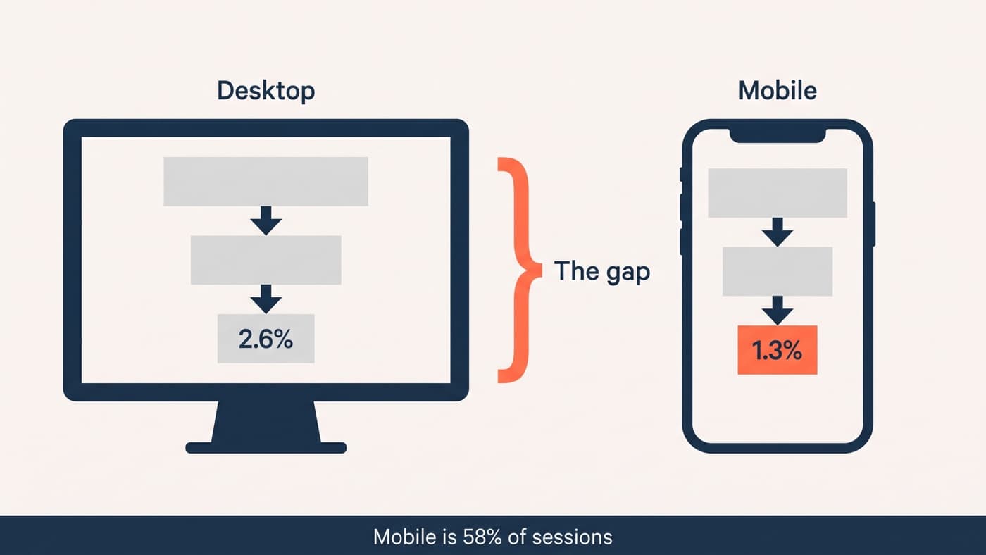
Automated scanners are worth running and worth distrusting. They reliably catch missing alt attributes and contrast failures, and they cannot tell you that the focus order jumps from the header to the footer, or that a checkout button is technically labelled Continue while announcing itself as Button. The keyboard run finds those in twenty minutes. The same twenty minutes is a decent mobile review too, which is why it sits alongside the mobile conversion work.
The overlay problem, stated honestly
A category of products promises to fix accessibility with one script tag. They add a toolbar offering contrast and font-size controls, and claim to repair the underlying page automatically. It is worth knowing why practitioners are hostile to them before you buy one.
The regulator has now said it out loud. In January 2025 the US Federal Trade Commission brought a case against accessiBe over its accessWidget product, alleging that the tool did not deliver the automatic WCAG 2.1 AA conformance it advertised and failed on basic components including navigation menus, form fields and image descriptions, alongside undisclosed paid reviews. A final order requiring a 1 million dollar payment was approved in April 2025.
The structural objection is simpler than the enforcement one. An overlay sits on top of markup it cannot change. If a button is a div, it is still a div; the widget can guess at a label and often guesses wrong, which is worse than silence for somebody relying on it. Many screen-reader users report turning overlays off on sight. None of this makes the vendors villains, and a contrast toggle is a fine thing to offer. It is just not a remediation.
Where the law stands, jurisdiction by jurisdiction
The technical standard is settled and the legal position is not uniform. WCAG 2.2 has been a W3C Recommendation since October 2023, with the current published version dated December 2024, and Level AA is what every regulation and procurement document means when it says conformance. Version 2.2 retains all of 2.1 apart from the removed 4.1.1 Parsing criterion, so building to 2.2 AA satisfies anything that asks for 2.1 AA.
In the European Union, the European Accessibility Act has applied since 28 June 2025 and names ecommerce among the covered services. Conformity is assessed against the harmonised standard EN 301 549, whose current published version references WCAG 2.1 Level AA, with an update aligning it to 2.2 expected. Enforcement runs through each member state’s implementing law, so the penalties and the complaint route differ by country. Microenterprise services, meaning fewer than 10 people and turnover or balance sheet total no greater than 2 million euros, are exempted, and that exemption ends the moment the business grows past it.
In the United Kingdom there is no statute requiring WCAG conformance from a private online store. The Equality Act 2010 requires service providers to make reasonable adjustments, and that duty is anticipatory rather than triggered by a complaint, while the 2018 public sector accessibility regulations that do name WCAG apply to public bodies only. What that adds up to is a duty with no version number attached, which is why WCAG 2.2 AA is the sensible working definition of reasonable rather than a legal citation.
Where to start on Monday
Do the keyboard run first, because it produces a list of real defects rather than a compliance score. Then fix contrast and focus states globally in the design system rather than page by page, since both are token-level changes that propagate. Then labels and alt text, which is content work rather than engineering and can run in parallel with everything else.
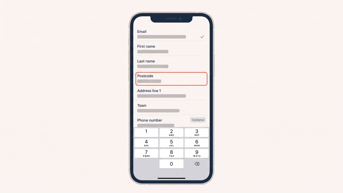
Forms are the highest-density concentration of all four problems, which is why the field-level form work and this list keep meeting each other. Beyond that, accessibility is an ordinary part of interface design rather than a project with an end date, and treating it as a one-off remediation is how sites drift back within two releases. If nobody on your team has tried to buy something from your store without a mouse, that is the first hour to book.