Nobody has ever abandoned a checkout because the form asked too little. Every field is a small tax on somebody who has already decided to buy, and most stores are over-collecting out of habit rather than need.
The habit has a mechanism. Fields arrive one at a time, each with a reasonable sponsor: marketing wants a phone number for delivery texts, the warehouse wants a second address line, somebody once had a fraud problem and now everybody types a date of birth. There is never a meeting where a field gets removed, so the form only grows, and by the time anyone measures it the store is asking fourteen questions to take one payment.
This article owns the fields themselves: how many there are, what type each one should be, when validation fires and what happens when somebody gets one wrong. The shape of the flow around them, one page or several, guest or account, belongs to our guide to checkout UX, and the platform-level version sits in checkout optimisation for WooCommerce. This one stays inside the form.
The field-economy audit
Print the form and give every field a sponsor. Not a department, a person, and one question: what decision does this data change, and when did it last change one? A surprising number fail immediately. The phone number nobody rings. The company name on a direct-to-consumer store. The How did you hear about us? dropdown nobody has read since the quarter it was added.
Every field then gets one of five verdicts.
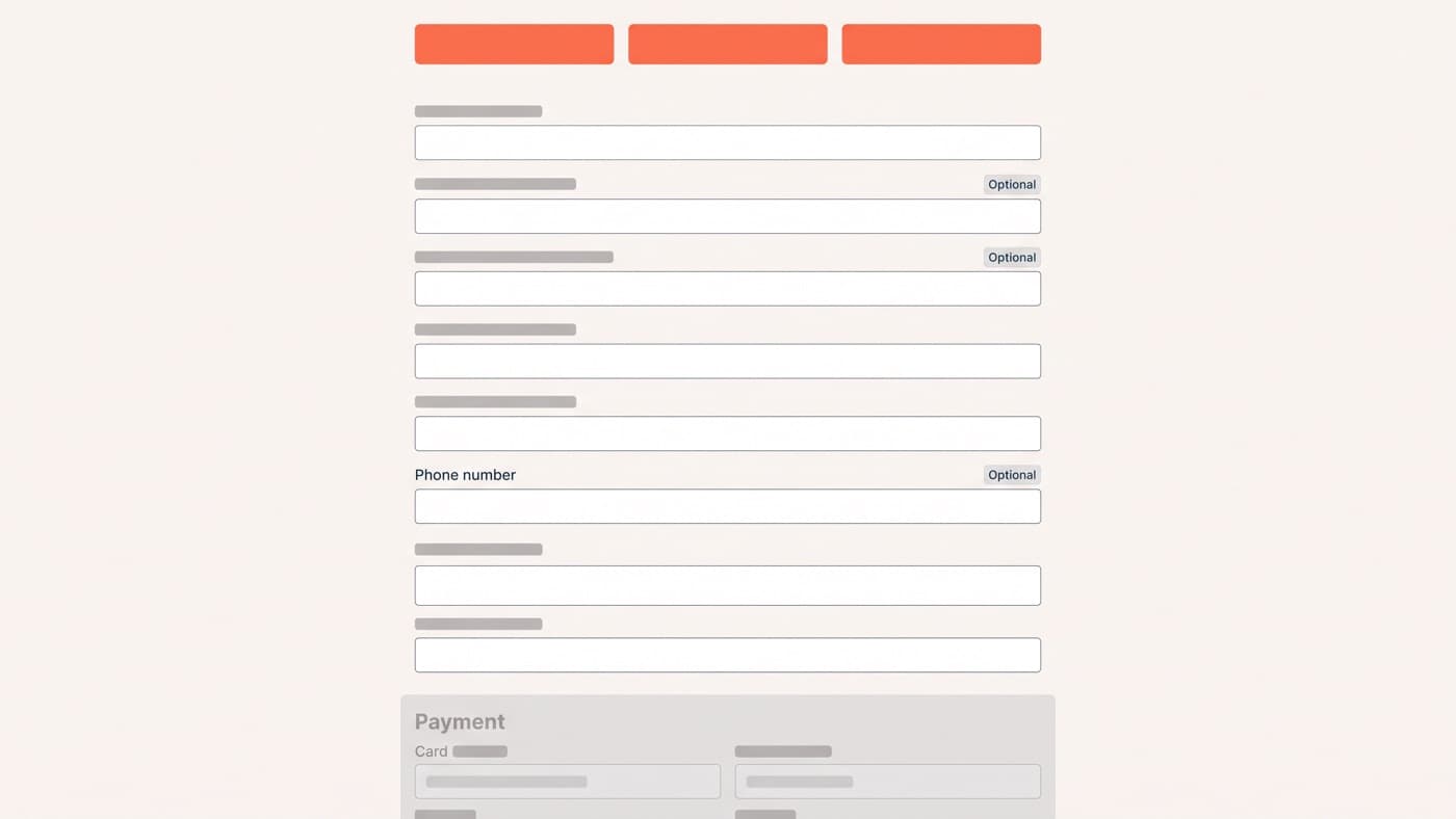
- Delete. The data changes no decision anyone can name, which describes most fields that were labelled optional years ago and never removed.
- Defer. It is genuinely useful but not needed to take the order, so ask on the confirmation page or in the first email, once the shopper has what they came for.
- Derive. Get it from something you already hold or can look up, which is what a postcode lookup does for four address lines and what the card number does for the card type.
- Demote. It has to stay and it has to be optional, so make it visibly optional, say what it buys the shopper, and never fail a submission on it.
- Keep. It is required to charge, fulfil or contact, and the order cannot happen without it. This list is always shorter than the form currently showing.
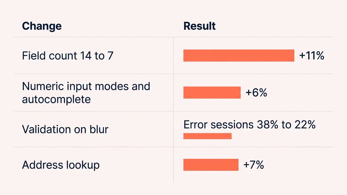
The payoff is usually larger than the design work that produced it. On an outdoor-equipment store, cutting the delivery-details step from 14 fields to 7 lifted completion of that step from 61.4% to 68.2%, an 11% relative gain at 96% confidence. Nothing was redesigned. Seven questions stopped being asked.
Input types are a mobile conversion feature
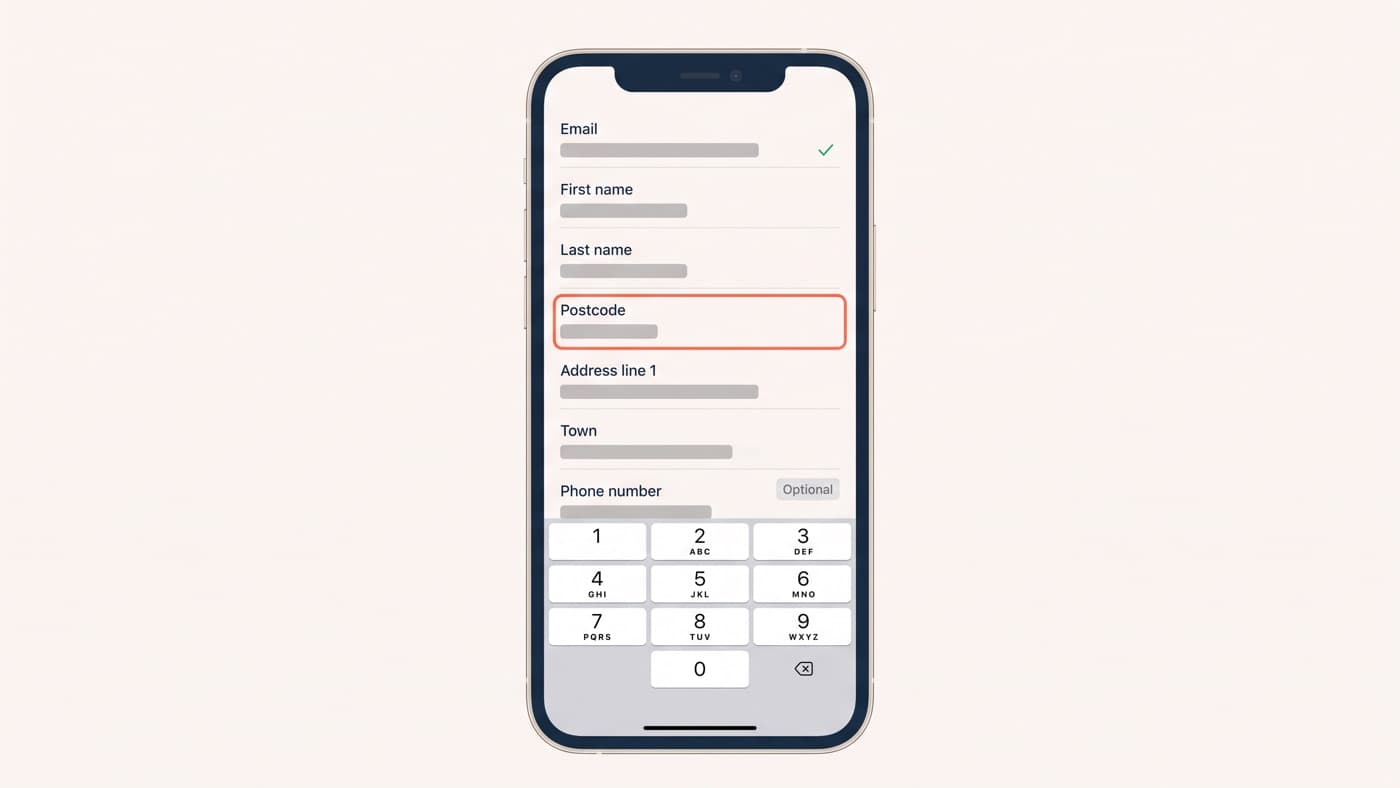
The cheapest form improvement available is telling the browser what kind of data a field wants. On a phone the wrong keyboard is a real tax: somebody entering a card number on a full alphabetic keyboard is hunting for digits in a layout designed for prose, and every second of that is a second spent not buying.
- A numeric input mode on card numbers, postcodes and phone numbers, so the keypad arrives instead of the alphabet.
- Real field types for email and telephone, which change both the keyboard and the browser’s own validation behaviour.
- Autocomplete tokens on every field: given-name, family-name, address-line1, postal-code, cc-number. This is the markup that makes autofill work, and autofill is the fastest form filler your store will ever have.
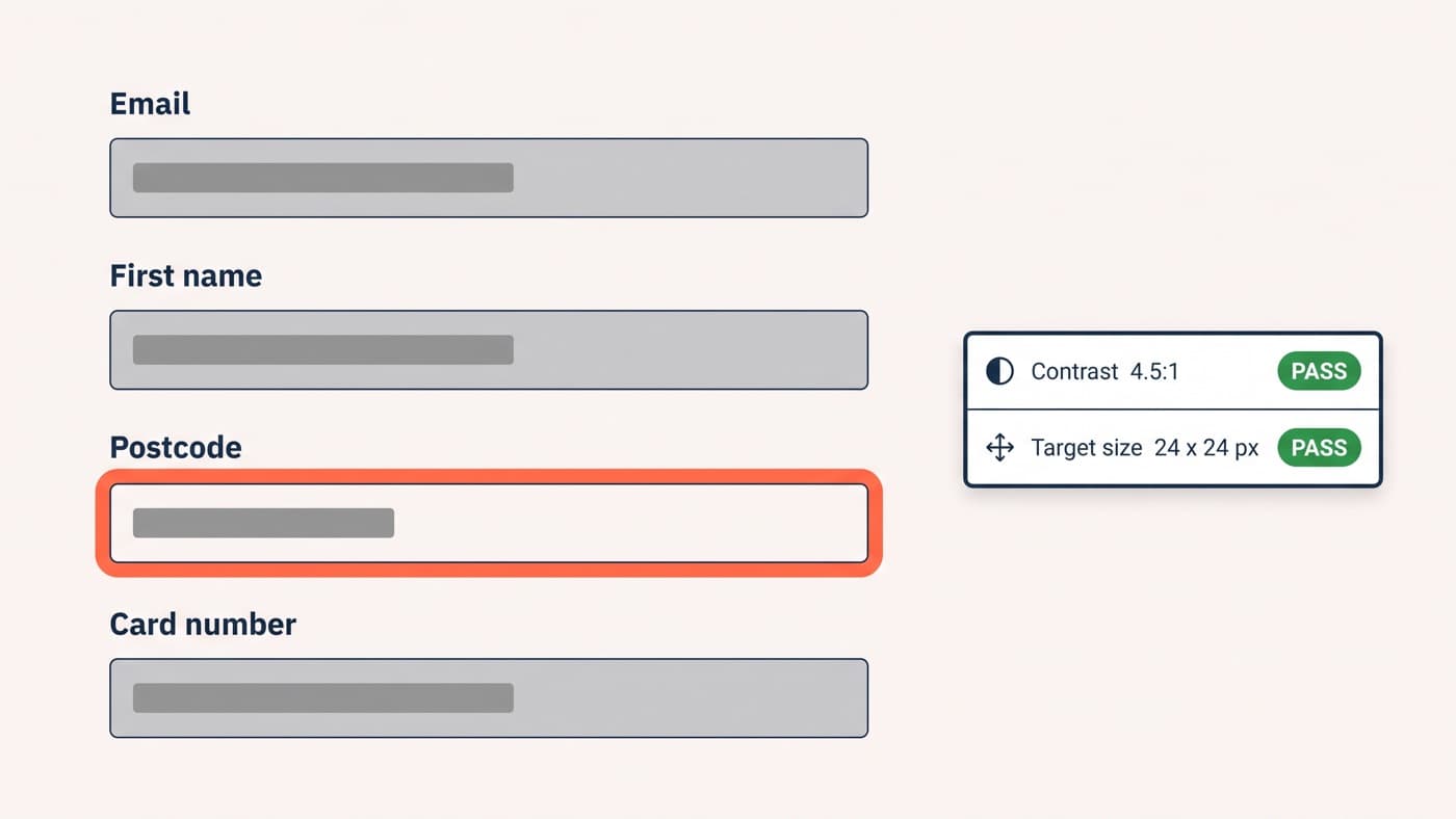
Two of those are accessibility requirements as much as speed features, which is the argument in the companion piece on accessibility: a field without a programmatic label is unreadable to a screen reader and invisible to autofill at the same time, for the same reason. On the same outdoor store, adding numeric input modes and autocomplete tokens to an otherwise unchanged payment step raised completion of that step by 6% at 95% confidence.
Validate on blur, not on every keystroke
There are three moments a form can tell somebody they are wrong and only one of them is kind. Validating on every keystroke means announcing an invalid email address to a shopper who has typed one letter. Validating only on submit means letting them fill eleven fields before revealing that the second was wrong. Validating when a field loses focus catches the error the moment they have finished with it, before anything else is invested.
The exception is a live rule the shopper is working towards, a password strength meter or a character counter, where per-keystroke feedback is the entire point. Everything else waits for blur. Moving one checkout form from keystroke validation to blur validation cut the share of sessions seeing at least one error message from 38% to 22% without changing a single validation rule.
Error messages are interface copy
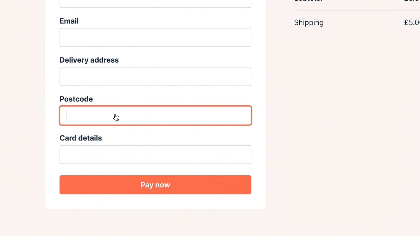
An error message has three jobs: say what is wrong, say where, and say what to do instead. Most manage one. Invalid input does none of them, and a red border with no text does none of them twice, because the shopper who most needs the message is often the one least able to see the colour.
Write the fix rather than the failure. Instead of Invalid postcode, say that the postcode could not be found and offer manual entry in the same sentence, with the link right there. Put each message beside the field it belongs to rather than in a summary of nine problems at the top of the page, and move focus to the first one. And never clear a field because its contents failed validation, which is the most infuriating thing a form can do and is still a theme default in more places than it should be.
Declined payments deserve their own copy. A decline is not a user error and reads terribly when it is styled as one. The useful message names the likely causes, offers another payment method, and keeps everything the shopper already typed. What to do with the session afterwards is a different discipline, covered in our piece on cart abandonment.
Address entry is where the time goes
Address capture is the longest part of most checkouts and the easiest to shorten. A postcode or address lookup replaces five typed fields with one selection, and it removes the class of delivery failures caused by typing errors nobody notices until a parcel comes back.
On a homeware store, adding address lookup cut median time on the delivery step from 48 seconds to 19 and raised mobile checkout completion by 7% at 95% confidence. Two conditions make it pay: a visible manual-entry escape for the addresses lookup services get wrong, which is more of them than the vendors admit, and coverage of every country you actually ship to rather than the home market alone.
The order to work in
Fixing one form tomorrow: count the fields and delete the ones nobody can defend, set input modes and autocomplete tokens, move validation to blur, rewrite the error copy, then add address lookup. That order is deliberate, because the first step makes every later step smaller.
None of it is a redesign, which is rather the point. Field economy is the cheapest work in interface design and the most likely to survive a replatform, because a form asking seven honest questions asks seven honest questions on any stack. If yours still collects a fax number, that is the audit to run first.