Trust badges are the most cargo-culted element in ecommerce: copied from Amazon by stores that are not Amazon, stacked in footers where nobody is doubting anything. Some trust signals move real revenue; most are wallpaper. What separates them, in test after test, is not the badge but the placement: trust works where doubt happens.
A trust signal is any element that answers the quiet question stopping a purchase: will this fit, will it arrive, can I send it back, is my card safe here. Reviews, guarantees, delivery estimates, payment marks and customer photos all qualify. The mistake is treating them as decoration to sprinkle. Each one answers a specific doubt, and it only earns its space where that doubt actually occurs.
The evidence behind that claim is unusually clean, because trust elements are cheap to move and easy to test. Across the placement, wording and volume tests in our archive the results cluster hard: the same handful of placements keep paying, and the same badges keep doing nothing.
The proximity principle
Doubt is local. A shopper worried about sizing feels it at the size selector; a shopper worried about card safety feels it at the payment field; nobody has ever scrolled to a footer to resolve a doubt. So the rule that has survived every test we have run on the subject: place the signal at the moment of its doubt, not in a general reassurance zone. A returns promise in the footer is furniture; the same promise under the buy button is an answer. You can watch this in your own session recordings: shoppers opening the returns policy from checkout and never coming back are shoppers whose doubt arrived somewhere its answer was not.
The inventory, ranked by test performance
Reviews and ratings sit at the top, and placement decides how much they pay. One furniture store we worked with had a 4.6-star average from 132 reviews sitting below the fold; surfacing the stars and count beside the product title lifted product-page-to-cart progression by 6% at 95% confidence. The reviews already existed. The store was making shoppers scroll to discover it was trusted.
The count matters as much as the stars once shoppers notice it: a rating with a visible count reads as evidence, a rating without one reads as a claim. The review content lower down earns its keep on considered purchases, where shoppers scan for their own use case rather than for the average.
Returns and guarantee wording comes second. Restating a free 60-day returns policy in plain words under the buy button moved a fashion store’s conversion from 2.6% to 2.8%, an 8% relative lift at 96% confidence. Note what tested well: the policy, stated specifically. A generic satisfaction-guaranteed rosette carries no information, and tested flat for us repeatedly.
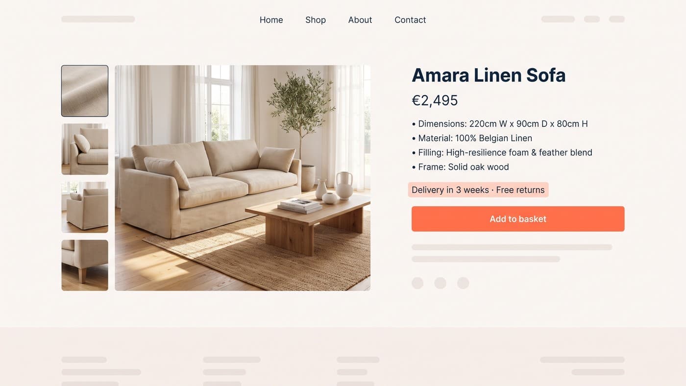
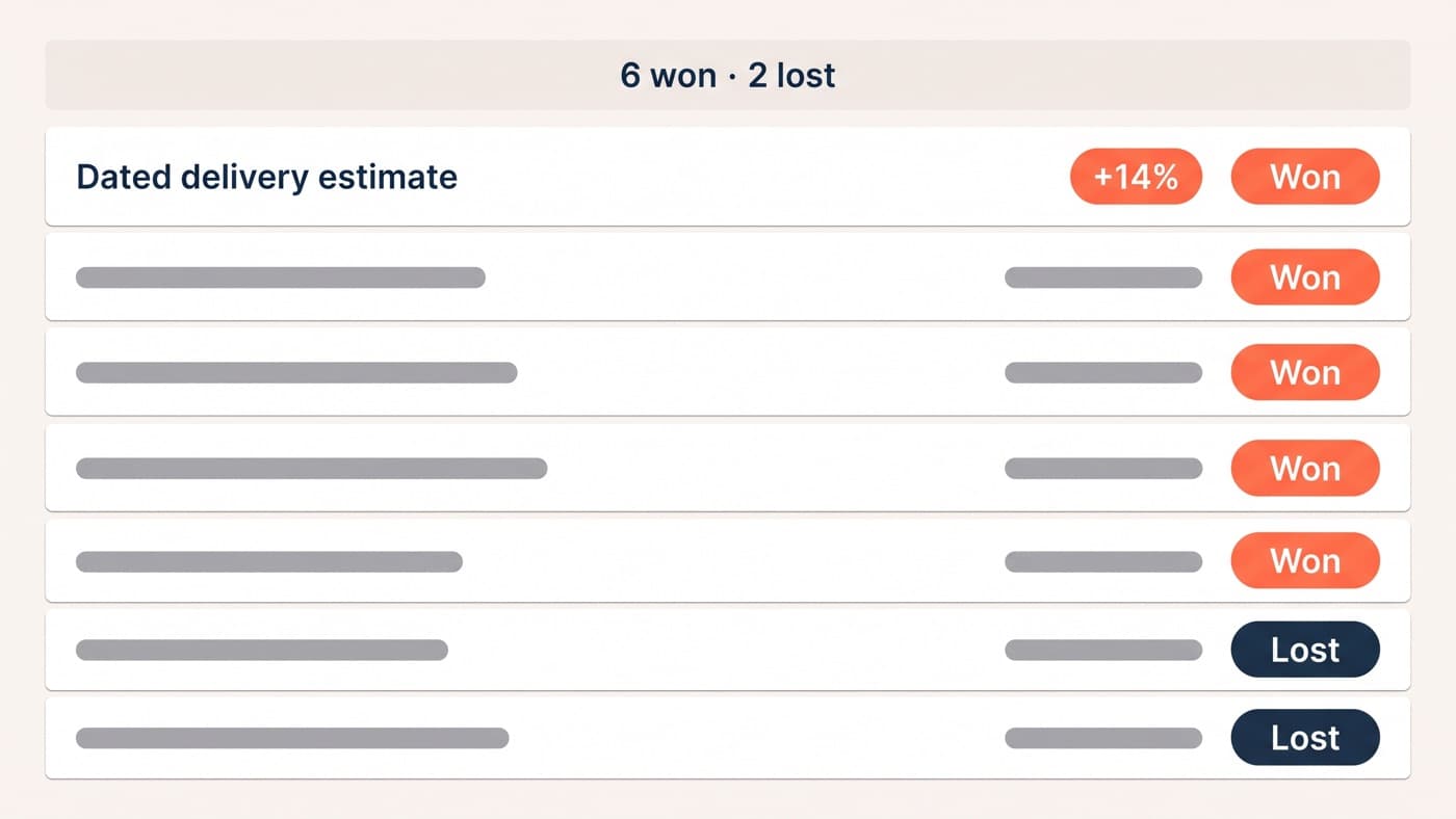
Delivery clarity ranks third and is the most underrated of the set. A dated estimate, delivered by Thursday, answers the will-it-arrive doubt better than any courier logo, and it keeps answering at the cart and payment steps, where the question returns with money attached.
Payment method icons earn their place at the cart, where they answer can-I-pay-my-way; on the product page they are noise. Customer photos pull hardest on considered purchases, because shoppers want proof a product survives real homes rather than studio lighting, and a review with a photograph outworks three without one.
Where each signal belongs
Mapped against the journey, the placements that keep winning, on the principle that each page hosts the doubts native to it:
- Product page: star rating and review count beside the title, dated delivery estimate and returns promise under the buy button, customer photos in the gallery.
- Cart: accepted payment methods, the returns window restated in one line, and any free-shipping threshold with the remaining gap made explicit.
- Checkout: security cues built into the design itself, the delivery date repeated, and a support contact visible in case something fails.
- Homepage: proof of the brand, not the products; a single specific press quote or aggregate rating, if you have one worth quoting.
- Footer: the legal and policy links shoppers expect to find there, and nothing you are counting on to persuade anyone.
The map is deliberately boring. Trust placement is not a creative exercise; it is logistics, moving answers to where their questions live.
What tested as wallpaper
The uncomfortable half of the inventory is what did not move numbers. Footer security badge rows have tested flat for us three times across three sectors, which is roughly what you would expect for elements placed where doubt is not. Third-party trustmark badges from services shoppers do not recognise: flat, and once mildly negative, presumably because an unfamiliar badge raises the very question it claims to settle.
Press logos are the instructive case. As logo strips on homepages they tested flat for us twice, yet the same coverage quoted as a specific sentence beside a specific claim has worked. A logo asks shoppers to transfer authority; a quoted line answers a question. The signal was never the brand mark, it was the information it could have carried.
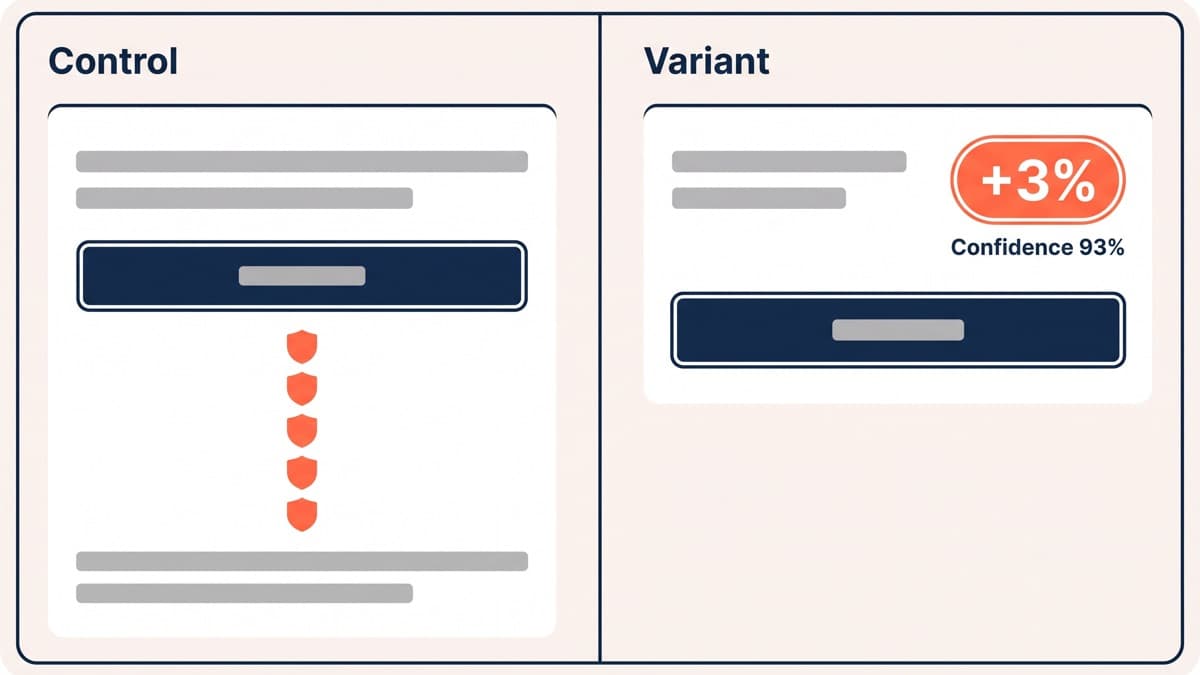
Clutter actively backfires. One store we tested had stacked five assurance elements around its payment button, badges, rosettes and a guarantee line competing for the same glance; a cleaned-up variant with just the returns promise and delivery date beat it by 3% at 93% confidence. Trust is a signal-to-noise problem, and every element you add divides the attention available to the one that matters. The instinct to add one more badge is exactly backwards; subtraction is the trust tactic almost nobody tests.
Test yours instead of trusting ours
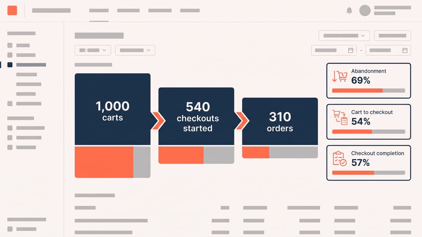
These results are patterns, not laws. Your audience carries its own doubts, which is why trust placement is one of the most reliably productive test categories: the elements are cheap to move and the doubts are real. Several of the A/B testing examples from our archive are exactly this shape, and cart-level trust work overlaps heavily with reducing cart abandonment, where the same surprise-cost and card-safety doubts do their damage.
Start with an inventory rather than a redesign: list every assurance element on your product page, cart and checkout, and write beside each the doubt it is supposed to answer and the evidence it is doing so. Most stores find at least two elements nobody can justify and one real doubt no element addresses.
The design half of the work, deciding what each doubt is and giving its answer a visual hierarchy that does not shout, is what UI/UX design is for. If your product pages are accumulating badges faster than evidence, get in touch and we will help you find which three elements are doing all the work.