Popups are the rare tactic that genuinely works and genuinely annoys people at the same time. The difference between a list-builder and a bounce-machine is not whether you use one; it is when it fires, who sees it, and what it offers. All three are testable, and the results are less obvious than either the popup vendors or the popup haters would have you believe.
An email popup trades a small amount of visitor experience for owned marketing reach, and the honest way to run one is to measure both sides of that trade. Signup rate alone is a vanity number: a popup can grow your list impressively while quietly taxing the sessions that were about to become orders. Every recommendation below assumes you are watching bounce rate and conversion alongside signups.
The trade is still worth making, which is the part the popup haters get wrong. An email address is the only marketing asset a store owns outright, and a well-run popup builds a list several times faster than embedded forms alone. The question is never popup or no popup judged on signups; it is which configuration clears its guardrails.
Timing: the biggest lever
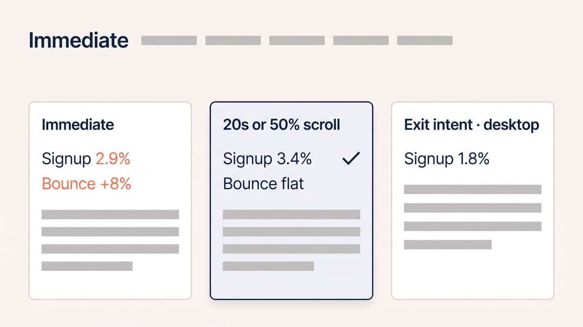
Timing is where our test results are most consistent. Firing on arrival performs worst on every metric except impressions: in our tests an immediate popup signed up 2.9% of visitors but pushed bounce rate up 8%, taxing every session to capture the least-engaged slice. Delaying until engagement, around 20 seconds or 50% scroll depth, signed up 3.4% with bounce flat. By then the visitor has decided the store is worth their attention, and the interruption reads as an offer rather than a door slammed in the face.
Exit intent is the specialist tool: on desktop it captured 1.8% of leaving visitors, traffic that was mostly lost anyway, which makes it nearly free. It barely exists on mobile, where exit signals are unreliable, so treat it as a desktop-only layer rather than a strategy. Scroll-depth triggers deserve one caveat for long pages: 50% depth on a short page fires almost immediately, so set the rule on whichever comes later, time or depth, rather than whichever comes first.
Targeting: who should never see it
Most popup damage comes from showing it to the wrong people. The suppression list matters more than the design:
- Existing subscribers, recognised by a cookie or your email platform’s identifier. They gave you their address already, and re-asking reads as not listening.
- Visitors with items in the cart. The popup interrupts the highest-intent moment in the funnel to ask for a smaller commitment.
- Paid landing page traffic in its first pageview. You paid for that click to hear one message, and the popup replaces it.
- Anyone in checkout, always. Nothing belongs between a shopper and payment.
- Anyone who dismissed it recently. A 30-day suppression after dismissal is minimum politeness; re-firing every session tested as pure bounce.
Suppression is also where popups and paid traffic reconcile. The landing page argument, that a paid visitor should hear one message, does not mean never capturing them; it means waiting until the second pageview or the exit, when the message has been heard.
One interruption at a time is part of targeting too. Stores accumulate overlays the way they accumulate apps: a cookie notice, a chat bubble, a discount wheel and an email capture all competing for the same first impression. Decide the single interruption a new visitor is worth, and make everything else wait its turn.
The offer hierarchy
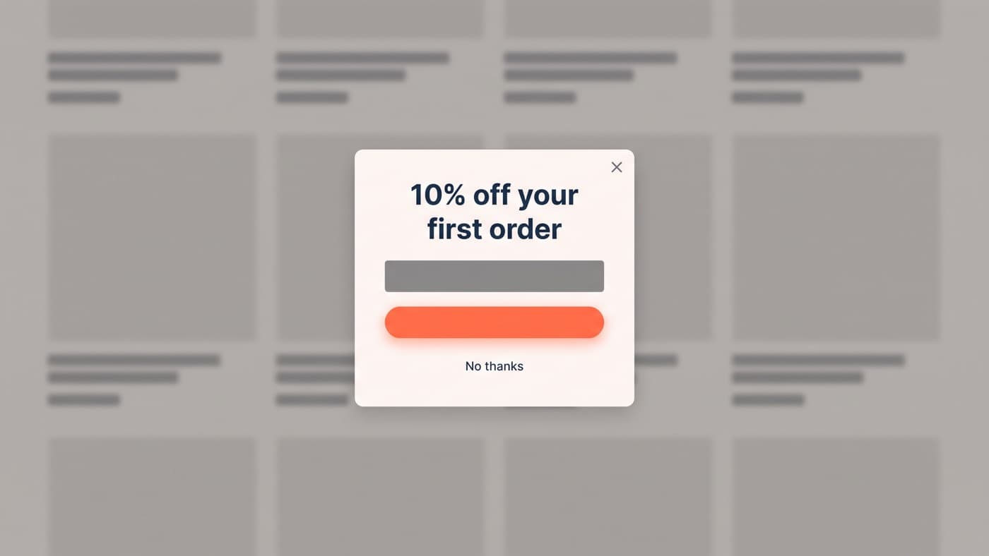
What the popup offers decides its ceiling. A percentage discount converts best, in our tests roughly twice the signup rate of a content offer, but it is also a standing tax: 10% off for every new subscriber compounds into real margin, and it trains an audience to expect a code before buying. Free delivery thresholds, early access and genuinely useful content sit below discounts on capture rate and above them on margin. The right choice is a margin calculation rather than a conversion one, made with the margin sheet open rather than inherited from the popup app’s default, and it interacts with the same offer economics that govern average order value work.
Mystery offers, spin-to-win wheels and quiz gates sit in a category of their own: they capture well and pollute well, filling lists with discount hunters whose second purchase never comes. If your email revenue is concentrated in first orders that a code discounted anyway, the popup is not building an asset; it is renting one.
Design details and Google’s rules
The design details that tested well are mostly about dismissal: a visible close control, a click on the backdrop closing it, and no shame copy on the decline link. A plain no thanks outperformed the no-I-hate-saving-money school on every guardrail we watch; manipulation reads as manipulation. Restraint tested well too: a card that leaves the page visibly present behind it reads as an offer, while a full-screen takeover reads as a hijack, and its extra signups were cancelled out by its extra exits.
On mobile, Google’s guidance on intrusive interstitials applies plainly: a popup that covers the main content on entry, especially for visitors arriving from search, risks demotion. Keep mobile popups to partial-height banners or fire them well after arrival, and never gate content behind them. Compliance and courtesy point the same direction here, which makes mobile the easiest place to do the right thing, and the suppression rules above do double duty: the fewer people see the popup, the fewer ways it can go wrong.
Measure it like a test, not a launch
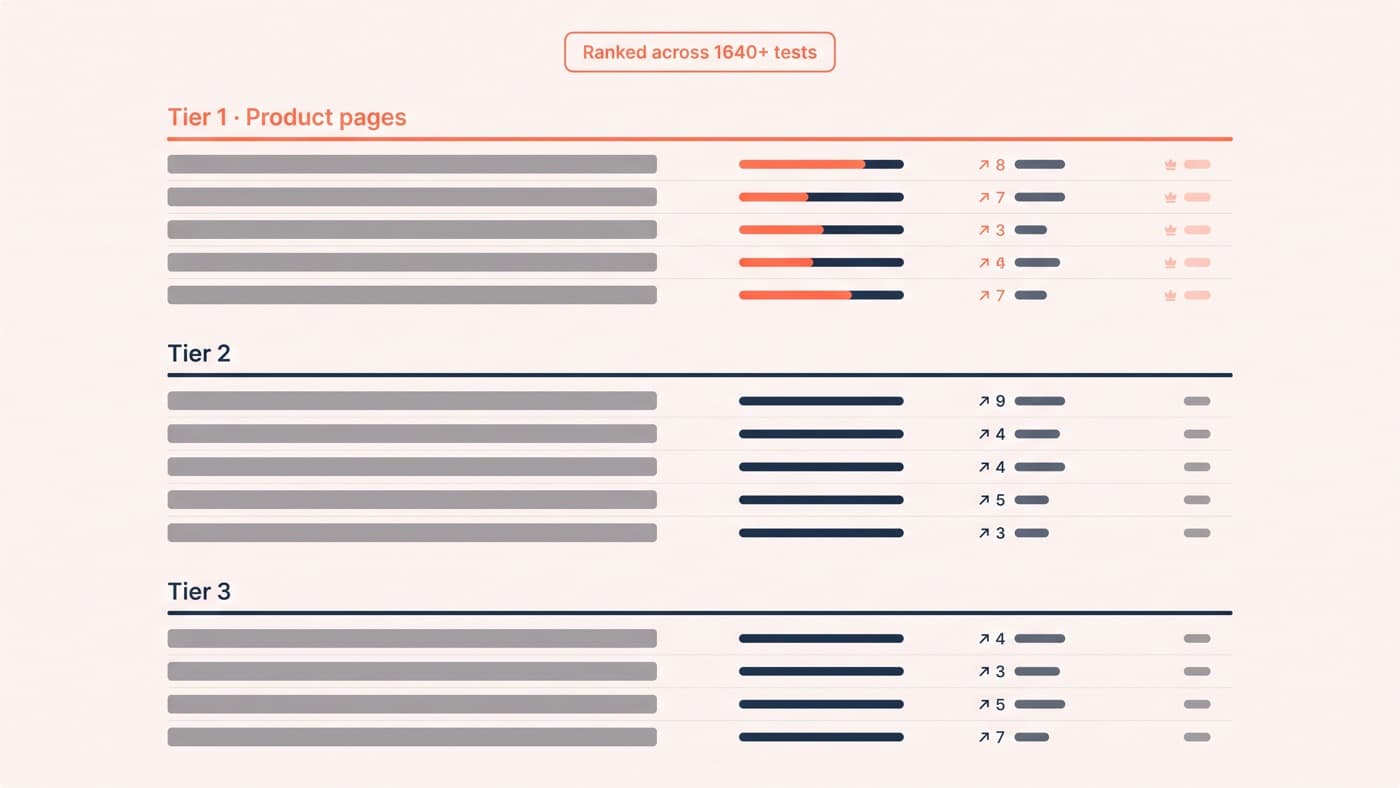
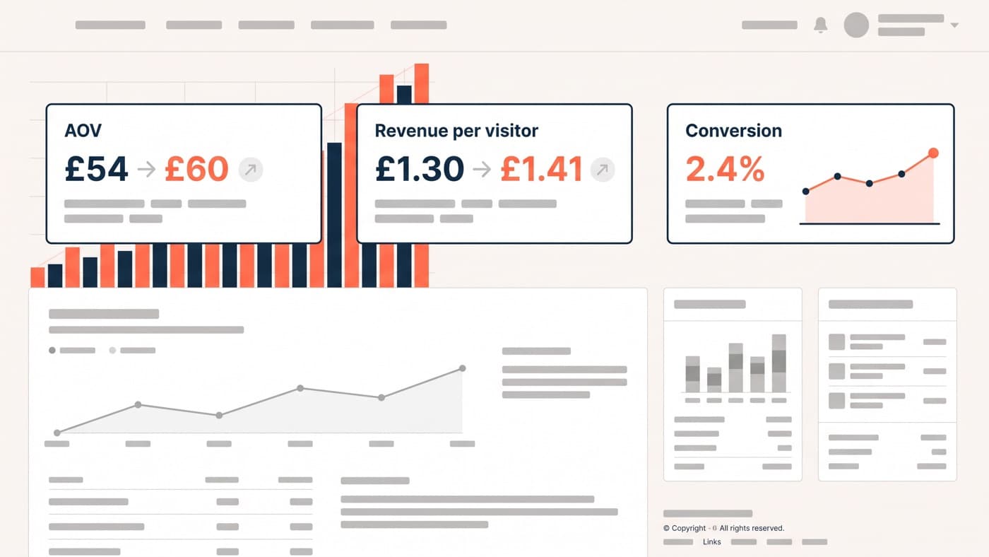
Run a popup like an experiment: variant against a no-popup control, reading signup rate, bounce rate, conversion and revenue per visitor together, and give it two full weeks minimum, because popup effects interact with traffic mix and a weekend-only read flatters whichever variant met the more casual audience. A popup that grows the list while flattening revenue has moved value from now to maybe-later, and email attribution will happily hide that trade from you. Timing, offer and trigger depth are all cheap tests with fast answers, several of them already in our ranked list of A/B testing ideas, and the discipline of reading the results honestly is covered in our ecommerce A/B testing guide.
The craft of making an interruption feel like an offer, the hierarchy, the timing, the tone and the dignity of an easy no, is interface design, and it is the kind of work UI/UX design exists for. If your current popup is growing a list and you genuinely do not know what it costs you, get in touch: that is a one-week test, not a philosophy debate.