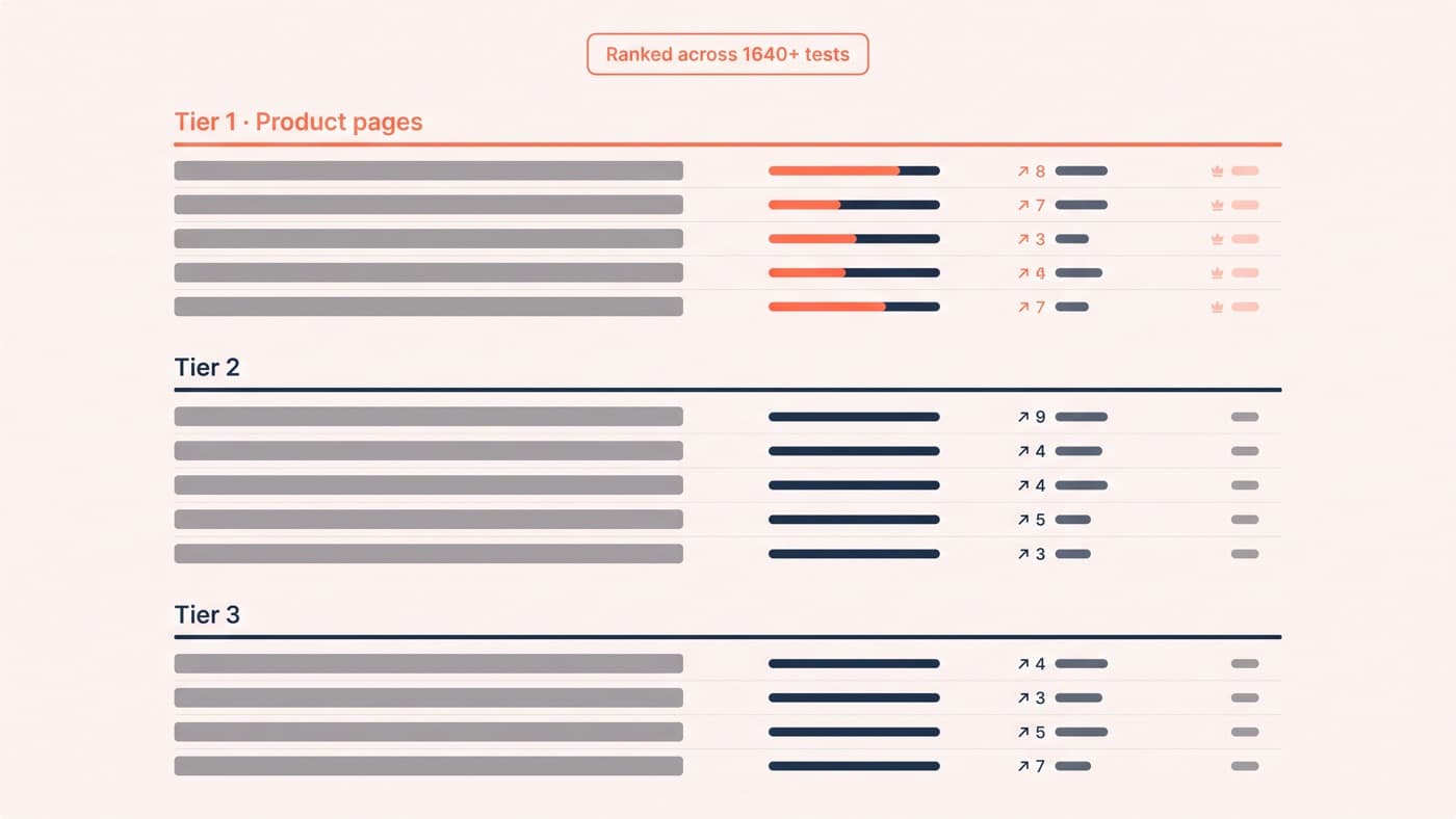
Idea lists are cheap; ranked ones are not. The fifteen A/B testing ideas below are ordered by how often each pattern has produced a winner across the 1640+ ecommerce experiments in our archive, so your traffic goes to the tests most likely to pay for themselves rather than to whatever a listicle happened to put first.
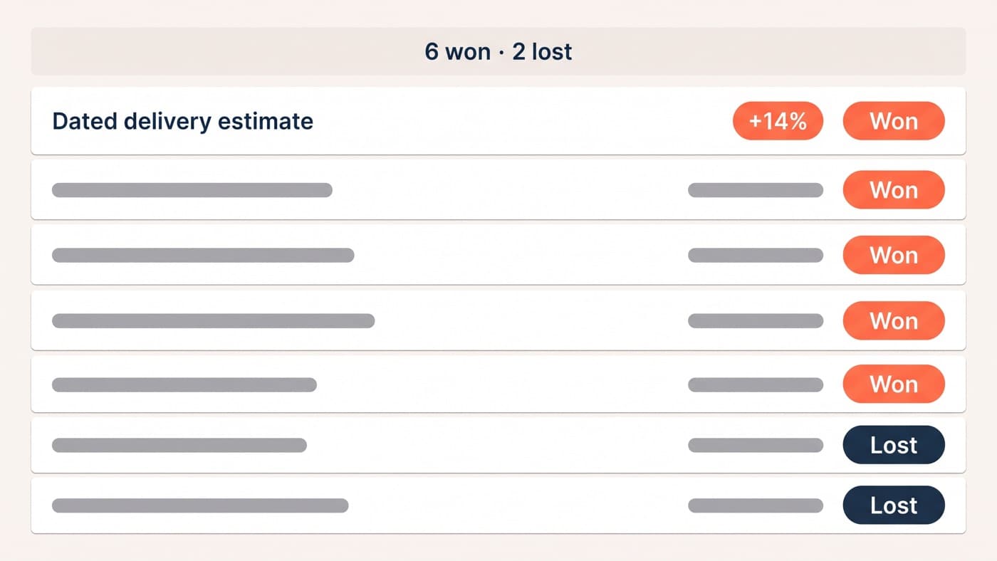
The list runs product pages first, checkout second, messaging and navigation third, which is also the order in which winning tests cluster across the archive. What it is not is a menu of guaranteed wins: even the best pattern we track loses more often than it wins.
How this ranking works, honestly
These tiers are ranked by observed frequency, meaning how often each pattern appears among our winning tests, not by an audited per-category win rate, which our archive is not structured to produce and which we will not pretend it is. Frequency carries a bias worth naming: we run more tests where clients have more traffic, so product pages are over-represented by construction. A second bias is survivorship, because patterns that won early got tested again. Treat the tiers as strong priors rather than physics.
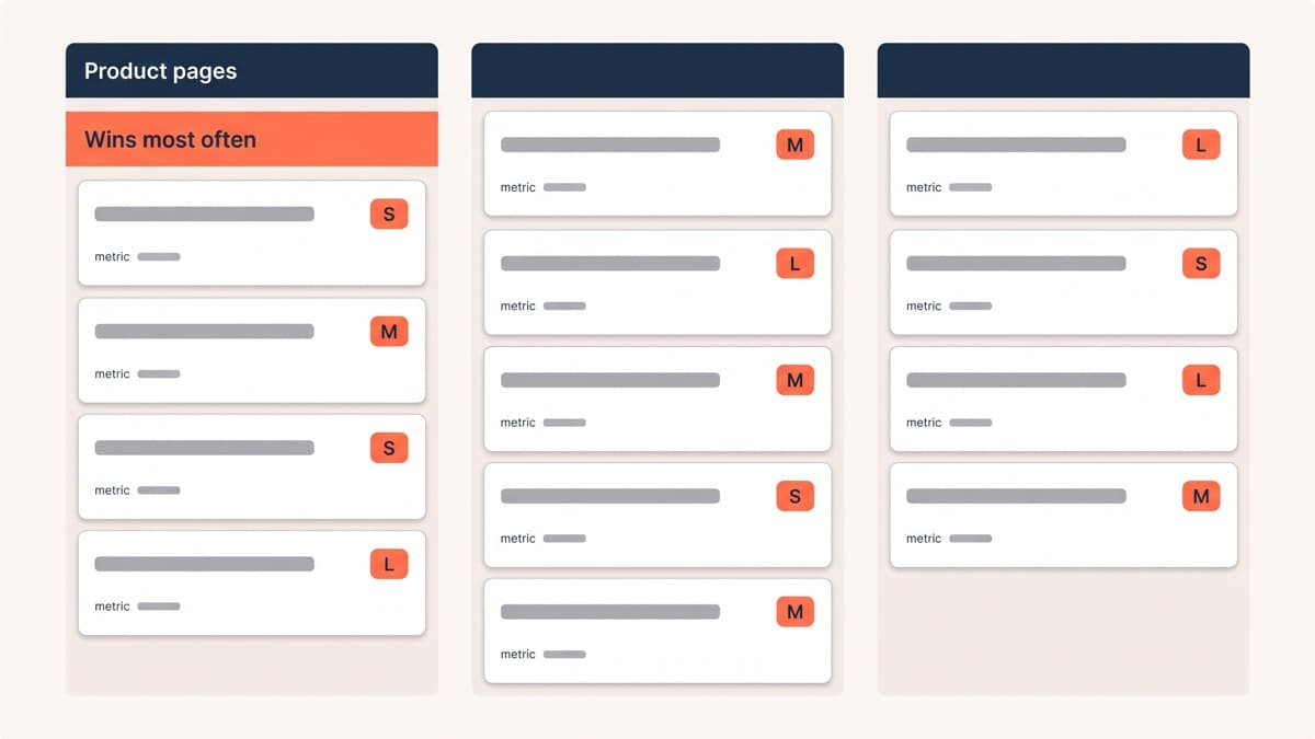
Each idea below carries the hypothesis pattern behind it, because an idea without a hypothesis is a guess with formatting; an effort size, S, M or L; and the metric that should decide it. Tier one ideas have won most often for us. Tier three ideas win less often but cost almost nothing to try.
Tier one: product page ideas
Product page patterns top the ranking for a structural reason as well as a merit one: the traffic is deepest there, so the observations are cheapest and the tests conclude fastest.
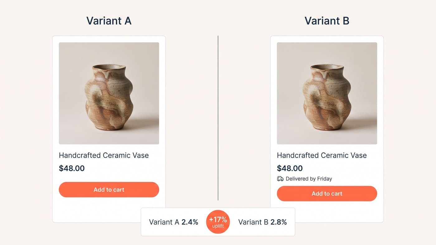
- Answer the delivery question on the page: a dated arrival estimate under the buy button. Hypothesis: shoppers leave to research shipping and do not return. Effort S. Metric: conversion.
- Reorder the gallery around what heatmaps show shoppers hunting for, with scale, texture and on-model shots first. Hypothesis: the default order serves the photographer, not the buyer. Effort S. Metric: page-to-cart progression.
- Rebuild the first mobile screen so product, price, rating and a reachable buy action all fit. Hypothesis: every element pushed below the fold taxes every session. Effort M. Metric: mobile conversion.
- Move the top objection, whether returns, sizing or compatibility, from a footer page to beside the buy button. Hypothesis: unanswered objections read as risk. Effort S. Metric: conversion.
- Promote the single most useful review to the top of the page. Hypothesis: one specific customer sentence beats an unexpanded star row. Effort M. Metric: conversion.
Tier two: cart and checkout ideas
Checkout ideas win nearly as often but run more slowly, because the funnel is thinner and one experiment at a time is the rule that keeps results readable.
- Collapse the discount-code box behind a have-a-code link. Hypothesis: an open box sends full-price buyers coupon hunting. Effort S. Metric: checkout completion.
- State returns terms inside the payment step, not behind a link. Hypothesis: doubt strikes at payment, and leaving to check is leaving. Effort S. Metric: completion.
- Default to guest checkout with account creation offered after purchase. Hypothesis: forced registration is a toll gate on first-time buyers. Effort S. Metric: completion.
- Show the full cost, delivery included, before checkout begins. Hypothesis: surprise costs at the shipping step are the classic abandonment trigger. Effort M. Metric: checkout start to completion.
- Add a cart-drawer cross-sell of genuine accessories under a third of the basket’s value. Hypothesis: complements read as service, substitutes read as ads. Effort M. Metric: revenue per visitor.
Tier three: messaging, navigation and trust ideas
Tier three patterns win less often, but most cost a day of work, retiming an email popup among them, which changes the arithmetic: a lower hit rate on a near-zero stake is still a good bet, especially while the development queue is busy with the bigger builds.
- Free-shipping threshold messaging with a progress bar in the cart. Hypothesis: a visible target reframes an extra item as a saving. Effort S. Metric: average order value and revenue per visitor.
- Replace a vague value-proposition line with a specific, checkable claim. Hypothesis: specificity is believed, adjectives are skimmed. Effort S. Metric: bounce and conversion.
- Repeat delivery and returns reassurance at the mobile moments doubt strikes: under the buy button, in the cart, at payment. Hypothesis: desktop sidebars carry trust a phone never shows. Effort M. Metric: mobile conversion.
- Reorder collection pages by proof, bestsellers first, instead of newest. Hypothesis: shoppers trust evidence of other buyers more than the trading calendar. Effort S. Metric: collection-to-product progression.
- Make site search more prominent on deep catalogues. Hypothesis: searchers convert at a multiple of browsers, and more of them can be created. Effort M. Metric: search usage and conversion.
Picking your first five
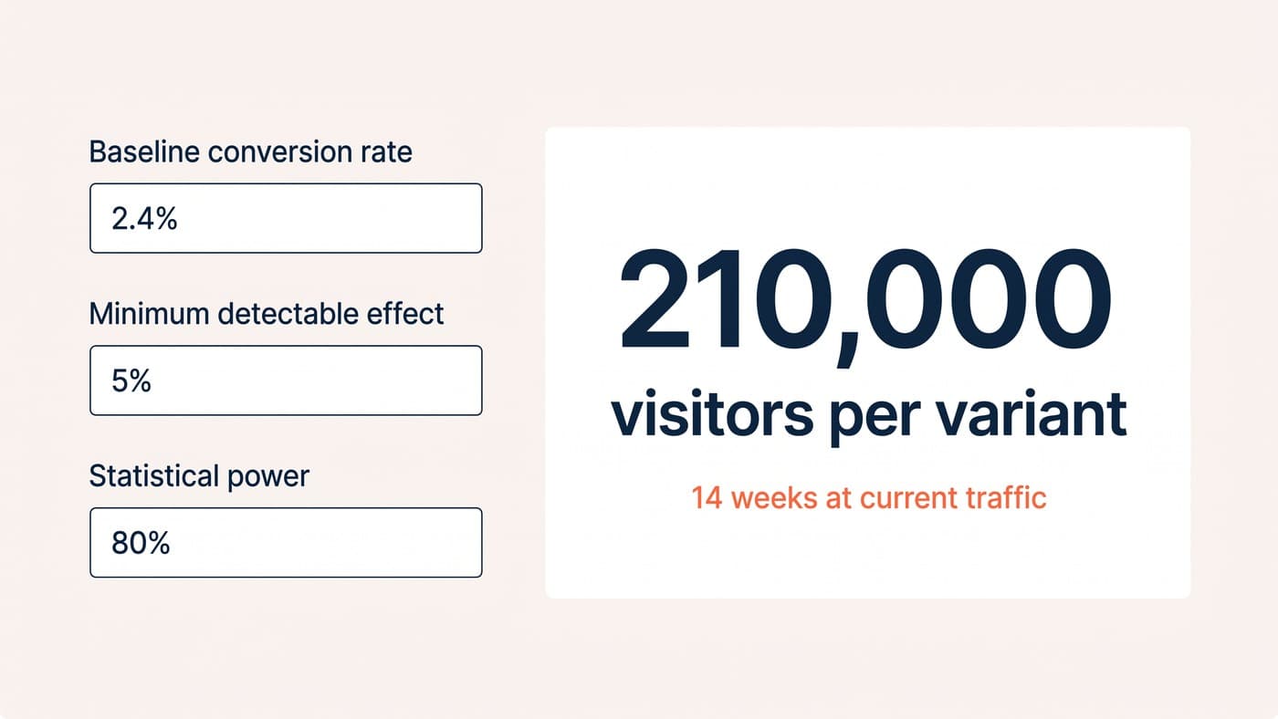
An idea list flatters every store equally; your traffic does not. At a 2% baseline, detecting a 10% relative lift needs tens of thousands of visitors per variant, and the arithmetic in our sample size guide should run before any meeting where these fifteen get debated. If your traffic supports four tests a quarter, tier one is your whole quarter, and a quarter spent on tier three ideas while tier one sits untested is the most common shape of wasted programme we audit.
Then let your own evidence pick within the tier. Ten abandoned-checkout recordings, your top fifty search queries and a month of support tickets will point at three of these fifteen with a specificity no ranking can match. An idea confirmed by your own data outranks its tier. Support tickets are the most underrated of the three sources, because shoppers describe their obstacles there in full sentences, unprompted.
From ideas to a roadmap
A ranked list becomes a roadmap when each candidate gets scored for expected impact, the evidence behind it and the cost of building it, and the scoring stays honest only if somebody records the prediction before the result arrives. What that looks like when the tests actually run is documented in our A/B testing examples, and the hypothesis discipline that keeps a backlog from refilling with guesses is covered in the ecommerce testing guide.
One warning from the archive before you start: the ideas that win usually answer a shopper’s question, and the ideas that lose usually decorate. Build quality decides the rest, because a variation that flickers or breaks on a mid-range phone tests your bug rather than your idea, which is the half of the craft that A/B test development carries. Score, run, record, rescore: the loop matters more than the list.