Most teams install Hotjar or Microsoft Clarity, stare at a pretty heat blob for ten minutes, feel data-driven, and change nothing. Heatmaps are not decoration. Used properly they are the cheapest hypothesis generator a store owns; used badly they are confirmation bias rendered in orange.
Heatmap analysis is the practice of reading aggregated click, scroll and movement data to find where attention goes and where interaction breaks, and session recordings replay individual visits so you can watch the sequence behind the aggregate. Neither is a verdict on anything. They are research inputs, and their entire value is the quality of the test hypotheses they feed.
What each map actually tells you
The three map types answer different questions and are routinely confused. Click maps show where visitors interact, which reveals intent: what people expect to be clickable, and what they want that the page does not offer. Scroll maps show how far down the page attention survives, which is a statement about layout and content order. Move maps track cursor position, and they are the weakest of the three, because the correlation between cursor and eye is loose enough that we treat them as a tiebreaker rather than evidence. Recordings sit apart: they show sequence, hesitation and struggle in a way no aggregate can, at the cost of being slow to consume.
The scroll-map goldmine
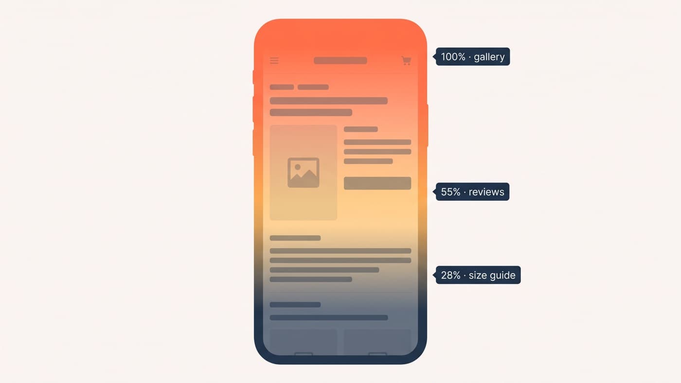
A scroll map earns its keep in one comparison: where attention dies against where your money content sits. On one apparel store we audited, the mobile product page kept 100% of visitors at the gallery, 55% at the review section, and 28% at the size guide below it, and returns data said sizing doubt was the main reason people hesitated. The content answering the objection sat at a depth barely a quarter of visitors reached. That is a finding no opinion can produce: the page order was arguing with the page’s job, and moving size guidance up became a test with a reason attached rather than a redesign whim.
Two habits make scroll maps read honestly. Compare device maps separately, because desktop and mobile fold in different places and an average of the two describes neither. And read percentages against the element, not the pixel: the question is never how far people scroll in general, it is what share of visitors ever saw the reviews, the guarantee, the buy button. Most tools will overlay that number per element if you ask.
Click maps: rage, dead and false affordances
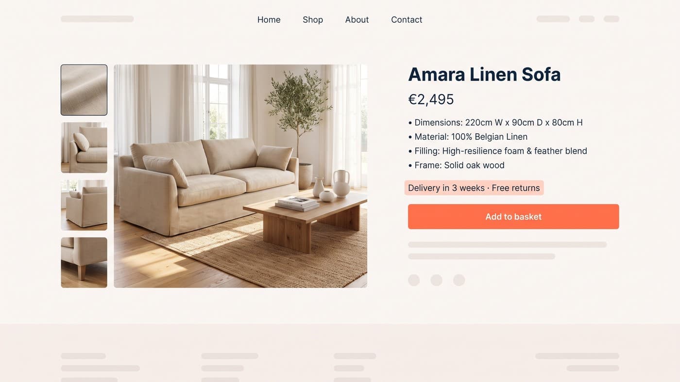
Three click patterns are worth hunting deliberately. Rage clicks, the same spot hammered in quick succession, mark broken or slow elements and pure frustration. Dead clicks land on things that do nothing: product images that look zoomable and are not, banners that read as buttons, underlined text that is not a link. False affordances are the inverse, real controls that nobody touches because they do not look interactive. On the same apparel store, the loudest signal was shoppers repeatedly clicking a static delivery banner, expecting a shipping calculator that did not exist; the banner had accidentally promised an answer the page never gave.
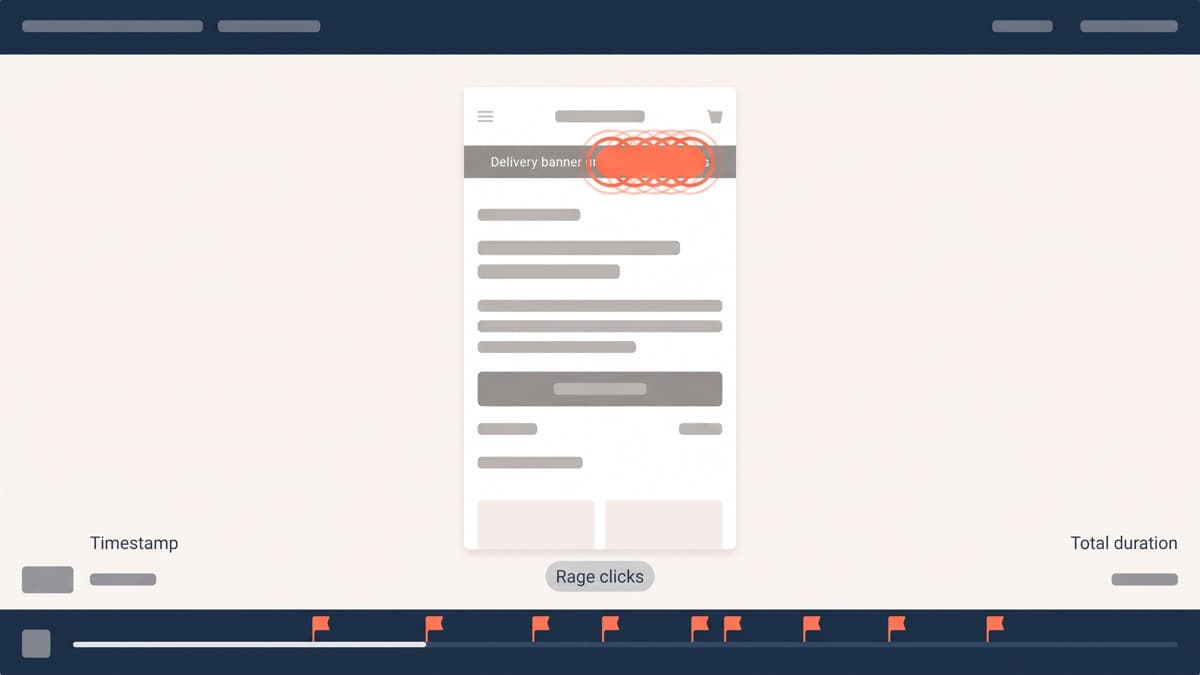
Click maps also need a floor of data before they mean anything: a few hundred sessions per page and device at minimum, and more for pages with many interactive elements. Below that, one determined visitor reads as a pattern. The same caution applies to comparing maps across periods; a redesigned page needs its data collected fresh, because blended before-and-after clicks paint a page that never existed.
A 90-minute recording protocol
Recordings are where teams drown. Watching sessions at random is archaeology without a question, so we run a fixed protocol that fits in ninety minutes:
- Choose one segment and one question, such as mobile visitors who began checkout and left, or product-page visitors who bounced inside thirty seconds.
- Sample 20 to 30 recordings from that segment only, filtered in the tool, never the whole day’s traffic.
- Watch at double speed, and log timestamps for hesitation, backtracking, rage clicks and abandoned form fields.
- Stop when the same pattern has appeared five or more times; saturation usually arrives well before recording thirty.
- Write every observation in three parts: what happened, the likeliest cause, and the change that would test the cause.
The segment matters more than the volume. Thirty recordings of checkout abandoners tell you more about checkout than three hundred random sessions, because everyone in the sample has already demonstrated the behaviour you are investigating.
From pattern to hypothesis
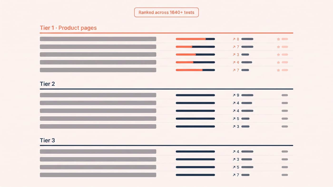
The output of all of this is a sentence, not a screenshot: because we observed X, we believe change Y will move metric Z. Dead clicks on the product gallery become a zoom-behaviour test. A scroll map showing 28% reaching size guidance becomes a content-order test. Rage clicks on the delivery banner become an inline shipping estimate. Findings that survive this translation join the test queue alongside everything else, ranked by evidence and effort, and our ranked list of test ideas shows what that queue tends to look like.
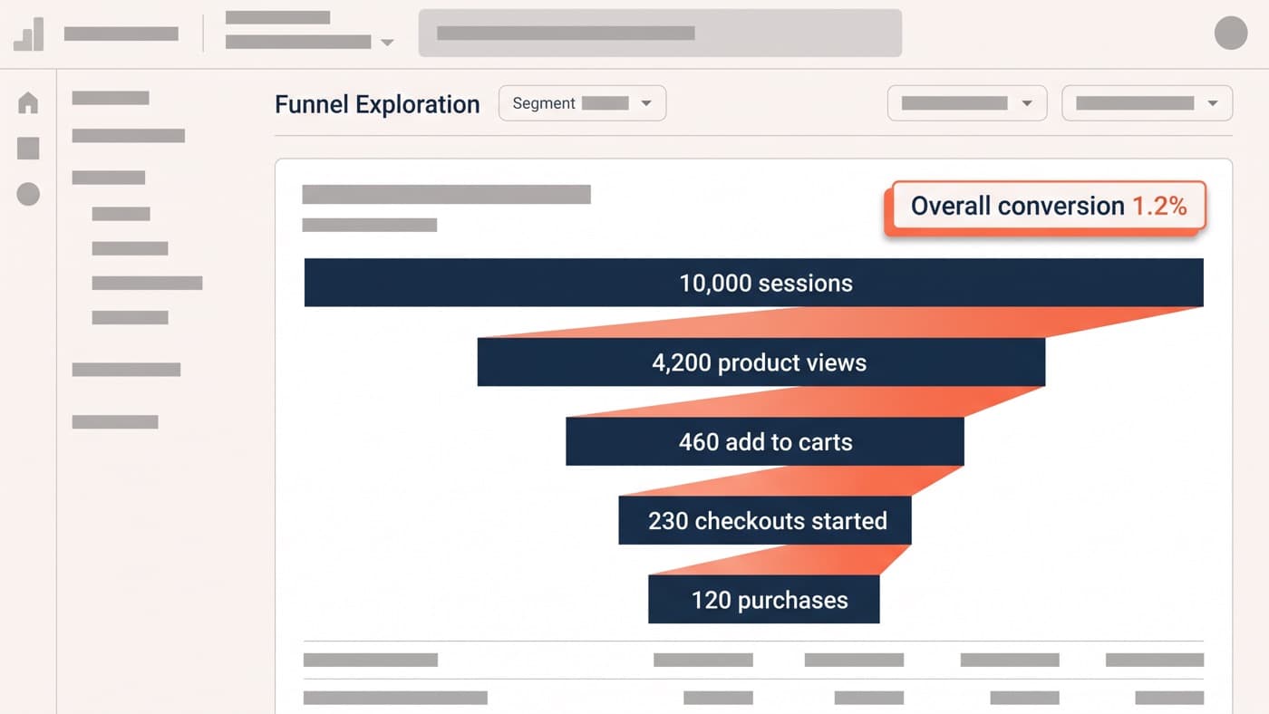
The discipline that keeps the practice honest is quantification. Heatmaps tell you where a problem lives; they are silent on how big it is, so pair every finding with the funnel numbers for the step it touches, which is what our GA4 funnel analysis walkthrough exists to produce. A pattern in five recordings that maps onto a visibly underperforming funnel step is a priority; the same pattern on a step performing fine is a curiosity.
Tool notes and privacy
On tools: Microsoft Clarity is free with generous limits and covers heatmaps, recordings and a useful rage-click filter, which makes it the default answer for most stores. Hotjar adds surveys, feedback widgets and more mature filtering at a monthly cost, and the built-in maps inside some testing platforms are usually thinner than either. Start free, and upgrade when a specific limitation, not a feature list, tells you to. Whichever you choose, install it before you need it: maps take weeks of traffic to stabilise, and the worst time to start collecting evidence is the week someone demands it.
Privacy is manageable rather than scary. Recording tools mask keystrokes and form inputs by default; keep that masking on, disclose the analytics in your privacy policy, fold the tool into your consent banner where consent rules apply, and never ship recordings that could expose card fields or account details. Handled that way, recordings are a routine research instrument.
If you have a heatmap account gathering dust and a conversion rate you cannot explain, this is the cheapest research you can commission from yourself. And if you would rather hand over the watching, the pattern-finding and the test queue that follows, get in touch: the ninety-minute protocol above is the first thing we run.