The thank-you page is the only page every single customer sees, and on most stores it is a receipt with a logo. You will never have a cheaper audience than the one sitting on it: the doubt is spent, the card is charged, and the attention is entirely yours for about ninety seconds. Most stores spend that window confirming an order number.
This article owns the surfaces after the sale: the confirmation page, the post-purchase offer, the tracking page, and the window in which a second order gets decided. How a basket grows before payment, meaning thresholds, bundles and cross-sell pricing, belongs to the work on average order value, and where a post-purchase offer stops being useful and turns predatory belongs to the dark patterns article. Both get linked rather than repeated here.
The only page with every customer on it
Every other page on the store sits under a funnel. The product page loses people to price, the cart loses them to delivery cost, the checkout loses them to a form. The order-confirmation page has no such problem: reaching it is the conversion, so it converts everybody who arrives. That makes it the highest-leverage piece of real estate the store owns, and the piece most likely to be running exactly whatever the theme shipped with.
What the theme shipped with is an order number, a list of line items, a billing address and a Continue shopping button. Every element on it describes a transaction that has already happened. Nothing on it acknowledges that the person reading has just made a decision they may be slightly nervous about, or that for the next minute they are more willing to hear from you than they will be at any other point in the relationship.
What the confirmation page should actually hold
Treat it as three jobs in a fixed order: settle the nerves, set the expectations, then ask for something. Reversing that order is the common failure, and it reads as a shop that stopped caring the moment the payment cleared.
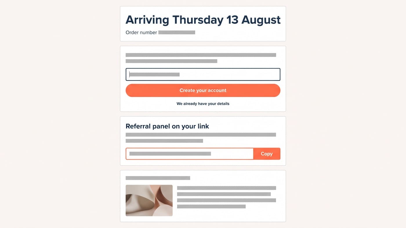
- Reassurance first: a dated delivery estimate rather than a shipping-method name, plus a plain sentence about what happens next and when the next email arrives.
- Account creation without a second form. The customer has just typed every field you need, so the account is a password box and one tap, not a sign-up page.
- Expectation-setting detail: how the item is packed, what the returns window is in days, and where the tracking will appear.
- Education specific to what was bought, meaning the care guide, the sizing note or the first setup step, not a generic brand film.
- One ask, chosen deliberately: a referral link, an SMS opt-in or a community invitation, and only one of the three.
- The offer, if you are running one, placed last and framed as an addition to this order rather than as a new purchase.
On a homeware store, replacing the theme default with that sequence took account creation on the order-status page from 4% to 19% of orders, and produced referral shares on 2.1% of orders, a channel that had not previously existed. Neither number needed a new app. Both needed somebody to decide the page had a job.
The post-purchase offer, and the line it must not cross
The one-click post-purchase offer is the rare tactic where placement does most of the work. The card is already charged and the address already captured, so accepting adds a line to an existing order rather than starting a second checkout. The friction is one tap and the risk to the completed order is nil, which is the entire argument: an offer before payment risks the order it is trying to grow, and an offer after payment does not.
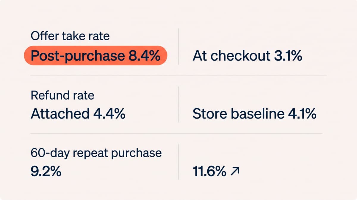
The take rates reflect that. On the same store, the same offer and the same product, a post-purchase placement took 8.4% against 3.1% for the identical offer inserted at checkout, and checkout completion was unchanged because nothing had been inserted into it. Refunds on orders containing an accepted post-purchase item ran at 4.4% against 4.1% for the store overall, which is the number that tells you the offer was relevant rather than merely easy to accept.
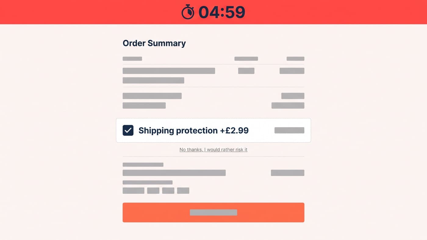
The line is drawn by two properties, relevance and reversibility. An offer that follows sensibly from what was just bought, priced as an addition and declinable in one obvious tap, is service. A countdown on the offer, a pre-ticked acceptance, a decline link styled to be missed, or a second offer served after the first is declined are the same tactics that get stores into trouble everywhere else on the site, and they behave the same way here: accepted more often, refunded more often, and remembered badly.
The tracking page is a channel nobody claimed
Between purchase and delivery a customer checks on an order three or four times, which makes tracking the most-visited surface in the whole relationship and, on most stores, one owned by a courier. A carrier tracking page is a table of scan events under somebody else’s branding, and using it hands your most engaged audience to a third party for a week.
A branded tracking page is not a technical achievement, it is a decision about who owns that week. It should carry the same dated estimate the confirmation page gave, the care or setup content that becomes relevant on arrival, the referral link if that was your chosen ask, and at most a quiet cross-sell for something that complements the item in transit. What it must never carry is an offer that contradicts the order being waited for, which is exactly what a discount on the same product does to somebody who paid full price nine days ago.
The second-order window
The interval in which a second order is decided is shorter than most stores plan for, and it is set by the product rather than by the marketing calendar. Consumables run on a replenishment cycle you can calculate from your own order data. Considered goods run on a much longer complementary-purchase cycle. Either way the window opens when the item arrives rather than when it ships, which is why follow-ups timed off the order date consistently land early and get ignored.
On the same homeware store, timing the follow-up from delivery confirmation instead of dispatch, and leading with the setup guide instead of a discount, moved the 60-day repeat purchase rate from 9.2% to 11.6%, a relative gain of 26%. The discount version had been running for a year and had trained a segment of customers to wait for it, which is the quiet cost of making the second order a price event rather than a service one.
Measuring it without flattering yourself
Post-purchase work is unusually easy to report dishonestly, because attach rate only ever goes up. Judge it on pairs instead: attach rate beside the refund rate on the orders that attached, repeat purchase at 60 and 90 days beside average order value, and support contacts per hundred orders beside every new element added to the confirmation page. A page that grows a referral channel and a support queue at the same time has not won.
Read it by cohort rather than in aggregate. A store that ships a post-purchase change in March and reads its repeat rate in June is mostly reading last year’s customers, and the change will look either miraculous or worthless depending on what else happened that quarter. Attribute the second order to the cohort that received the change, and give the slowest product cycle in the catalogue enough time to report.
None of this is a campaign. The confirmation page, the offer surface and the tracking page are template and extension work, closer to Shopify development than to marketing, and they are permanent in a way campaigns are not: the change ships once and applies to every order afterwards, which is the opposite economics to an acquisition budget. Ask any prospective vendor how they would version and test these surfaces rather than what they would put on them. If your order-status page is still whatever the theme shipped with, that is the cheapest thing on your list.