A quiz is a salesperson you script once and then clone. On a catalogue with real choice complexity it outperforms nearly anything else you could put in a homepage hero. On a twelve-product store it is a toy that adds a step between a customer and the thing they were already going to buy.
Guided selling is a funnel, and this post is about that funnel: who it suits, how many questions it survives, and what the result page has to do to earn its place. Deciding what to show a returning visitor from what you already know about them is a different mechanism with different rules and a different failure mode.
The complexity test
Three conditions decide whether a quiz belongs on your store. The category has to be large enough that browsing is work rather than pleasure, which in practice starts somewhere around forty products in one buying decision. The decision has to be one a customer genuinely cannot make from a photograph: skin type, fit, compatibility, strength, roast, coverage. And you have to hold expertise that can be encoded as rules rather than vibes.
All three and a quiz is often the highest-return thing on the roadmap. Two and it is worth a cheap test with an app before anybody commissions a build. One and you are producing an interactive brochure that will be quietly removed in a year by whoever is auditing page weight, having generated a lot of engagement and no revenue anyone can attribute to it.
Question economy
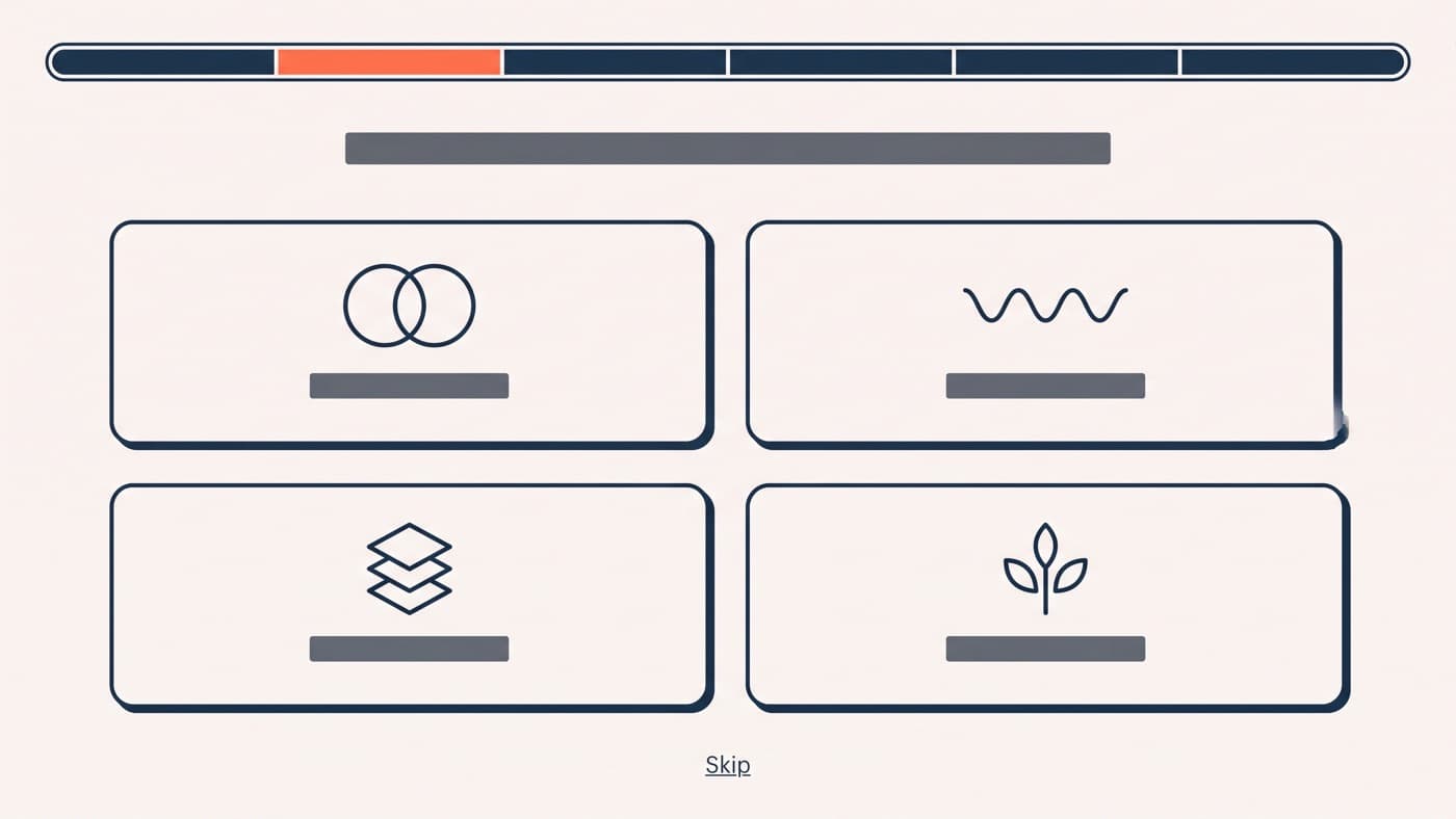
Every question costs you people. Six is the practical ceiling, five is usually better, and around four answer options per question is where a screen stays scannable on a phone. Phrase them in customer language rather than attribute language: not "select fabric weight" but "where will you wear it most". Never ask for something you can infer, and never ask a question whose answer does not change the recommendation.
The test for that last rule is mechanical. Remove a question, run the same answers through the logic, and see whether anybody gets a different product. If nobody does, the question exists to make the quiz feel thorough, and it is being paid for in drop-off. A well-built quiz finishes with roughly 60 per cent of the people who start it, and the losses cluster in two places: the first question, and wherever you put the email gate.
The email gate, and where to put it
The double win everybody wants is a sale plus a subscriber whose preferences you now know, which is a far better segment than an address captured by a discount pop-up. Gate the result and you capture more addresses and lose completers. Ask after the result and you capture fewer, from people who have already seen something they want. Both are defensible, so test it rather than inheriting somebody else’s rule, and hold it to the same guardrails as any other capture mechanic.
The result page is a product page, and usually fails as one
Most quizzes end by dumping three product cards and a shop-now button, which throws away the highest-intent page in the entire funnel. The result screen has just been handed a specification by the customer. It should behave like a product page that knows why it is being shown: the reason stated back in their own words, the price, availability, one piece of proof, an add-to-cart, and a way to see the two runners-up in case the first answer feels wrong.
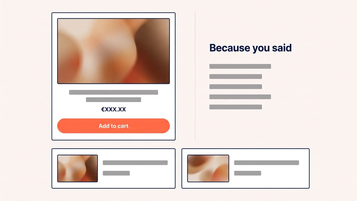
The reason line is doing more work than the recommendation. "Because you said you have combination skin and shower in the morning" is a justification a customer can check against themselves, and it converts a black box into advice. Without it, a result screen is a slot machine.
Entry points are the real variable
Most quizzes underperform because nobody finds them, not because the questions are wrong. Five placements are worth testing, and they perform differently enough that treating a launch as one event wastes the build:
- The homepage hero, which reaches the most people and the least intent. Good for volume, poor for close rate, and the placement most likely to be judged on the wrong metric.
- The top of the complex collection, where somebody is already looking at forty products and visibly struggling. This is usually the best-performing entry point and the one teams add last.
- A product page prompt for visitors who are clearly comparing, phrased as help rather than as a detour: not sure this is the right one for you.
- An exit-intent offer on a category page, which recovers a slice of the people about to leave without a decision and costs nothing to try.
- Paid landers where the quiz is the entire page, which suits cold traffic that has no relationship with your navigation and no patience for it.
Each of those is a separate test with a separate answer, and the results rarely agree. A quiz that flops in the hero can be the best-converting element on a collection page, because intent, not design, is doing most of the work.
Build it or buy it
An app is the right way to learn whether the format suits your catalogue at all, and cheap enough that arguing about it costs more than trying it. A custom build earns its cost in three situations: when the logic is genuinely complex, such as a compatibility matrix or inventory-aware results; when the result page needs to be a real template rather than the vendor’s; and when the app insists on loading its runtime across the whole store for a feature used on one page.
Measuring it without fooling yourself
The number everyone quotes is quiz-completer revenue per visitor against the site average, and on most stores it looks spectacular: £3.10 against £1.40. It is also contaminated, because the people who finish a six-question quiz were already more likely to buy. Selection bias is not a rounding error here, it is most of the gap.
The honest measures are a test that toggles the entry point on and off, or a comparison of quiz-exposed sessions rather than quiz-completed ones. Hold the result to revenue per visitor rather than to completion rate, and watch the returns line as well, since a quiz that recommends confidently and wrongly generates a very particular kind of refund. Building one that carries its own weight is Shopify development work, and if you want the complexity test run against your catalogue before anyone writes a question, get in touch.