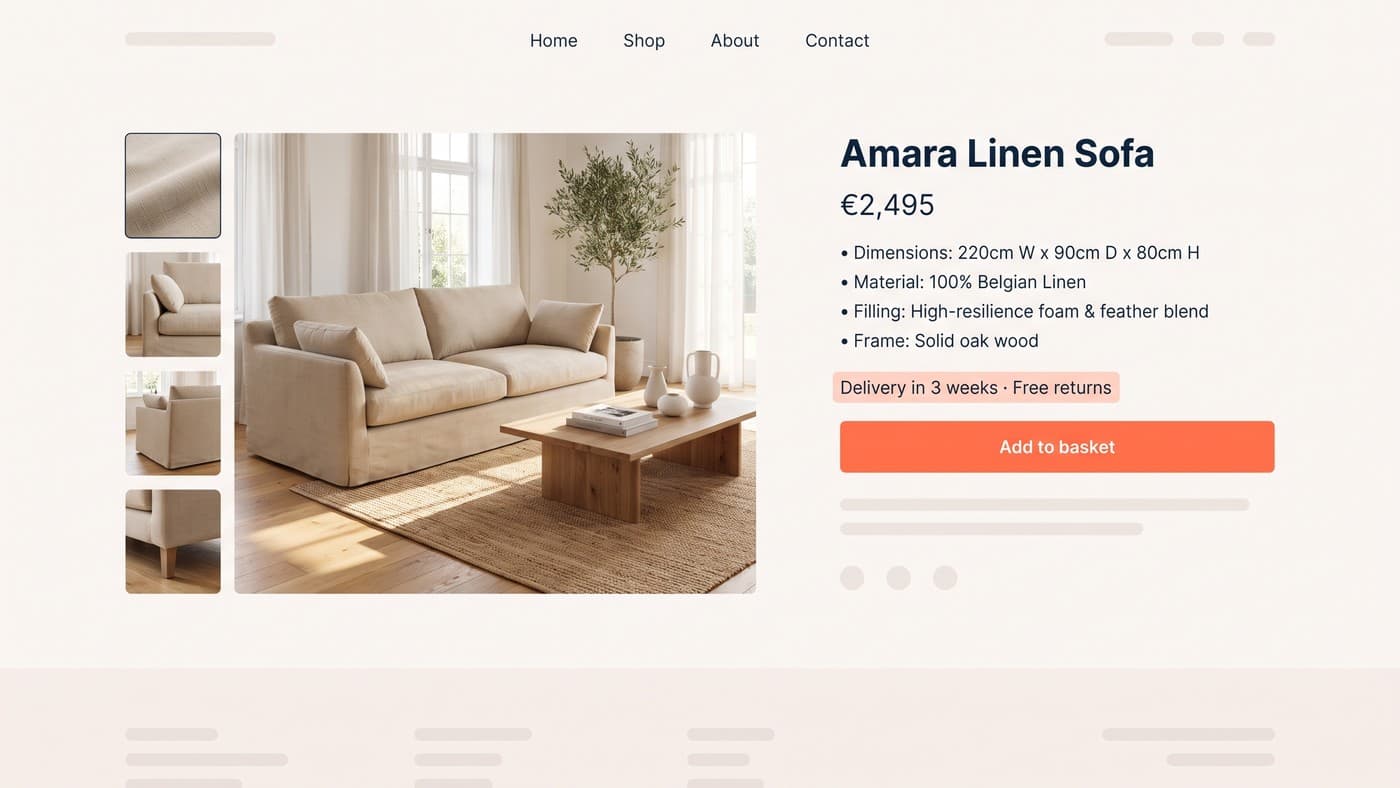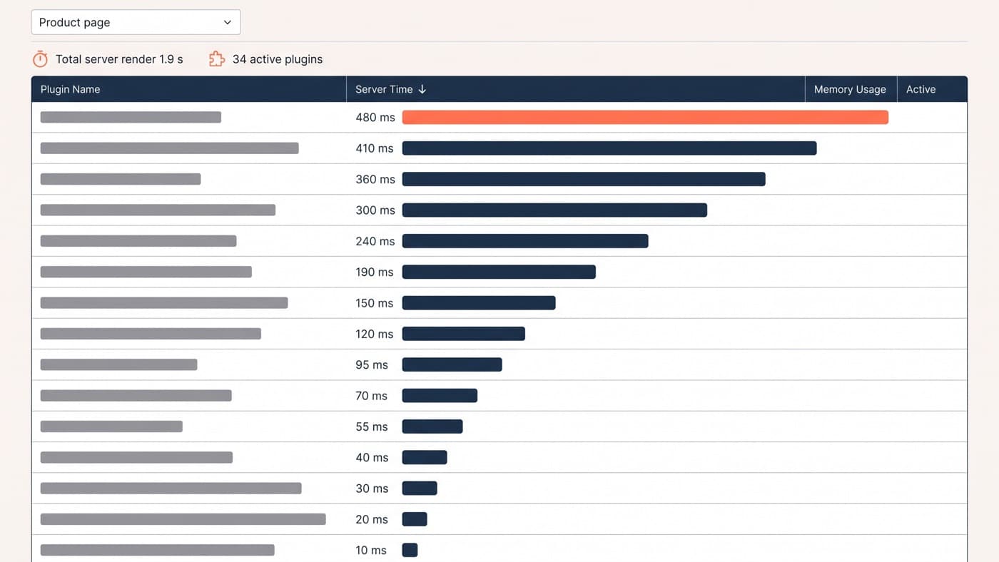
Your theme’s product template was designed to demo well as a marketplace thumbnail, not to sell your product. On WooCommerce you are allowed to rebuild it from the buy box outward, and most stores never do.
What belongs on a product page, in what order and why, is a design question and it is answered elsewhere. This post is the implementation: where WooCommerce lets you move things, which hooks and templates to reach for, and how to do all of it without a page builder taking ownership of the highest-traffic template on the store.
Learn the hook map before you open a template file
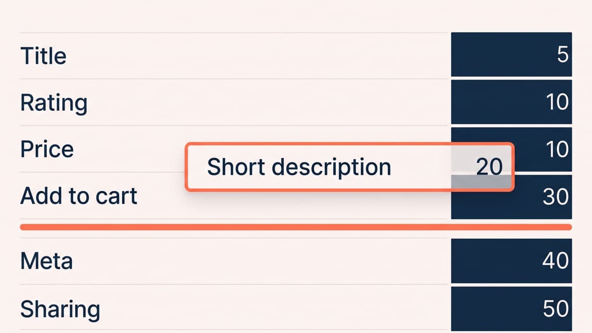
Almost everything in the WooCommerce buy box hangs off one action, woocommerce_single_product_summary, at priorities worth memorising: title at 5, rating and price both at 10, the short description at 20, the add-to-cart form at 30, the product meta at 40 and sharing at 50.
Which means reordering the buy box is not a template edit at all. Remove a function from the hook and re-add it at a different priority, and the page reorders itself with no copied file to keep in sync when WooCommerce revises its own.
Template overrides are the second tool, not the first. Copying a template into your theme’s woocommerce directory works, and it also freezes that file: WooCommerce keeps versioning its copy, yours stops, and the outdated-template warning on the status screen is telling you about a bug you have not hit yet. Override when the structure genuinely has to change. Hook when you only need to move, add or remove.
The buy box is the page
Everything above the fold on a product page is arguing for one action. The default order does not act like it: the short description sits between the price and the add-to-cart form, which pushes the button down the mobile viewport in exchange for two sentences most catalogues have never filled in properly.
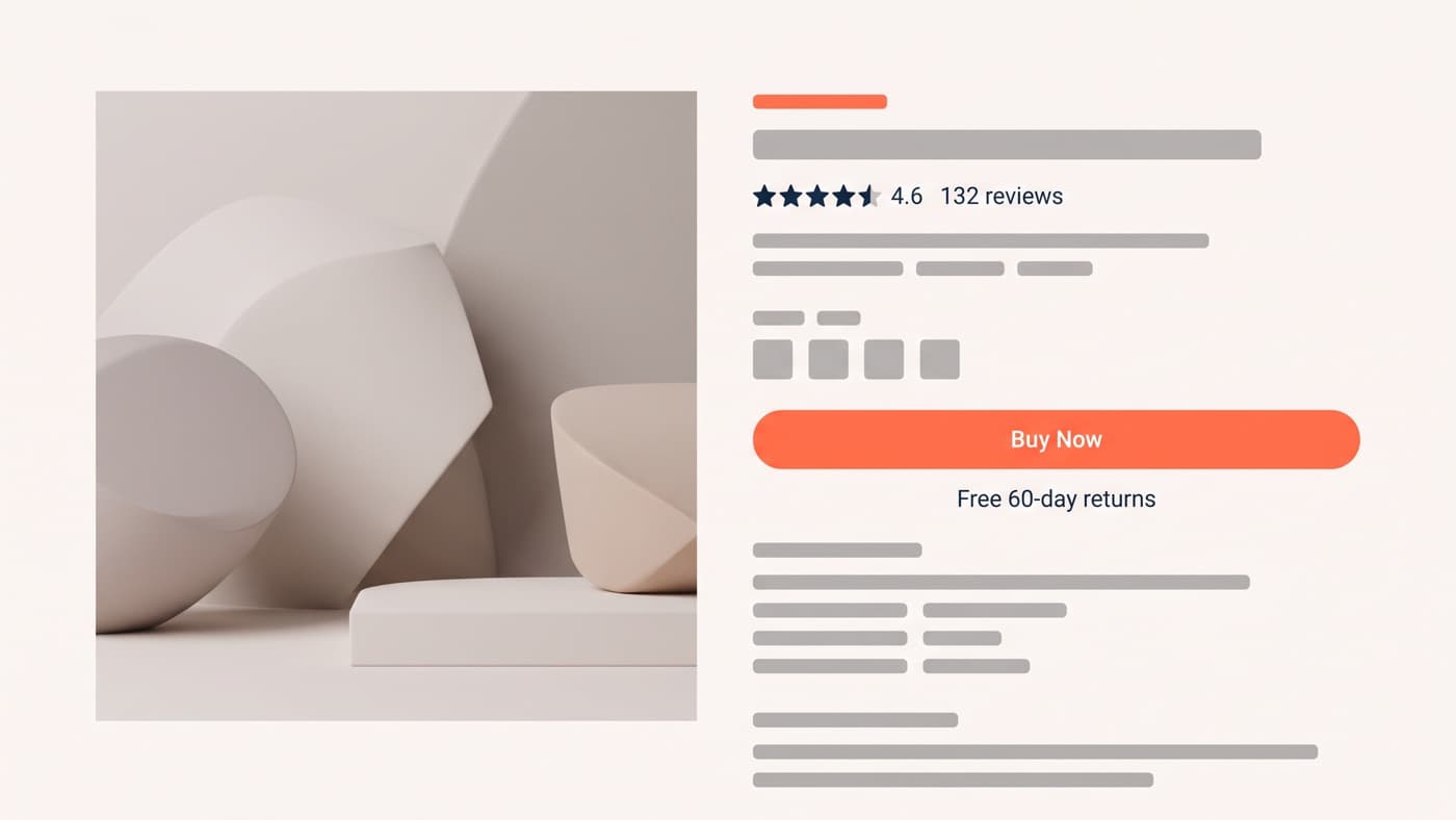
A better order, producible entirely with priorities rather than markup, reads down the buy box like this:
- Title, then price. The two things every visitor checks before anything else, and the two WooCommerce already puts first.
- One line of reason to believe, in place of the short description block, if the catalogue can support writing one per product.
- Variation selectors, then quantity, then a full-width add-to-cart button that does not move down the page when a variation is chosen.
- Delivery cost, returns terms and stock status immediately under the button, which is where the last objection gets answered or does not.
- The long description, the specifications and the reviews below the fold, in the order a considered purchase actually needs them.
The star rating stays up by the title, where it works as a credential. By the time somebody is choosing a size it has stopped persuading anyone.
Stock status is the element most often left wherever it landed. WooCommerce renders it inside the add-to-cart area at a size that implies it does not matter, and on a store where low stock is real rather than manufactured, it is one of the few pieces of information on the page that changes a decision.
Below the buy box, WooCommerce splits description, additional information and reviews into tabs, which hides two of the three from anybody who does not think to click. On a considered purchase the reviews are often the strongest asset the page owns, and a tab is an efficient way to guarantee most visitors never reach them. Stacking those sections down the page instead is a template override rather than a hook change, and it is one of the few overrides worth the maintenance.
Variations: the dropdown is the default and the default is the problem
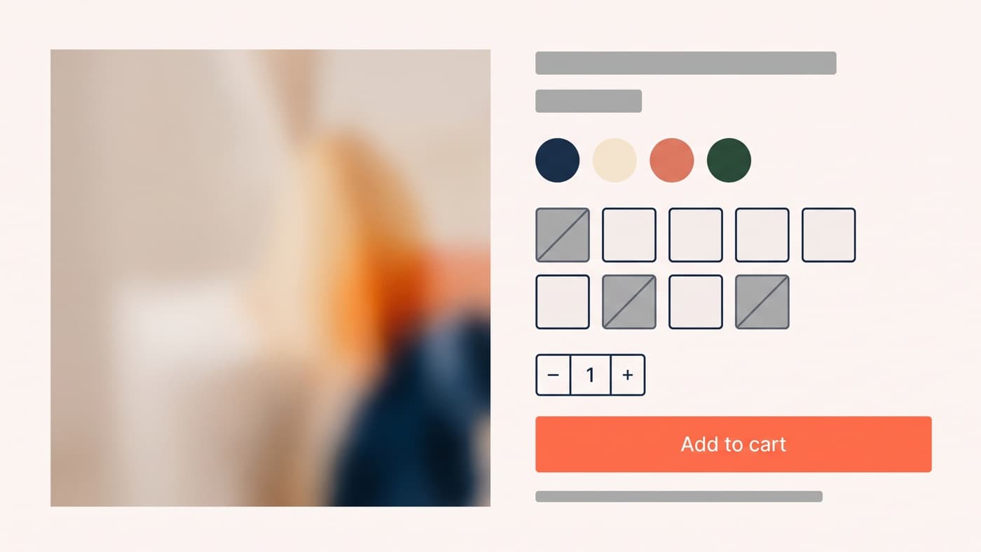
WooCommerce renders variation attributes as select elements. For two sizes that is fine. For a garment offered in nine sizes across four colours it is the worst part of the page, because a dropdown hides the range, hides which combinations are out of stock until after a selection, and adds a tap to the one interaction you most want to be effortless.
Swatches and buttons are the fix, and it is a rendering change rather than a data change: the attribute terms already exist, you are choosing to draw them as visible controls with an unavailable state instead of as a hidden list. The detail that decides whether it works is what happens on an invalid combination. Showing all nine sizes with three marked unavailable is honest and useful. Silently removing them makes the page feel broken and sends people back to the collection.
Gallery behaviour matters alongside it. Selecting a colour should change the images, and the default variation handling swaps a single featured image rather than the set, which on any store selling colourways is the difference between a gallery that answers the question and one that contradicts the swatch the customer just pressed.
Trust belongs next to the decision
Delivery cost, returns terms and payment reassurance do their work where the decision is made, which is beside the add-to-cart button, not in a footer band and not behind a link to a policy page. WooCommerce gives you hooks on either side of the button, and that is the highest-value real estate on the entire template.
Which signals earn the space and which ones tested as wallpaper is a separate inventory. The WooCommerce-specific observation is narrower and slightly damning: the platform’s default is to put none of it in the buy box at all.
Related products, on purpose
The default related-products row selects by shared category and tag in an order nobody chose, and on most catalogues it produces a set of near-identical items competing with the product the customer is already looking at. That is a merchandising decision being made by a database query.
There are two better jobs for the space. Complements rather than substitutes, which raises order value instead of splitting attention. Or a genuine others-also-bought row, if the order history is deep enough to mean anything. If neither is available, deleting the row is a legitimate choice, and it takes its queries and its images with it.
Whatever you choose, cap the count deliberately rather than inheriting whatever the theme set, because on mobile that row becomes a long scroll of images sitting between the customer and everything below it.
Blocks, hooks, and why not a page builder
WooCommerce now ships block-based single-product templates, which move the same job into the site editor. That is a reasonable direction for a new build and it obliges nobody to convert an existing store: classic templates and hooks remain fully supported, and mixing a block template with a heavily hooked buy box is the configuration that produces bugs nobody can reproduce.
What to avoid on a product template is a page builder. It is tempting because it makes the layout visual, and the cost is that the store’s highest-traffic template now depends on a third-party plugin, loads that plugin’s runtime on every product view, and cannot be edited by anyone without the licence and the training. A product template is a system rendered thousands of times from data, not a one-off layout, and it should be built once in code.
The order to work in is boring and it holds: buy-box hierarchy first, then variations, then trust placement, then everything below the fold. Each of those is a testable change rather than a redesign, which is the whole argument for doing this at template level instead of rebuilding the theme. Reworking a product template properly is WordPress development rather than theme-option tweaking, and if your product pages still render in the order WooCommerce shipped them in, that is where to start.