One design system, four storefronts, +16% mobile conversion
- Mobile conversion
- +16%
- from 1.32% to 1.53%
- Theme, four storefronts
- 1
- from 4 forked themes
- Time to ship a landing page
- −72%
- from 9 days to 2.5
- Size-related returns
- −5.2pts
- from 24.8% to 19.6%
The brief
What they came to us with
Brava Athletic sells leggings, bras and base layers into four markets from four Shopify storefronts: UK, EU, US and AU. The storefronts started life as copies of one another in 2022. By the time we arrived they were four different products wearing the same logo.
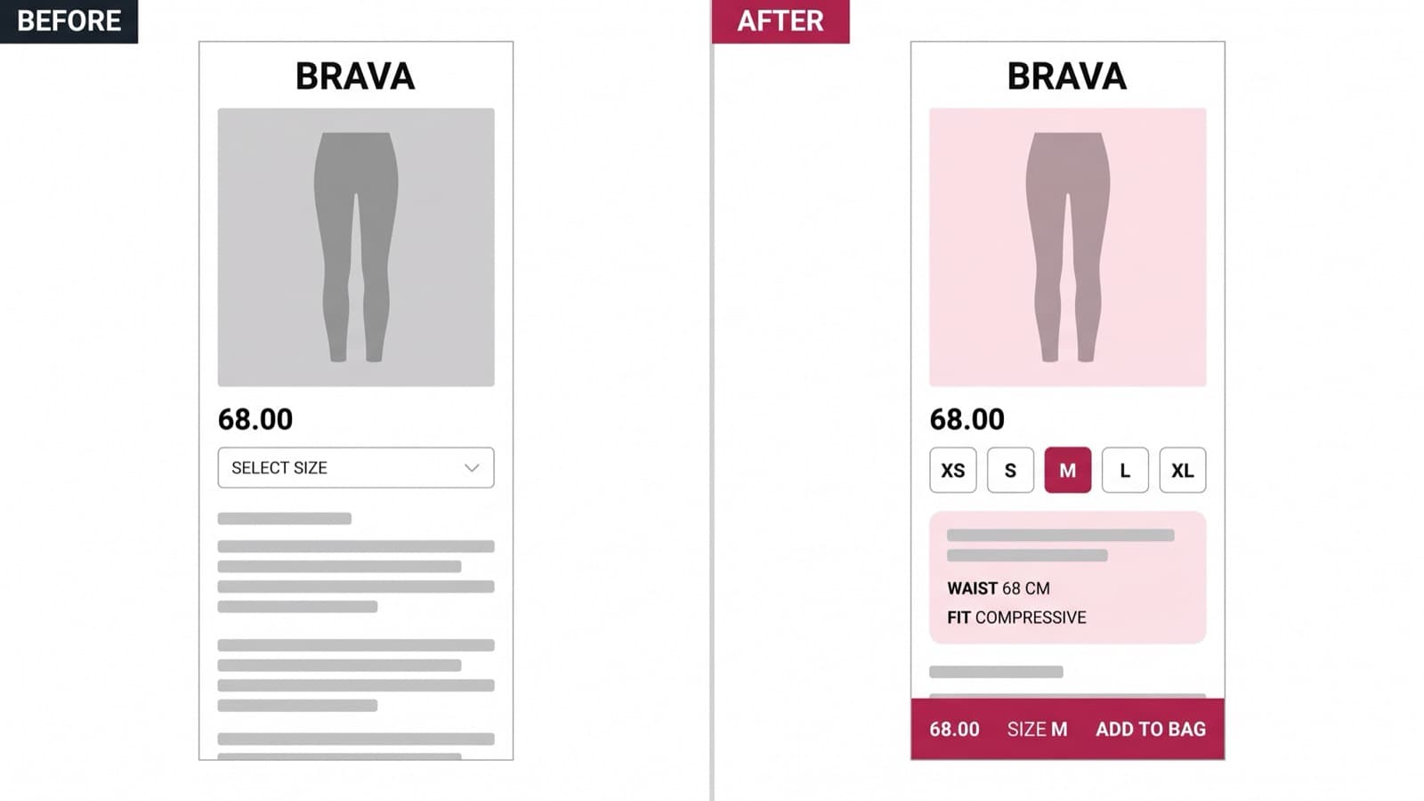
The product page was the clearest example. The UK sold with a size dropdown and a fit note under the price. The US sold with a size grid, no fit note and a reviews module above the buy button. The EU had inherited an older layout with the add-to-bag below the fold on a phone. AU had a sticky buy bar nobody else had, built by a contractor, undocumented. Mobile is 74% of sessions across all four, and mobile is exactly where the four had diverged most.
The cost showed up in two places. Marketing waited nine days for a landing page because every campaign had to be built four times, and returns from sizing sat at 24.8% — high even for activewear, and highest in the two regions whose product pages hid garment measurements behind a modal.
We were hired to make the four storefronts one thing again without a rebrand and without four teams having to agree on everything first.
Constraints
- Four regional teams, each with their own merchandising calendar and their own opinion about which storefront was the good one.
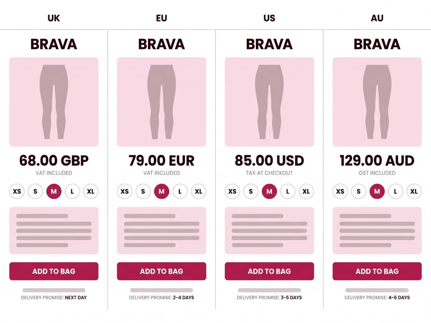
- Tax and shipping display differ by market: VAT-inclusive pricing in the UK, per-country VAT in the EU, tax added at checkout in the US, GST-inclusive in AU. The buy box could not be one fixed layout.
- A code freeze from mid-October to the first week of January. Nothing ships into peak, so the rollout had to land either side of it.
- No rebrand. The logo, the raspberry, the type and the photography were finished work and off the table.
The approach
How we worked the problem
A design system is only worth building if it makes something faster or better on the same day it ships. We treated speed and conversion as two separate deliverables and measured them separately.
- 01
Inventory all four storefronts before deciding anything
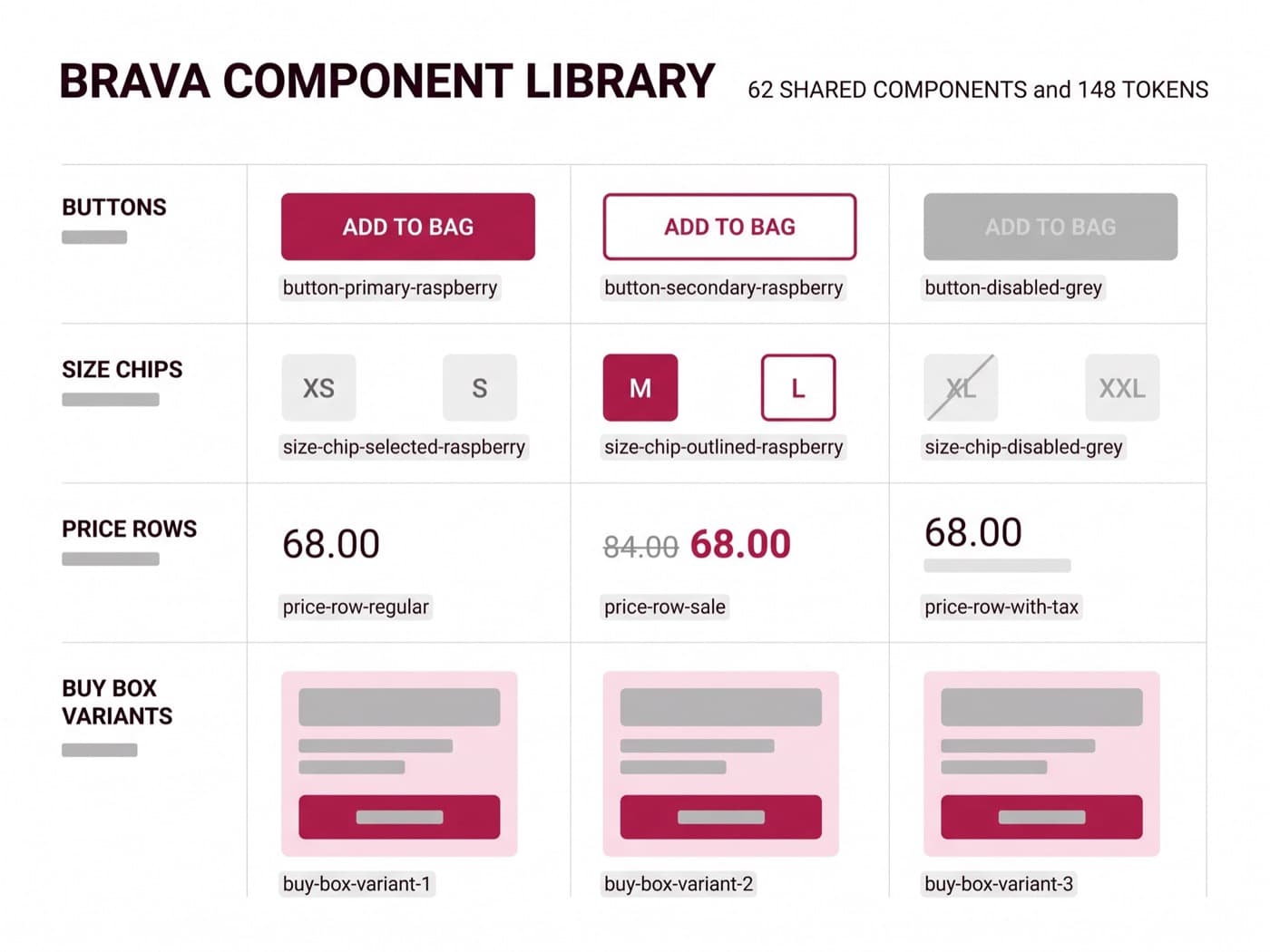
We screenshotted every template in every region and put them side by side: 41 unique page layouts, 312 bespoke Liquid sections, 19 button styles and 11 different ways of rendering a price. Seven of those sections existed in only one region and had no owner.
The inventory settled the "which storefront is the good one" argument in an afternoon. None of them were. Each had two or three components worth keeping, and we kept those.
- 312 sections audited, 62 kept as shared components
- Every divergence tagged as intentional, accidental or regulatory
- Owner named for each surviving component
- 02
Tokens first, components second, pages last
Colour, type, spacing and radius went into Figma variables and out to Liquid as CSS custom properties from one generated file. Nobody hand-writes a hex value in this codebase any more, and a token change reaches four storefronts in one commit.
Regional difference lives in config, not in code. A storefront declares whether prices are tax-inclusive, which size scale it uses, and which delivery promise string to render. Everything else is identical by default — divergence has to be argued for, which is the point.
- 148 tokens, single source in Figma, generated into Liquid
- One theme with a per-region config file, not four themes
- Regional overrides limited to 9 declared keys
- 03
Rebuild the mobile product page around size and fit
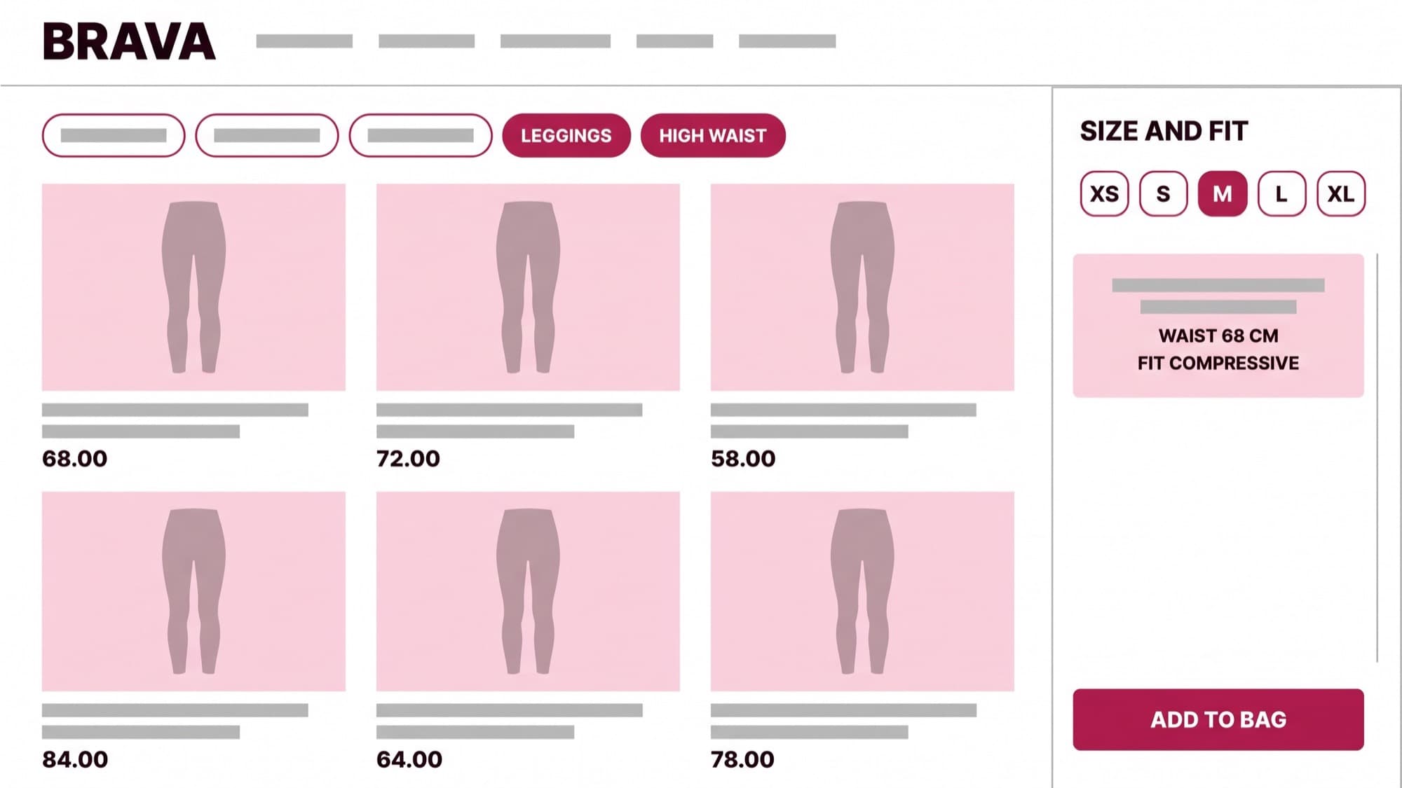
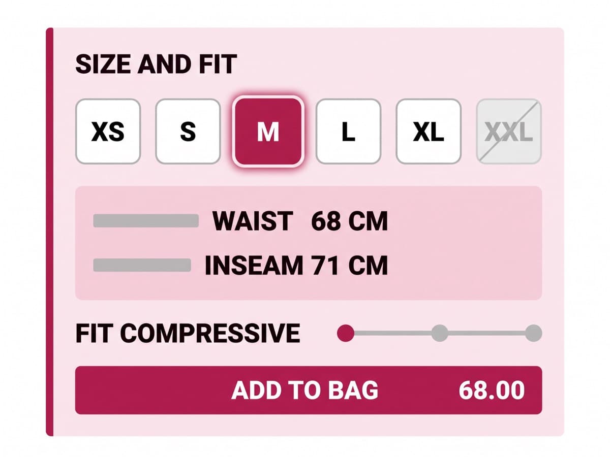
Activewear lives or dies on fit confidence. The new PDP puts the size selector, the garment measurement for the selected size, and the fit descriptor — compressive, supportive, relaxed — in the same block, above the fold on a 375px screen. No modal, no accordion.
Under it sits a sticky buy bar carrying the price, the selected size and add-to-bag, so the buy action is never more than a thumb away regardless of how far someone scrolls into the reviews.
- Size, measurement and fit descriptor in one above-fold block
- Sticky buy bar on all four storefronts, one component
- Buy box tested at 320, 375 and 430px widths
- 04
Roll out one region at a time, and hold one back
UK went first, then EU six weeks later, then US. AU stayed on its old theme as a control for nine weeks after the US launch — deliberately, and over some objection, because otherwise we would have had a number and no way to defend it.
Over that window AU mobile conversion rose 4.1% on its own, on seasonality and media mix. That is the share of the headline the system does not get credit for. The migrated regions gained 16% over the same period, so roughly 11 to 12 points is attributable to the work itself. We report the 16 because that is what the business banked, and the 11 because that is what we actually did.
- Staggered rollout: UK, EU, US, then AU as control
- Nine-week hold-out to separate system lift from trend
- Peak-season freeze respected — AU migrated in January
The log
Rollout and test log
Ten months, four migrations and eleven tests run on the shared components. Seven of the moments that changed the number, with the relative change in mobile conversion for the region tested.
- 01
UK storefront migrated to the shared theme
Because the UK PDP buries garment measurements in a modal, moving the whole storefront onto the shared theme will raise mobile conversion without touching merchandising.
- 02
Size and fit selector with garment measurements
Because 38% of size-guide opens end in an exit, showing the measurement for the selected size inline will raise add-to-bag and cut size-related returns.
- 03
Sticky mobile buy bar
Because median PDP scroll depth is 2.4 screens, pinning price, size and add-to-bag to the bottom of the viewport will raise mobile add-to-bag.
- 04
Autoplaying fabric video above the buy box
Because fabric questions dominate customer service tickets, a looping fabric-stretch video above the buy box will raise add-to-bag.
- 05
"Most people take their usual size" prompt
Because sizing hesitation is the top exit-survey theme, a fit-confidence line beside the size selector will raise add-to-bag.
- 06
EU and US storefronts migrated
Because the shared theme held in the UK, migrating EU and US onto it with regional config only will reproduce the lift in both markets.
- 07
AU control released, post-freeze
Because AU held flat on the old theme while the migrated regions gained, migrating AU will close most of the gap within one cycle.
- UK storefront migrated to the shared theme+4.2%97%shipped
- Size and fit selector with garment measurements+5.8%98%shipped
- Sticky mobile buy bar+3.1%96%shipped
- Autoplaying fabric video above the buy box-2.4%95%not shipped
- "Most people take their usual size" prompt+0.3%flatnot shipped
- EU and US storefronts migrated+3.6%96%shipped
- AU control released, post-freeze+4.4%97%shipped
| Experiment | Relative change | Confidence | Shipped |
|---|---|---|---|
| UK storefront migrated to the shared theme | +4.2% | 97% | Yes |
| Size and fit selector with garment measurements | +5.8% | 98% | Yes |
| Sticky mobile buy bar | +3.1% | 96% | Yes |
| Autoplaying fabric video above the buy box | -2.4% | 95% | No |
| "Most people take their usual size" prompt | +0.3% | flat | No |
| EU and US storefronts migrated | +3.6% | 96% | Yes |
| AU control released, post-freeze | +4.4% | 97% | Yes |
The results
What it moved
Mobile conversion across the four storefronts moved from 1.32% to 1.53%, a 16% relative gain. Against the AU hold-out, about 11 points of that survive as system-attributable; the rest is seasonality and media mix that would have arrived anyway. Both numbers are in the client's deck, in that order.
The speed half is less glamorous and probably worth more. A campaign landing page took nine days across four regions and now takes two and a half, because it is built once and configured three times. Design-to-dev handoff went from a 40-page spec per page to a Figma file whose components already exist in Liquid by the same name. Regression QA dropped from 164 template-and-region combinations to 47.
Size-related returns fell from 24.8% to 19.6% of units — the single change with the clearest cause, since the measurement block shipped alone in the UK a fortnight before anything else did.
The system is the client's now. Four regional teams file component changes as pull requests against one repo, and two of the last five components in the library were written without us.
- Mobile conversion+16%1.32%1.53%
- Time to ship a landing page-72%lower is betterdays9days2.5
- Size-related returns-21%lower is better24.8%19.6%
- Component parity across regions+153%38%96%
| Metric | Before | After |
|---|---|---|
| Mobile conversion | 1.32% | 1.53% |
| Time to ship a landing page | days9 | days2.5 |
| Size-related returns | 24.8% | 19.6% |
| Component parity across regions | 38% | 96% |
| Period | Mobile conversion |
|---|---|
| M1 | 1.32% |
| M2 | 1.33% |
| M3 | 1.36% |
| M4 | 1.38% |
| M5 | 1.41% |
| M6 | 1.4% |
| M7 | 1.44% |
| M8 | 1.47% |
| M9 | 1.5% |
| M10 | 1.53% |
“Four storefronts, four opinions, one component library. Our regional teams ship landing pages in a day now, and they all look like us.”