A checkout redesign that cut abandonment by 22%
- Checkout abandonment
- −22%
- from 38.4% to 30.0%
- Sitewide conversion
- +13.6%
- from 2.35% to 2.67%
- Task success, moderated
- 89%
- from 52% on the compatibility task
- Added revenue, 12 months
- £2.2m
- conversion effect only, AOV gain excluded
The brief
What they came to us with
Hexon Devices makes sensors, hubs and indoor cameras for people who want a connected home without a subscription. The hardware reviews well. The catalogue is the problem: fourteen SKUs, three hub generations, and a compatibility matrix that the founding engineers can recite from memory and nobody else can.
At 310,000 sessions a month the site converted at 2.35% — respectable for hardware at a £186 average order. But 38.4% of shoppers who reached the first checkout step never finished. That is not a traffic problem or a pricing problem. Those people had chosen a product, entered a flow, and then changed their minds inside it.
The brief we were given was "make checkout shorter". The brief we ended up working to was different. Length was never the issue: the median completed checkout took 218 seconds, and the sessions that abandoned were often the ones that had spent the longest reading. People were not bored. They were unsure — about compatibility, about what was actually in the box, about when it would arrive and what happened if it did not work with the hub they bought in 2023.
Constraints
- Shopify Plus checkout extensibility. No custom code on the payment step — only approved UI extension slots, which set a hard ceiling on how much of the flow we could redraw.
- The Hexon Home pairing flow ships on the firmware team's quarterly train. Any post-purchase or in-checkout copy about setup had to match the app version live on launch day, not the one in QA.
- Two product launches in the window, the second at 9× normal traffic for 36 hours. Tests were paused around both — the roadmap had to fit between them.
- Card fields sit in the payment provider's iframe. We could not instrument keystrokes, restyle inputs or rewrite the error strings inside it, so error recovery had to be solved either side of that boundary.
The approach
How we worked the problem
We watched people fail at this checkout before we changed a pixel of it. The redesign that followed was assembled from what they got wrong, then taken apart again one experiment at a time.
- 01
Watch fourteen people try to buy the wrong thing
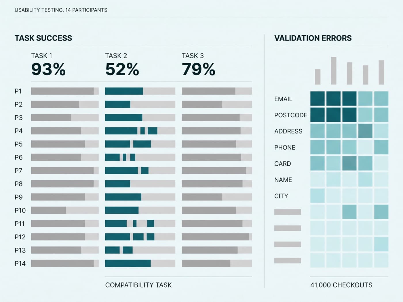
Fourteen moderated sessions, sixty minutes each, split between existing Hexon owners and people who had never bought a smart device. Three tasks: buy a starter kit for a two-bedroom flat, add a camera to an existing 2023 hub, and buy a sensor as a gift for somebody whose setup you do not know.
The second task had a 52% success rate. Six of fourteen participants added a camera that would not pair with the hub they had been told they owned, and four of those six only doubted themselves at the payment step — which is exactly where doubt turns into an abandoned session. We then instrumented the live checkout for the same behaviour: back-navigation from payment to cart, help-page opens in a second tab, and every client-side validation failure by field.
- 14 moderated sessions, 3 tasks, success and error rate scored per task
- Field-level validation errors instrumented across 41,000 live checkouts
- 600 exit-intent responses on the checkout step, coded into 9 themes
- 02
Answer compatibility before the payment step, not after it
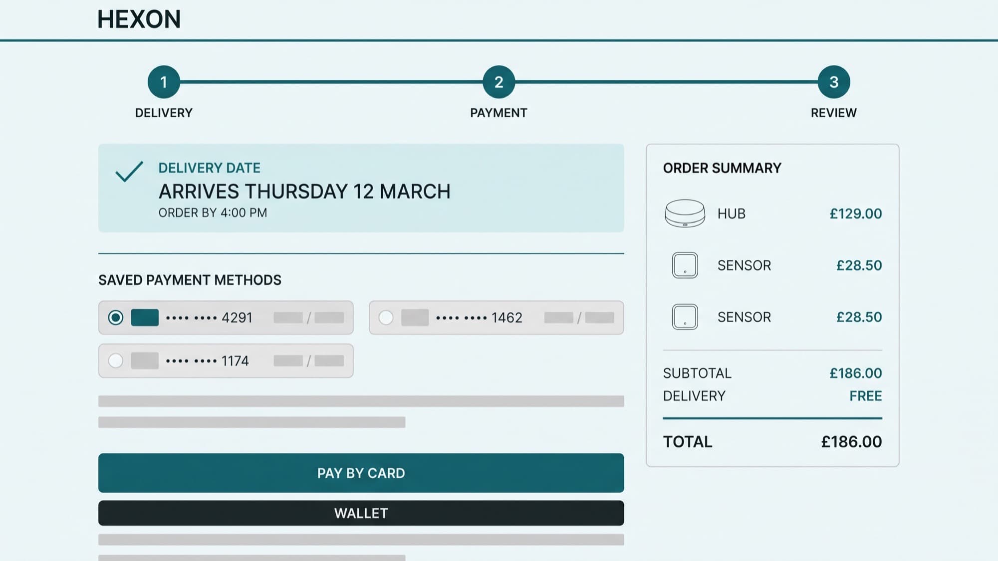
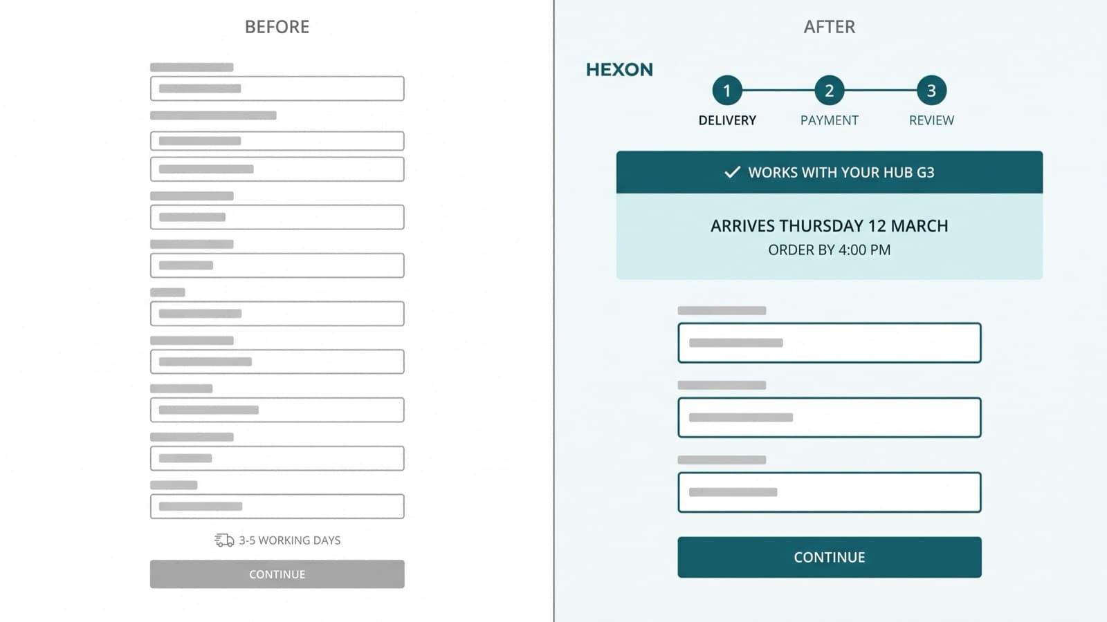
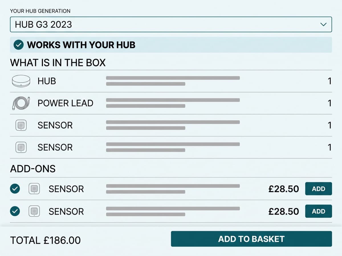
The single biggest change was not in checkout at all. We built a compatibility selector on the product page and carried its answer forward: pick your hub generation once, and every subsequent screen — cart, checkout step one, order summary — states plainly that what you are buying works with it, or blocks you and offers the version that does.
The same rule applied to bundles. A starter kit stopped being a discounted list of SKUs and became a named configuration with a what-is-in-the-box panel and an add-on rail for sensors, so the upsell arrived while the shopper was still choosing rather than as an interruption on the review step.
- Hub generation captured once, persisted to the order summary
- Incompatible add-ons blocked at cart with a named alternative
- Bundle contents itemised line by line, not rolled into one row
- 03
Remove the reasons to leave the flow
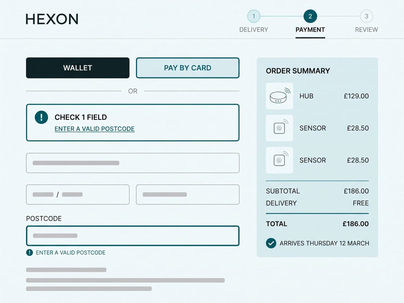
Guest checkout became the default path with account creation offered after payment, not before it. Wallet buttons moved above the form rather than under it. The delivery estimate became a named date with a cut-off time, and the warranty and returns terms — two years, 30 days, no restocking fee on unopened hardware — moved from a footer link into the step where people were actually worried about them.
Error recovery got the same treatment. We could not touch the payment iframe, so we handled everything around it: inline validation on blur rather than on submit, an error summary at the top of the step that focuses the offending field, and a declined-card state that preserves the basket, the compatibility answer and the chosen delivery date instead of dumping the shopper back at step one.
- Guest path default; account offered post-purchase
- Wallet payments surfaced above the form on mobile and desktop
- Declined-card recovery preserves basket, hub selection and delivery slot
- 04
Test the redesign in pieces, not as a monolith
A checkout redesign shipped whole tells you nothing about why it worked, and gives you nowhere to go when it does not. Eleven experiments, each with a pre-registered sample size and a two-business-cycle minimum, measured on checkout completion rate for the tested audience.
One of them lost. Collapsing the three steps into a single scrolling page tested well in the lab and cost 4.7% of completions in the wild, mostly on mobile, and we did not ship it. Writing that up honestly is what earned the room to try the next four things.
- 11 experiments: 8 winners, 2 flat, 1 loss
- Fixed sample size agreed before launch, no interim calls
- Every result written up in a shared decision log, losses included
The log
The experiment log
Eleven tests over ten months. Six of the ones that decided the shape of the flow, with the relative change in checkout completion rate for the tested audience.
- 01
Compatibility confirmation in cart and checkout
Because 6 of 14 moderated participants added an incompatible device and 43% of back-navigations from payment landed on a product page, restating hub compatibility in the order summary will raise checkout completion.
- 02
Named delivery date with cut-off time
Because "when will it arrive" is the top exit-survey theme at 21% of responses, replacing the 3–5 working days estimate with a named date will raise completion.
- 03
Guest checkout as the default path
Because 29% of first-time checkouts stall on the account step, defaulting to guest and offering the account after payment will raise completion for new customers.
- 04
Wallet payments above the card form
Because 64% of checkout starts are on mobile and wallet users complete 2.4× faster, promoting wallet buttons above the form will raise mobile completion.
- 05
Extended-warranty add-on on the review step
Because warranty is the second-most-opened help topic in checkout, offering a three-year extension on the review step will raise attach rate without harming completion.
- 06
Single-page checkout
Because the flow takes 218 seconds, collapsing three steps into one scrolling page will reduce time to complete and raise completion.
- Compatibility confirmation in cart and checkout+6.8%98%shipped
- Named delivery date with cut-off time+4.2%96%shipped
- Guest checkout as the default path+5.5%97%shipped
- Wallet payments above the card form+3.1%95%shipped
- Extended-warranty add-on on the review step+0.2%flatnot shipped
- Single-page checkout-4.7%96%not shipped
| Experiment | Relative change | Confidence | Shipped |
|---|---|---|---|
| Compatibility confirmation in cart and checkout | +6.8% | 98% | Yes |
| Named delivery date with cut-off time | +4.2% | 96% | Yes |
| Guest checkout as the default path | +5.5% | 97% | Yes |
| Wallet payments above the card form | +3.1% | 95% | Yes |
| Extended-warranty add-on on the review step | +0.2% | flat | No |
| Single-page checkout | -4.7% | 96% | No |
The results
What it moved
Checkout abandonment fell from 38.4% to 30.0% — a 22% reduction — which is the same thing as saying completion went from 61.6% to 70.0%. Sitewide conversion followed it almost exactly, 2.35% to 2.67%, because nothing upstream of the cart changed materially in the same window.
On 310,000 sessions a month at a £186 order value, that is roughly £185,000 of additional monthly revenue, or £2.2m annualised. Average order value also rose to £199 as the bundle and add-on rail did its work, but we have left that out of the figure — it is a different test on a different audience and stacking the two would flatter the number.
The operational results matter as much. Checkouts that hit at least one validation error dropped from 34.6% to 19.8%, median time to complete fell from 218 to 149 seconds, and the compatibility task in a repeat round of moderated testing went from 52% to 89% success. Support tickets tagged "wrong product ordered" are down by half, which nobody was measuring at the start and everybody quotes now.
- Checkout abandonment-22%lower is better38.4%30%
- Checkouts hitting a form error-43%lower is better34.6%19.8%
- Median time to complete-32%lower is better218s149s
- Sitewide conversion+14%2.35%2.67%
| Metric | Before | After |
|---|---|---|
| Checkout abandonment | 38.4% | 30% |
| Checkouts hitting a form error | 34.6% | 19.8% |
| Median time to complete | 218s | 149s |
| Sitewide conversion | 2.35% | 2.67% |
| Period | Checkout abandonment |
|---|---|
| M1 | 38.4% |
| M2 | 38.1% |
| M3 | 37.6% |
| M4 | 35.9% |
| M5 | 35.2% |
| M6 | 33.8% |
| M7 | 33.1% |
| M8 | 31.9% |
| M9 | 30.8% |
| M10 | 30% |
“They ran the usability sessions in front of us. Watching four people in a row fail the same compatibility step ended an argument we’d been having for a year.”