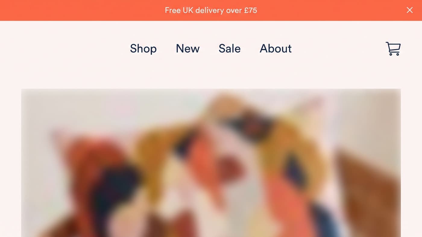
The highest strip of screen on your storefront currently says Welcome to our shop. It is about forty pixels tall, it appears on every page above everything else, including the pages paid traffic lands on, and changing it is one of the cheapest experiments you will ever brief.
This article owns those forty pixels: what earns the slot, whether the bar rotates, whether it sticks, and how it should change by market. Where to set a free delivery threshold and what it does to margin belongs to the average order value guide, and the wider question of per-market merchandising to the Shopify Markets article. Neither is restated here.
What earns forty pixels
Only one message can be first, and in most stores the argument is settled by whoever asked most recently. The useful frame is to ask what a first-time visitor needs in order to keep going, because the bar is seen by everyone and read by the undecided. There are usually four candidates and they are not equal.
- A delivery threshold or delivery promise: free UK delivery over £75, or dispatched today if you order before two. Specific, useful on every template, and the only common candidate that changes basket behaviour rather than mood.
- A live promotion: twenty per cent off until Sunday. Strong while it is true and worthless the moment it becomes permanent, which is what happens to most promotional bars within a quarter.
- A proof or reassurance line: free returns for thirty days, or a review score. Cheap to say, easy to ignore, and usually more persuasive next to the buy button than at the top of the page.
- A welcome or brand line. This is the default, it is almost certainly the one you have, and in the tests we have run it is the control that loses.
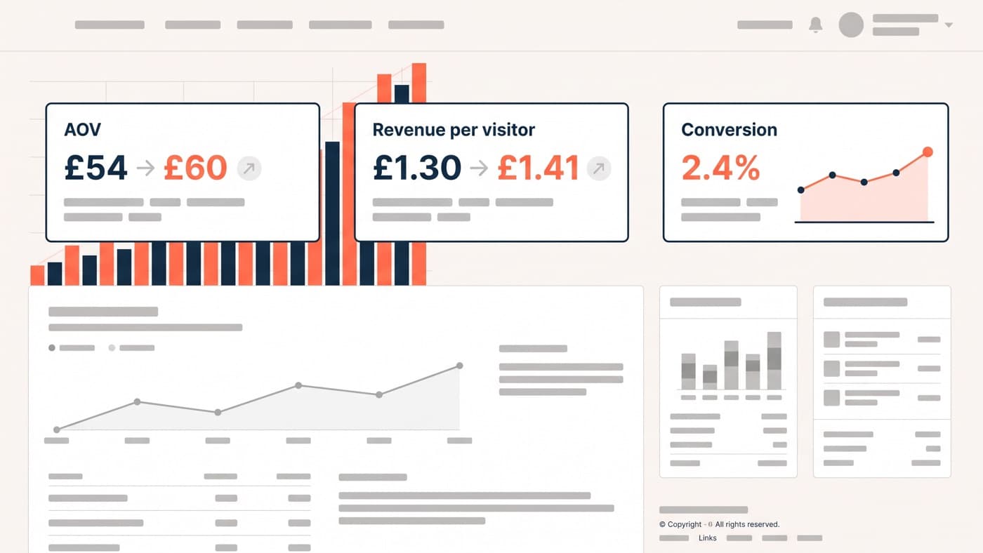
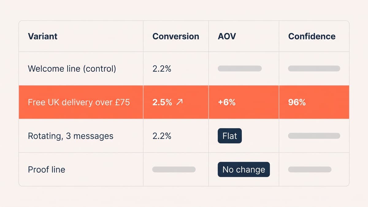
On a homeware store running about 2.2% sitewide conversion, replacing the welcome line with a delivery threshold reading free UK delivery over £75 moved conversion to 2.5%, a relative gain of 14% at 96% confidence, and average order value rose 6% as baskets reached for the threshold. The promotional variant, which was a genuinely dated sale, won by more over its two weeks and gave the gain back the following month, which is why it sits second on that list rather than first. The proof line moved nothing at all.
Rotation almost always loses
The instinct when four messages want the same slot is to rotate them, and the instinct is wrong for a reason that has nothing to do with taste. A rotating bar is a message the visitor has to wait for, on a page they are already scrolling, so the second and third messages are shown mainly to people who have not scrolled yet. In the same programme, a three-message carousel in the bar tested flat against the single threshold line while cutting the bar’s own click-through by roughly a third.
If several messages genuinely qualify, the answer is placement rather than rotation. Give the strongest one the bar, put the second in the cart drawer where it is immediately relevant, and let the third live on the product page beside the thing it describes. Three messages in three places beat three messages in one place, and each of them becomes testable on its own terms.
Sticky, dismissible, or neither
Three decisions follow. Sticky bars stay in view as the page scrolls, which is worth more on long collection pages than anywhere else and costs the most on mobile, where forty pixels is a real fraction of the viewport. Our sticky variant won slightly on desktop and lost about 3% on mobile, which is exactly the sort of split that gets averaged into nothing if you only read the overall number.
Dismissibility is the one to get right. A bar with a close control that remembers the choice respects the returning customer and costs you almost nothing, because the message is aimed at people who have not decided yet. A bar with no close control on mobile, stacked above a sticky header, is how stores end up with eighty pixels of chrome and a product image that starts below the fold.
Placement above or below the header is a genuine test rather than a convention. Above the header it is seen more often and reads as an announcement; below it, it reads as part of the store and tends to survive more scrolling. Run it once on your own traffic and stop arguing about it.
Per-page and per-market variants
A single bar across the whole site is a compromise nobody actually chose. The home page bar is talking to visitors who may not yet know what you sell; the collection page bar is talking to somebody comparing options; the product page bar is talking to somebody who has all but decided and wants to know when it arrives. Those are three different sentences, and varying them uses the same mechanics as any other experiment.
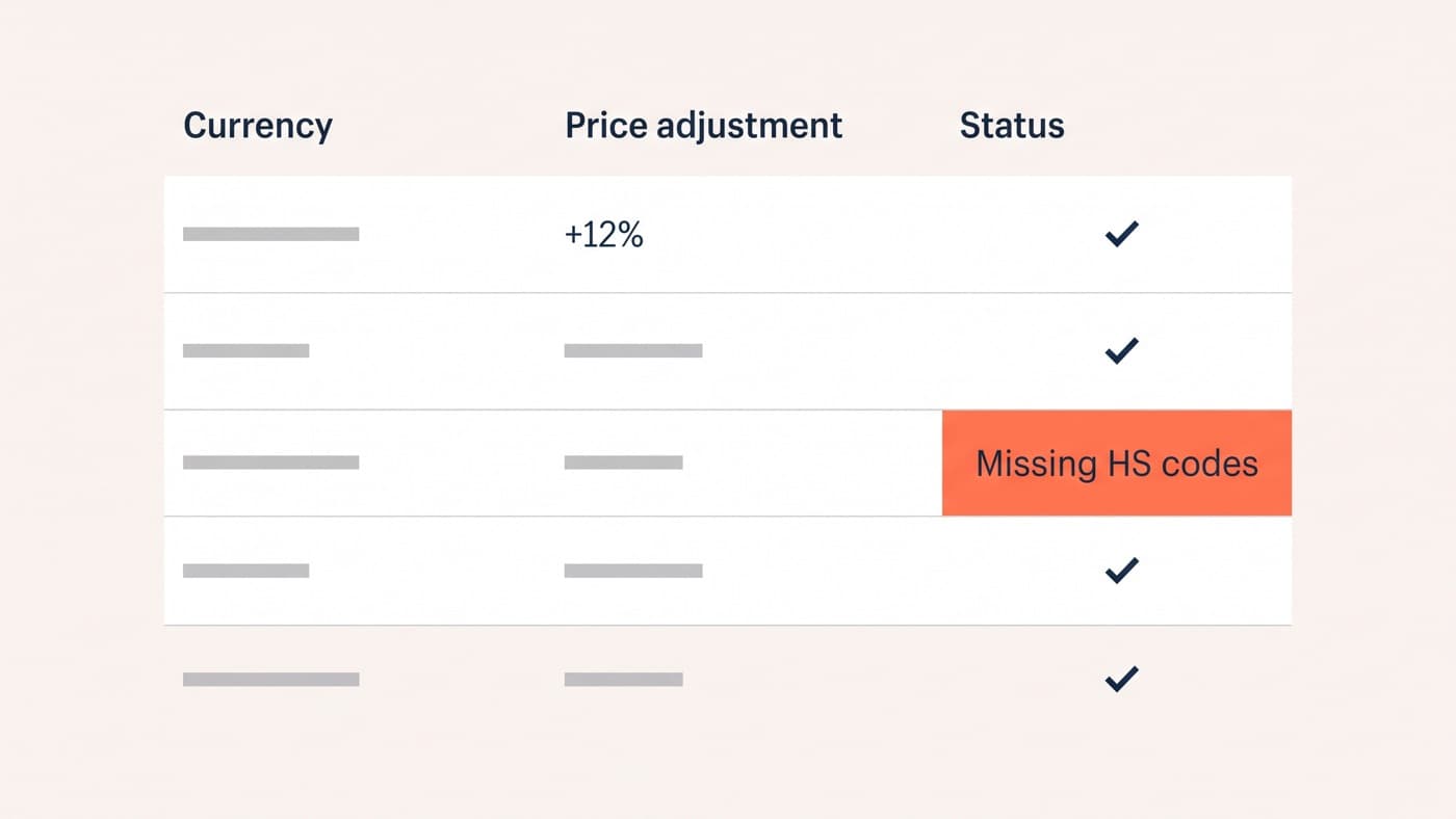
Market variants matter more than page variants and are missed more often. A threshold stated in pounds shown to a visitor being priced in euros is worse than no bar at all, and a delivery promise that is true domestically and false for a parcel crossing a customs border does active damage rather than nothing. Set the bar from the same market context that sets the price, and treat a bar that cannot read that context as broken rather than as merely imperfect.
Design details and the test plan
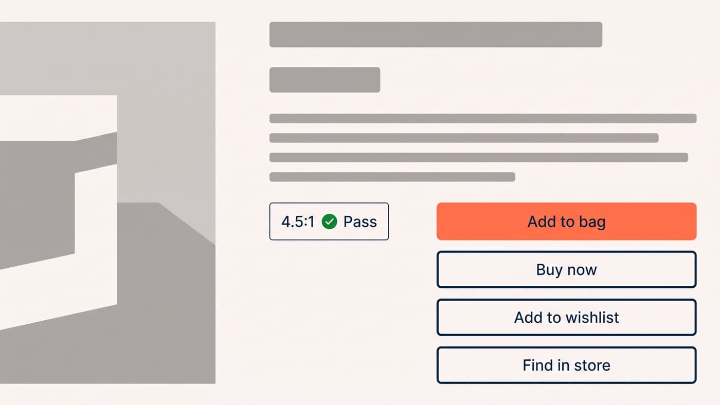
The design failures are boring and repeatable. Contrast comes first: a bar using a brand tint at low contrast disappears for precisely the people most likely to need it, and its text should meet the same contrast standard as body copy rather than being exempted for looking decorative. Keep it to one line at the narrowest phone width you support, because a two-line bar on a 360 pixel screen pushes the page down and reads as a fault. And give it one link at most, since a bar carrying three links is a navigation row that has lost its way.
Then test it like anything else: one change at a time, orders as the primary metric rather than clicks on the bar, average order value carried as a secondary metric because a threshold message will move it, and a run long enough to cover full weekly cycles. Bars are quick to build, which is why they get shipped on opinion and then defended for years. That is the argument for putting them through ordinary A/B testing rather than through a meeting. The forty pixels are already there and already being seen; the only open question is whether they are saying anything.