Roughly seven in ten carts are abandoned, and the checkout usually gets the blame. Most of the time the checkout is where the decision surfaces, not where it was made — the customer decided to leave two screens earlier and the checkout is simply where they act on it.
Which means the useful question is not "how do we improve the checkout", it is "what did we promise before it that we are now failing to keep".
The abandonment that happens before checkout
The most reliable way to lose a buyer who had already decided is a shipping cost that appears at the final step. It is not the amount that does the damage, it is the surprise — the sense that the number they had been reasoning with was not the real one.
Show the cost, or the threshold for free shipping, from the product page onwards. Customers who see a £4.95 delivery charge early and continue anyway are customers who will not abandon over it later. You lose a few earlier and keep more at the end, which is a trade every store should take.
The account wall
Forcing account creation on somebody buying one thing once is asking for commitment before you have earned any. The business reason is real — accounts help retention — but taking it at the moment of purchase costs more than it returns.
Make guest checkout at least as prominent as signing in, then offer the account afterwards, on the confirmation page, when the customer already has a reason to want order tracking. Same account, better moment, and nobody had to weigh a password against a purchase.
Every field is a question you are asking
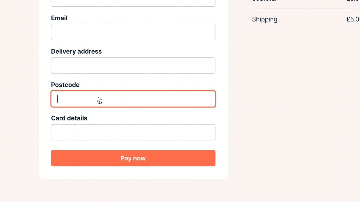
Treat each field as a request the customer can refuse. "Company name" on a consumer store, a title dropdown, a second address line as a required field, a phone number with no explanation of why you want it — each is a small negotiation, and they accumulate.
Ask only for what fulfils the order. Where something genuinely is needed, say why in a single line beside it. And check the input types on mobile: a numeric keypad for postcodes and card numbers is a two-minute change that removes a genuine irritation on the highest-traffic device.
Errors are where trust is lost
Nothing kills a purchase faster than a form that rejects the customer without saying why. Validate as they go rather than only on submit, never clear a field that failed validation, and write errors as instructions — "your card number needs 16 digits" rather than "invalid input".
And handle the declined payment properly. It is the most fragile moment in the entire journey, and most stores respond with a red box and no route forward. Keep the basket, keep the address, offer another method, and make it obvious nothing has been lost.
Mobile checkout is where the money leaks
Mobile is most of your traffic and roughly half your conversion rate, and the checkout is where that gap is widest. Some of it is intent — people browse on phones and buy on laptops — but a large share is mechanical, and mechanical problems are fixable.
The keyboard is the biggest offender. When it opens it takes half the viewport, and if your layout has a sticky header and a sticky summary bar, the customer is left typing into a two-line slot with the submit button hidden. Test with the keyboard open, on a 375px screen, because that is the actual condition most of your customers are buying in.
Then let the phone help. Correct input types bring up the numeric keypad for card numbers and postcodes. Autocomplete attributes let the browser fill the address in one tap. Address lookup from a postcode removes four fields. Express payment methods bypass the form entirely for returning customers, and putting them above the form rather than below it is often the single highest-value change in the whole flow.
None of that is design work. It is a morning of attributes and ordering, and it routinely outperforms the redesign that was being discussed instead.
What we check first
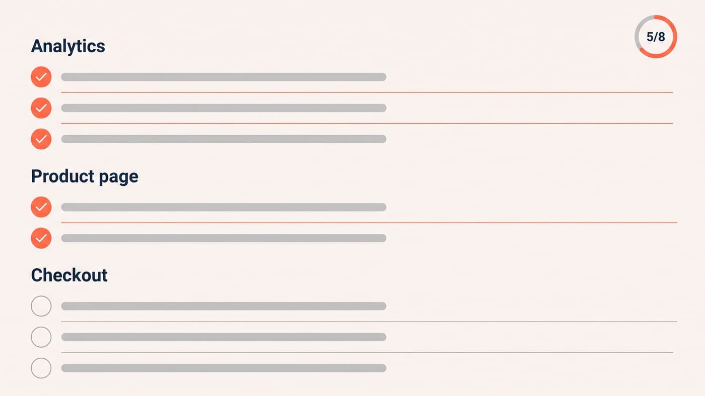
On any checkout review, in this order:
- Is the shipping cost visible before the cart?
- Is guest checkout as prominent as signing in?
- How many fields are genuinely required, and can any be inferred?
- Do express payment methods appear early, above the form?
- What does a declined card actually look like on a phone?
- Does the page work with a keyboard open on a 375px screen?
One more habit worth adopting: read your own checkout error messages out loud. Anything that sounds like it was written for a developer rather than a customer is costing you orders, and it is usually a ten-minute fix that nobody has ever been assigned.
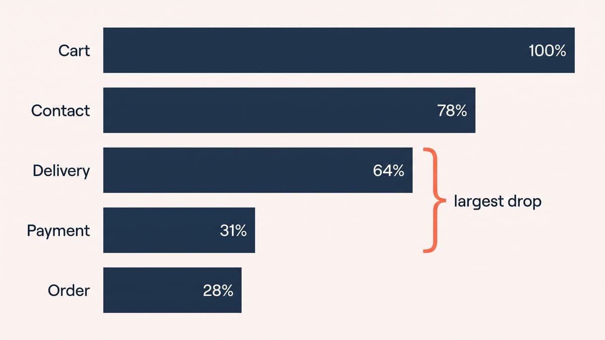
And measure at the step level rather than as a single abandonment rate. One number tells you that people are leaving; five numbers tell you which screen to open. Almost every store already has the data to do this and reports the single figure out of habit.
It follows that the highest-value checkout work usually happens outside the checkout — on the product page, in the cart, in the delivery promise. If abandonment is high, look upstream before redesigning the last screen, because that is generally where the expectation was set that the checkout is now failing to meet.
The framing worth keeping is that a checkout is not a form, it is the last few minutes of a decision somebody has already made. Every element either confirms that decision or gives them a reason to revisit it, and surprises are the most reliable way to trigger the second.
Which is why most of the fixes here are about honesty rather than persuasion. Show the cost early, ask for less, explain what is needed and why, and handle failure gracefully. None of it is clever, and it consistently outperforms the clever things.
Then buy something from your own store on mobile data with a card you have not saved. Most teams have never done it, and it is the most informative hour available to them. Checkout changes are also excellent test candidates because the traffic is concentrated — see our guide to ecommerce A/B testing for how to run them properly, or talk to our UI/UX design team by getting in touch.