Nobody buys a £400 sofa on their lunch break. They look at it on a phone on Tuesday, again on a laptop on Thursday, send it to a partner on Saturday, and buy it eleven days later on the phone where they started. Most product pages are designed for a purchase that happens in one sitting, which is a purchase that never actually happens.
For considered purchases — furniture, skincare, tools, anything expensive or bought infrequently — the product page is not a checkout ramp. It is a research document that has to survive being read four times by a sceptical person who is also looking at three competitors in other tabs.
Design for the fourth visit, not the first
The first visit is browsing. The fourth is due diligence, and it is the one that converts. On that visit your customer is not discovering the product, they are trying to find the one fact that will let them stop worrying — the dimensions, the return window, whether it will actually arrive before the weekend.
This changes what belongs where. A page optimised for first impressions leads with atmosphere. A page optimised for the fourth visit makes the specifics findable in seconds and does not make anyone hunt through a carousel to re-check a measurement they already looked up once.
The gallery is doing more work than the copy
On considered purchases, images are where most of the real decision-making happens, and most galleries waste the opportunity by showing eight versions of the same studio angle.
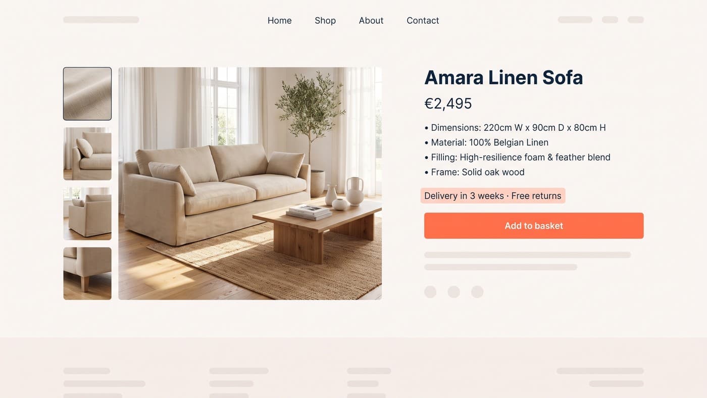
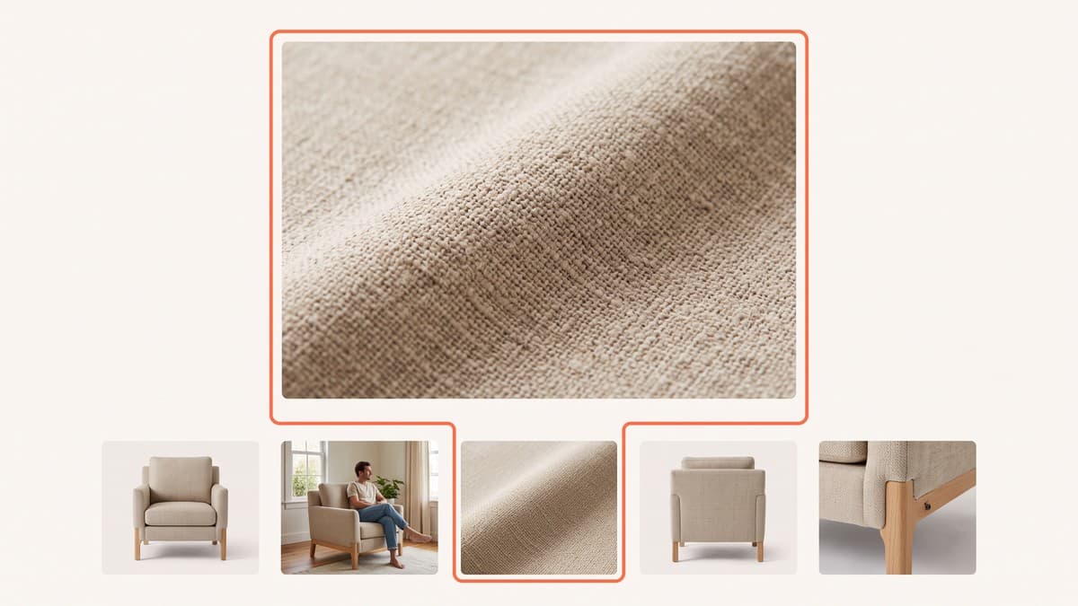
What people are actually looking for is scale, texture and context. One shot of the product in a real room with a recognisable object next to it will answer more questions than four immaculate studio frames. A close crop that shows the weave, the grain or the finish does the job of a paragraph of copy nobody reads. And a photograph of the thing being used tells people what their life looks like with it in it.
Find the question that stops the sale
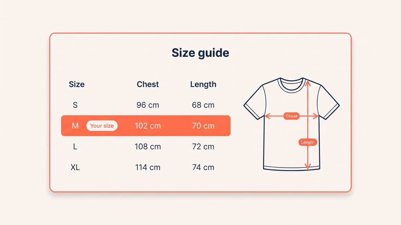
Every product category has one objection that does most of the damage, and it is usually written down somewhere in your business already. In furniture it is whether the thing fits. In apparel it is sizing. In skincare it is whether it will irritate. In tools it is compatibility.
Your support inbox knows what yours is, because the same question arrives forty times a month. So does your on-site search, which is a list of things customers expected to find and could not. Answer that question on the page, above the fold, in plain language — not in a tab, not in an accordion, and not in a PDF.
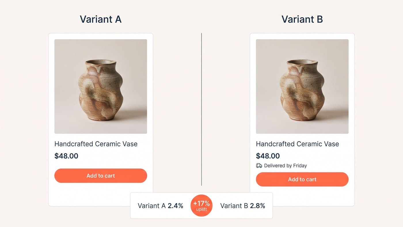
This is the single change we test most often across our UI/UX design work, and it is the one most likely to produce a double-digit relative lift — because it is not a design improvement, it is the removal of a reason to leave.
Specifications are a trust signal
Thin, vague specs read as evasion. If you sell something people research, the depth of your detail is itself an argument: it says you know what you are selling and you are not hoping the customer fails to ask.
Give real numbers with units. Name the materials properly. State the delivery window rather than a vague promise, and put the returns policy where the hesitation happens instead of in the footer. Counter-intuitively, publishing the awkward facts — the eight-week lead time, the dry-clean-only care label — tends to raise conversion rather than lower it, because it filters out the returns and reassures everybody else that you are not hiding anything.
Format matters as much as content here. A wall of prose describing dimensions is unreadable on a phone; a short labelled table is scannable in four seconds and survives being checked twice. Use the words your customers use rather than the ones on the supplier spec sheet — nobody searches for a "seat depth tolerance", they want to know whether they can nap on it.
Reviews have to earn their space
A star rating near the title is worth having. Forty reviews stacked at the bottom of the page, sorted newest-first, mostly are not — because by the time someone scrolls that far they have a specific worry, and "great product, fast delivery" does not touch it.
On considered purchases, the useful review is the one from someone with the same problem. A tall customer on sizing. A small flat on dimensions. Sensitive skin on irritation. If your review tool lets people filter or tag by that, use it, and surface the attribute your customers actually share rather than a generic verified-buyer badge.
The counter-intuitive part is that a handful of three-star reviews raise conversion rather than lower it. A page with nothing but five stars reads as curated, and customers who have been on the internet before know it. Specific, mildly critical reviews are the ones that make the positive ones believable.
What we would change first
If you only have appetite for a handful of changes, start here. Each of these is testable on its own, which matters — change five things at once and you learn nothing about any of them:
- Move delivery and returns information above the fold, out of any tab or accordion.
- Replace two studio images with one scale shot and one texture close-up.
- Answer your single most common support question directly on the page, in the customer's words.
- Make the specification block scannable — real units, sensible labels, no marketing adjectives.
- Add a genuine way to save or share the page, because on considered purchases the decision is frequently made by two people on different devices.
One caution on all of it: change these one at a time where traffic allows. A considered-purchase page has fewer visitors than a fast-moving one, so the temptation is to ship five improvements together and call the combined result a win. That tells you the bundle worked, not which part of it did, and next quarter you will be guessing again.
None of that is a redesign. It is a page that respects how long the decision actually takes, and it will beat a prettier page that assumes the decision happens in ninety seconds. If you want us to look at yours, get in touch.