The most expensive thing a Shopify merchant can do is buy a new theme in response to a conversion problem. It feels decisive, it costs a fortnight, and it changes roughly two hundred things at once — which means that whatever happens next, you will never know which of them did it.
Shopify stores rarely underperform because the theme is ugly. They underperform because of a handful of specific frictions that are the same from store to store, and that nobody has looked at closely because looking closely is less fun than redesigning.
The Shopify ceiling is lower than people think
Shopify gives you a working store in an afternoon, and that is genuinely brilliant. It also means every store starts from the same defaults, and defaults are built for the average merchant selling an average product to an average customer. You are not that.
The gap between a stock theme and a store built around how your customers actually buy is usually worth more than any individual button-colour experiment will ever be. But you have to find that gap before you can close it, and that means measuring rather than redecorating.
Where Shopify stores actually leak
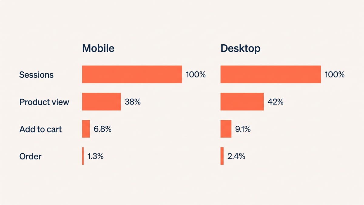
Pull the funnel apart before touching anything. Sessions to product page, product page to add-to-cart, cart to checkout, checkout to order. Do it separately for mobile and desktop, because on most stores mobile is somewhere between sixty and eighty per cent of sessions and converts at roughly half the rate — and an averaged funnel hides exactly the problem you are looking for.
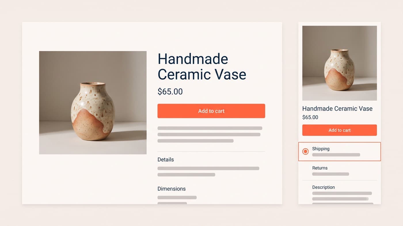
Three leaks come up again and again. The product page that answers every question except the one about delivery. The collection page whose default sort buries the products people actually want. And the cart that adds a shipping cost at the last possible moment, which is the single most reliable way to lose a customer who had already decided to buy.
Every app has a price tag nobody prices in
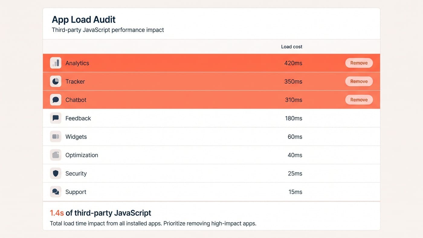
The average store we audit runs between eighteen and thirty apps. Each was installed for a good reason. Collectively they load a few hundred kilobytes of third-party JavaScript before the buy button becomes clickable, and on a mid-range Android phone on a train, that is the difference between a sale and a back button.
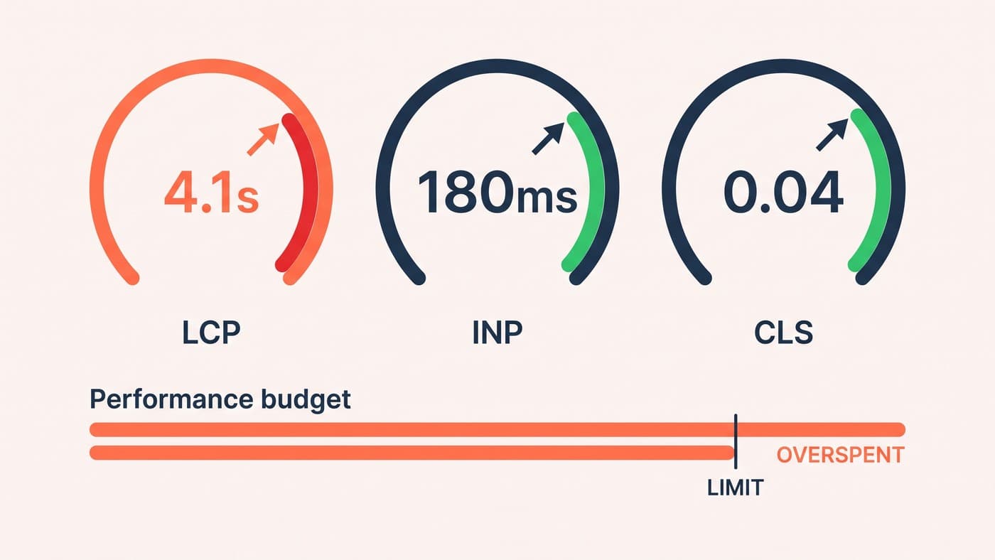
We treat performance as a budget the way a buyer treats stock: a fixed number of milliseconds, and every app has to earn its slot by paying for itself in conversion rather than in features. The apps that fail that test are rarely the ones anyone expects — review widgets, upsell pop-ups and chat bubbles are the usual suspects. We have cut about 40% of a client's app stack and watched conversion rise, not fall.
This is a big part of what Shopify development work looks like in practice, and it is much less glamorous than a redesign. It is also where the money is.
The collection page is doing your merchandising
Collection pages get a fraction of the attention product pages do, and they decide far more. Every visitor who arrives from search, social or a campaign lands on one, and the default sort order silently determines what most of them will ever see. On a 400-product collection, the difference between "featured" and "best selling" is the difference between showing people your newest stock and showing them what already works.
Filtering is the other half. Customers filter by the thing they have already decided — size, colour, price, whether it is in stock — and a collection page that makes them scroll past forty unavailable products to find three available ones is training them to leave. Out-of-stock items should sort to the bottom by default, not sit at the top because they happen to be popular.
This is also where mobile hurts most. Filters hidden behind a small icon get used a fraction as often as filters that are visible, and on a phone the fold arrives after about two products. Test the sort order before you test anything on the product page — it is upstream of everything else, and the traffic volumes make it far easier to prove.
The checkout you can change, and the one you cannot
Shopify checkout is deliberately locked down, and that is mostly a gift — it is tested against more transactions than your store will ever see. What you control is everything leading into it, and that is where the abandonment is generated even though it is recorded later.
Show shipping costs before the cart, not at the final step. Make express payment options visible early for returning customers. Do not force account creation on people who want to buy one thing once. And check what your cart looks like on a 375-pixel screen with the keyboard open, because that is the actual context most of your customers are buying in.
A sane first ninety days
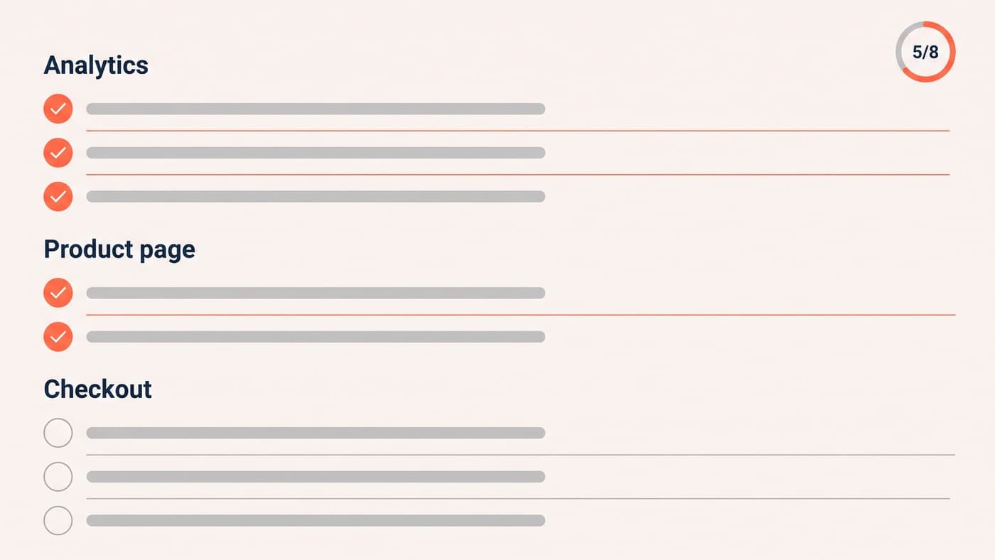
When we take on a Shopify store, the order of work is almost always the same, and none of the first four steps involve designing anything:
- Fix the analytics, so the numbers you are about to act on are real. Broken or double-counted events invalidate everything downstream.
- Split the funnel by device and find the two worst drop-offs.
- Audit the app stack against a performance budget and remove what cannot justify its milliseconds.
- Read fifty session recordings and every support ticket from the last month.
- Only then start testing — with a backlog built from what steps two to four turned up.
What we will not do
We also will not start with a redesign at all. The order above exists because each step makes the next one meaningful: you cannot read a funnel you do not trust, and you cannot prioritise a backlog without having watched somebody struggle. Teams that skip to the visible work usually end up repeating it.
We will not ship a redesign that cannot beat the control. That rule has saved our clients more money than any single win we have ever had, because it kills the expensive, confident, wrong ideas before they reach traffic — including ours.
Conversion work on Shopify is not one dramatic project. It is a diagnosis, a queue, and the patience to let the traffic settle the argument. If your store has plateaued and a new theme is starting to sound appealing, talk to us first.