Nobody designs the failure screens. Stores ship whatever the theme included, usually a cartoon and an apology, and then never look at them again. But a visitor on a 404 or an empty search result is a buyer mid-journey with nowhere to go, which makes these the cheapest pages you will ever fix and the ones nobody has an opinion about in the design review.
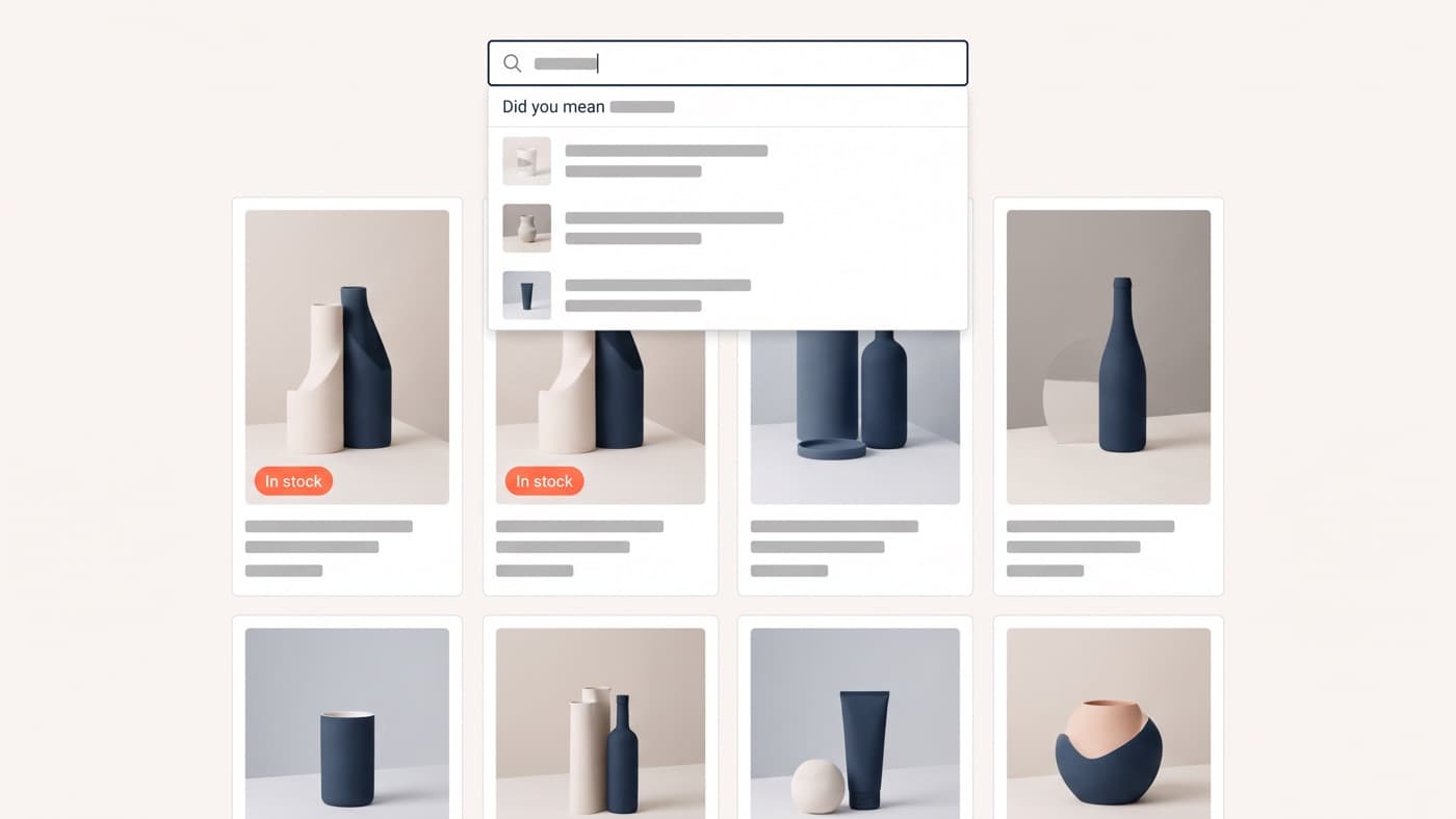
This article owns dead-end recovery: the screens a shopper reaches when the thing they wanted is not there, and what each one has to do to keep them. The zero-results search state has enough depth to be its own discipline and belongs to our work on site search, so it gets one sentence here: never show an empty page, always show the query, a spelling correction and the closest matches you do have.
The dead-end inventory
Most stores have five of these and have designed none of them. Write the list down, then open each one on a phone, which is where they look worst.
- The 404, reached from an old link, a mistyped URL, a deleted product or a stale email campaign. Usually the theme default.
- The empty cart, which sounds like a nothing state and is actually a returning visitor who expected to find something there.
- Zero search results, where the shopper has told you exactly what they want in their own words and been told no.
- The out-of-stock product page, which arrives with full purchase intent and answers it with a greyed-out button.
- The order-failure screen after a declined payment or a timed-out session, which is the most expensive dead end in the building because everything else already worked.
There is a sixth worth adding if you run filters: the empty filtered collection, where a shopper selects size 12 in blue under 50 pounds and gets a blank grid. That one is a design problem rather than a page, because the right fix is to stop the combination being selectable or to relax the last filter automatically and say so.
What every recovery screen owes the visitor
The pattern is the same regardless of which dead end it is. Say plainly what happened, without blame and without a joke that delays the answer. Then offer routes rather than a route: a search field, the categories, and something concrete to look at. And keep the whole thing above the fold on a phone, because a recovery screen that requires scrolling has already lost the argument.
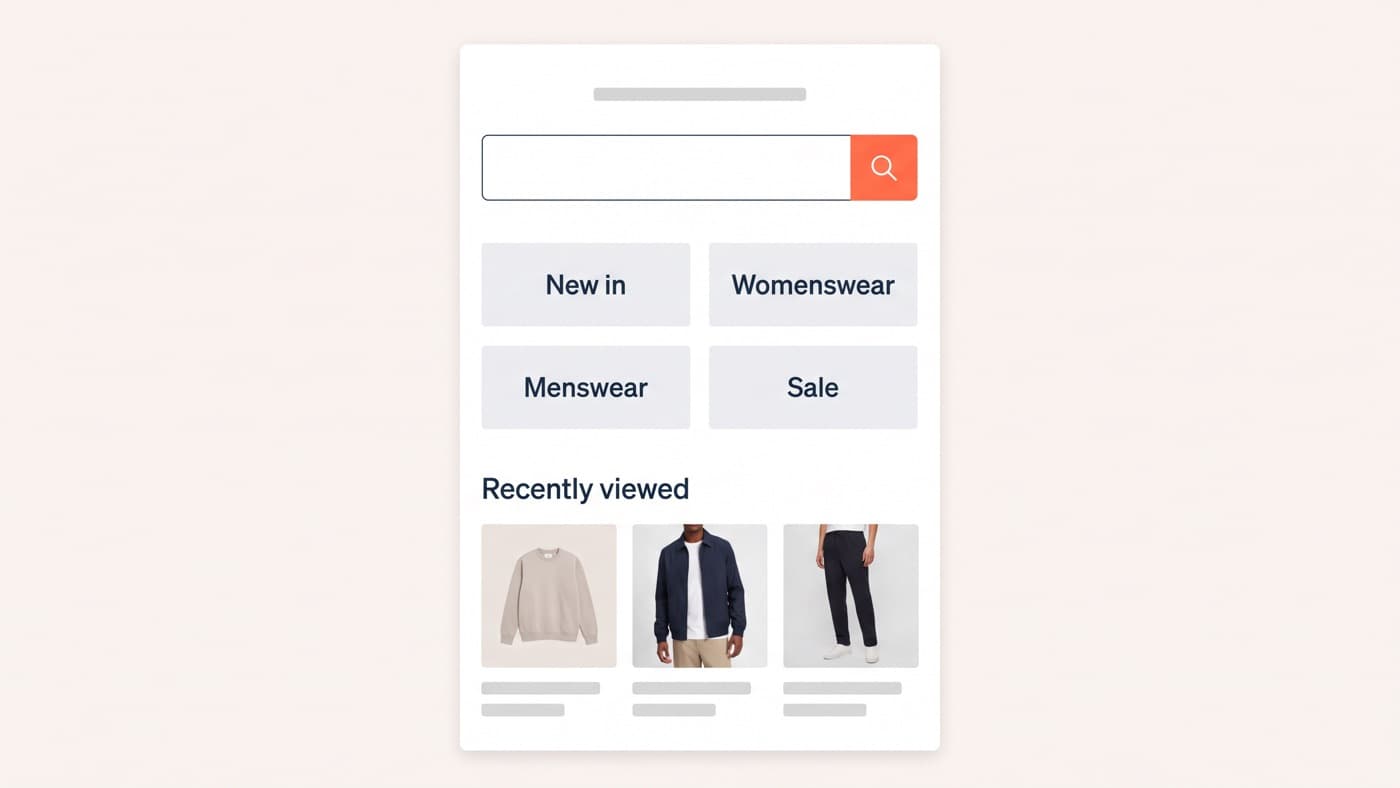
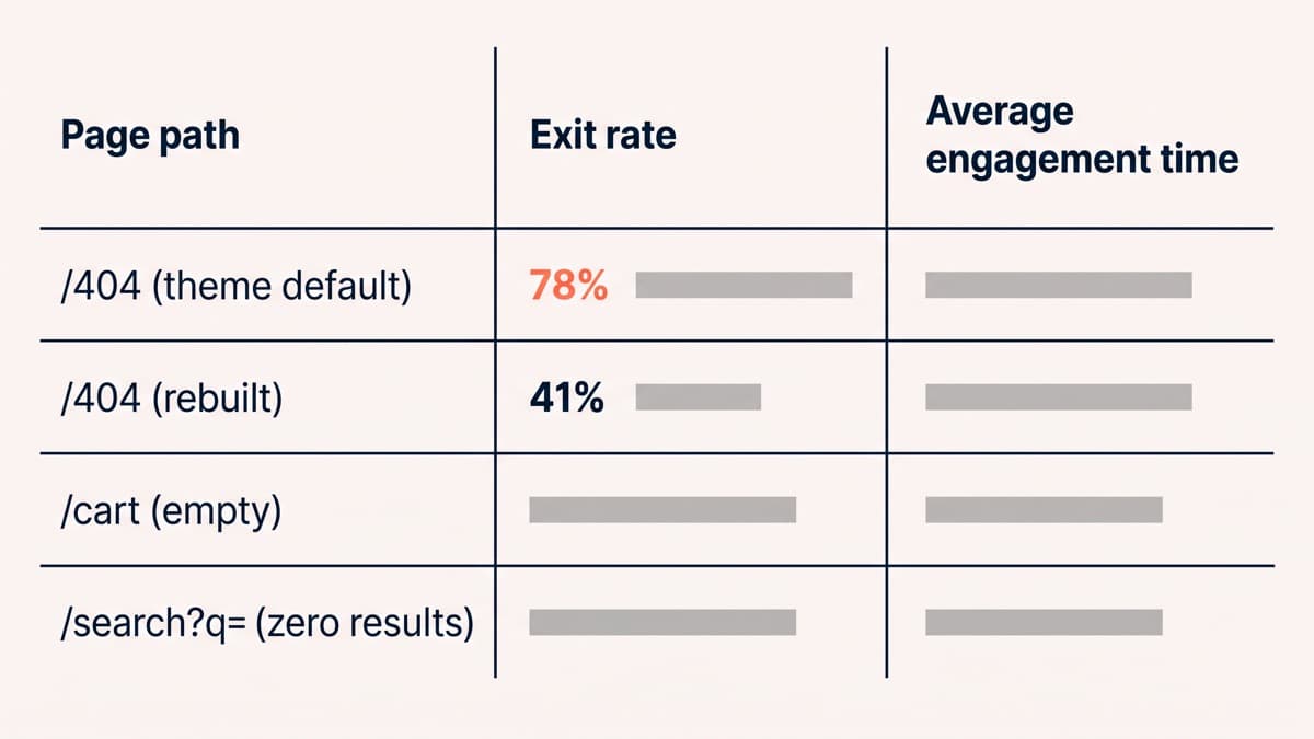
For a 404 specifically, that means the site search box first, 4 top-level category links, and a row of 3 products drawn from recently viewed items where you have them and best sellers where you do not. On one fashion store, replacing the theme default with exactly that layout took the exit rate on the 404 template from 78% to 41%. The page did not get cleverer. It got useful.
The empty cart deserves the same treatment and rarely gets it, because it reads as a system state rather than a page. It is usually a returning shopper whose cart did not survive the session, so the two fixes are to persist the cart properly in the first place and, when it genuinely is empty, to fill the screen with recently viewed items, saved products and the top categories rather than a shopping-bag icon and the word Empty.
Out of stock is a retention page, not an error
The out-of-stock page is the one with real money attached, because the visitor has arrived with the exact intent you spend your budget buying. The instinct is to delete the page or redirect it to the collection, and both throw away the ranking and the intent together, while anyone arriving from a link gets sent somewhere they did not ask for.
Keep the page, keep the content, and give it three jobs. Capture the demand with a back-in-stock email field, which is the only dead end that turns into a mailing list. Offer the nearest alternatives, meaning the same category and price band rather than a generic best-sellers rail. And say when, because a restock date converts far better than a promise to notify. On a homeware store, 6.4% of out-of-stock product views left an email address and 23% of those addresses bought within 60 days.
Variant-level stock is where this gets fiddly. A product available in four sizes and out of stock in one should not present as unavailable, and the size selector should show the missing size as unavailable rather than hiding it, because hiding it makes the shopper wonder whether they misremembered.
The order-failure screen is the same argument with more urgency attached. A payment that declines or a session that expires has already consumed everything the store spent to get there, so the screen owes the shopper their basket intact, their details still filled in, a plain explanation that names likely causes rather than a processor response code, and an alternative payment method offered on the spot. Wiping the form and returning somebody to an empty cart at that moment is the most expensive interface decision in the whole checkout.
Finding the dead ends in your own analytics
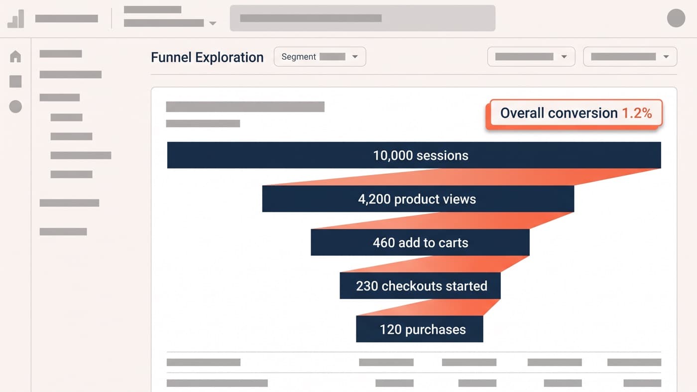
None of this gets prioritised until somebody attaches a number to it, and the numbers are not in a default report. Start with a page-path exploration sorted by exit rate with an engagement-time column beside it, which surfaces the 404 template quickly because its combination of high exits and low engagement is distinctive.
Then add the events that do not exist by default: a zero-results event carrying the search term, an empty-cart view, an out-of-stock product view, and a payment-failure event on the checkout. Without those, three of the five dead ends are invisible in reporting, which is the actual reason they never get designed. The mechanics of building that view sit in the GA4 funnel walkthrough.
Once the events exist, the search-term report attached to the zero-results event is the most valuable output of the whole exercise, because it is a list of things people tried to buy from you and could not. Some of it is spelling and synonyms. Some of it is a merchandising decision waiting to be made.
The half-day version
If this is a half-day rather than a project: rebuild the 404 with search, 4 categories and 3 products, fill the empty cart with recently viewed items, stop deleting out-of-stock pages and add a back-in-stock capture to them, and add the four missing events so the next round has evidence. That is the order, and the last step is the one that funds the next round.
Dead-end screens are the clearest test of whether a store treats interface design as a system or a set of happy paths, because they are the pages that only exist when something has gone wrong and they are always the last thing anybody looks at. If you do not know what your 404 currently says, that is a good place to start looking.