The homepage is the most fought-over page on a store and close to the least important. On the stores in our archive it is the entry page for roughly a quarter of sessions, and a smaller share of the ones that end in an order. Its real job is routing the people who do arrive, and most homepages are built as though the job were selling.
That confusion produces the standard homepage: a rotating hero nobody asked for, a lifestyle image with a slogan over it, three rows of best sellers, and no obvious way into the catalogue. It performs for the visitor who has already decided, and abandons the visitor who has not decided where to look.
The homepage is a junction
Treat the homepage as the junction between intent and inventory. Somebody arrives holding a vague idea, a coat, a gift, whatever your last advert put in their head, and the job is to hand them the shortest credible route to the part of the range that matches. Everything above the fold either shortens that route or lengthens it.
That framing settles a lot of arguments quickly. The debate about which of six categories deserves the hero is really a debate about which route to shorten, and the answer is usually all of them, in a grid, rather than one of them, in rotation.
It also fixes the metric. Do not judge a homepage on its own conversion rate, which mostly measures who happened to land there. Judge it on progression: what share of homepage sessions reach a collection or product page, and how fast. A homepage converting at 1.1% while routing 70% of its sessions onward is doing better work than one converting at 1.4% while routing 40%.
Three questions, answered above the fold
Above the fold has to answer three questions in the order a stranger asks them: what is this shop, why this one rather than the tab I just closed, and where do I go now. Miss any of the three and the visitor either leaves or scrolls hunting for something you buried four screens down.
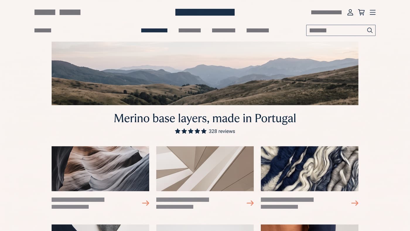
What is this shop is usually solved by imagery and one line of copy, and the trap is writing that line for the brand deck rather than for the stranger. Considered essentials for modern living identifies nothing. Merino base layers, made in Portugal identifies a shop in six words, and the shopper who wanted something else leaves immediately, which is a win rather than a loss.
Why this one is proof, and only the specific kind counts: a star rating with a visible review count, a delivery promise with a date in it, a returns window stated plainly. Generic reassurance rosettes answer nobody, and the placement logic behind that is the whole argument of our piece on trust signals.
Where do I go now is the question most homepages get wrong, because it is the least glamorous. Category access, above the fold, named the way customers name things, visible without scrolling on a phone. On any store with a real catalogue this is the highest-value block of pixels you own, and it routinely loses the argument to a lifestyle photograph. It also only pays if the collection page it lands on holds up its end of the handover.
The carousel question, answered
Rotating heroes survive because they end meetings. Five stakeholders want the hero and a carousel gives everybody a slide. The public evidence has been unkind to them for over a decade, and ours is no kinder.
Across the homepage tests in our archive the pattern is consistent enough to be boring. The carousel region as a whole is clicked in around 2.3% of sessions. Of the clicks it does attract, the first slide takes 89% and every remaining slide shares the other 11%. On a five-slide carousel that means four slides are decoration, and decoration that costs image weight while pushing your category row below the fold.
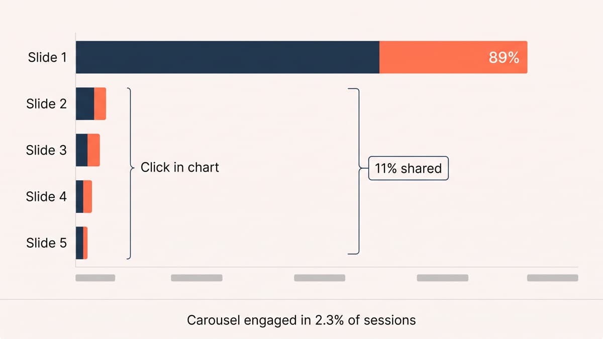
Replacing a five-slide carousel with a static hero plus a three-tile category row moved homepage-to-collection progression from 46% to 53% on a mid-market homeware store, a 15% relative gain at 96% confidence. The static hero was one of the original slides. Nothing was added. Four things were removed.
If a carousel survives your organisation anyway, at least make it honest: no auto-advance, visible controls, and the same discipline applied to slide one that you would apply to a static hero. But the cheaper fix is to stop selling five things at once above the fold and let a category row do the routing.
What this post is not about
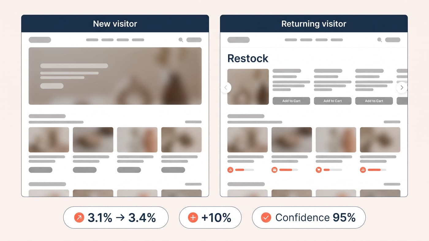
There is a version of this argument that ends in personalisation: show returning customers a different homepage from first-time visitors, and show the coat browser coats. That is a real lever, it belongs to segment targeting rather than to layout, and we are not going to re-argue it here. Get the default routing right first, because a personalised version of a homepage that does not route is a more expensive homepage that does not route.
The homepage tests worth the slot
Homepage traffic is usually plentiful enough to run a real test, which makes it one of the few templates where you can settle arguments instead of having them again next quarter. The ones that keep earning their place:
- Category row against hero imagery above the fold. The biggest single routing change available, and the one most likely to be blocked on aesthetic grounds.
- Carousel against static hero. Cheap to build, and the result usually ends a recurring meeting rather than just winning one.
- Category naming. Customer language against internal language, with the customer language taken from your own site-search logs rather than from a workshop.
- The proposition line. Specific against atmospheric, judged on progression rather than on how well it reads aloud.
- Proof above the fold. A rating with its count, a delivery promise, or nothing at all, which is a genuinely competitive third arm.
- Best-seller row position. Above the category row or below it, which is really the question of whether you are merchandising or routing.
Two cautions. Homepage changes contaminate everything downstream, so run them one at a time and watch revenue per session rather than clicks on the thing you moved. And a homepage win rarely transfers to the next redesign, because it tells you about your visitors rather than about design in general; the patterns that do travel sit in the wider idea backlog.
The homepage will always attract more opinions than any other template, because everybody can see it and nobody has to build it. The counter is a written-down job. Agree that the homepage exists to route, agree the metric, and every later argument about the hero image becomes a testable question instead of a matter of taste. Holding that line is most of what ecommerce interface design is for, and if your homepage is currently routing under half its sessions onward, that is the number to start with.