Most store navigation is a map drawn by the org chart. Categories named after internal teams, ordered by whoever argued hardest, nested to match the way the merchandising spreadsheet is filed. None of that is visible or useful to the person holding a credit card, and all of it is the first thing they touch.
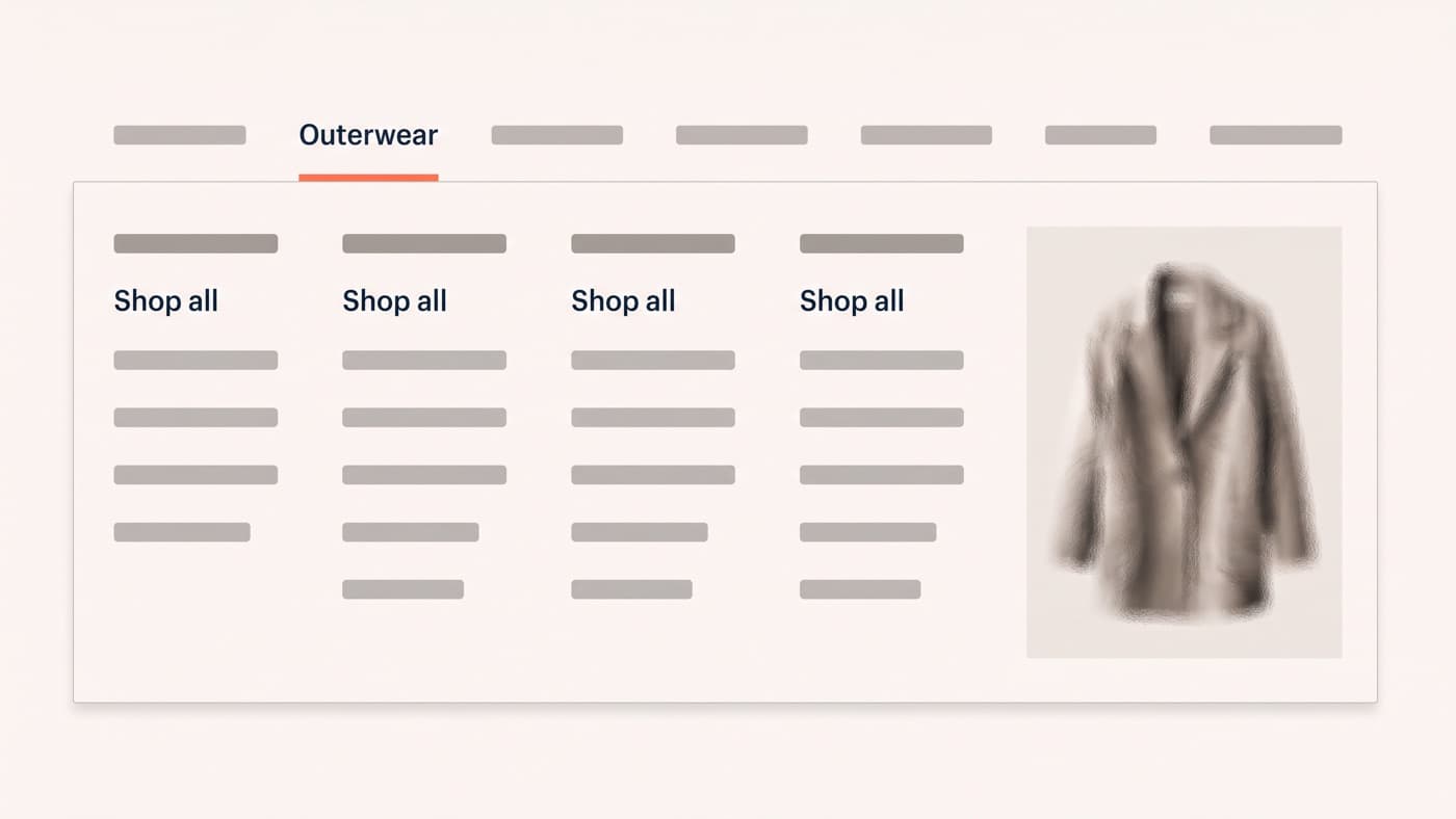
A mega menu is simply a large panel that reveals a chunk of the catalogue at once. Done well it is the fastest route into a broad range. Done badly it manages to make a store feel bigger and less navigable at the same time. This is about the structure, the labels and the mobile translation, which is where most of them quietly fall apart.
Do you actually need one?
Mega menus solve a breadth problem. If the catalogue is a few dozen products across three or four categories, a plain dropdown is better: faster to scan, trivial to translate to a phone, and it does not depend on a hover interaction that half your traffic cannot perform.
The threshold sits roughly where a top-level category needs more than a single column of children to be represented honestly, or where you have more than one useful way to slice the range: by type, by use, by collection. Below that line, a mega menu is a costume.
The cost side is real. A mega menu adds markup to every page on the site, adds an interaction that does not exist on touch devices, and creates a maintenance surface somebody has to keep current as the range changes. Stores with three categories and a five-column panel are common, and they are always a theme decision rather than a merchandising one.
The taxonomy belongs to the customer
The most common structural failure is naming. Internal vocabulary leaks into navigation constantly: a category called Hard Goods, a menu item called Collections holding both product ranges and editorial, a top-level entry named after a supplier nobody outside the building has heard of.
The correction is unglamorous. Take the labels from your own site-search logs, where customers type what they actually call things, and use their words verbatim; that idea deserves its own treatment and has one. Then sanity-check the result against the language in support tickets, which is where you find out what people say when they have already failed to find something.
Order matters as much as naming. Navigation is scanned quickly and the first items take disproportionate attention, so the sequence should reflect either revenue or the way customers segment themselves, never internal politics. If Sale sits first, expect the whole range to be shopped as a sale.
Seven items, and what to do with the overflow
Keep the top level short. The exact count is less important than the principle, but somewhere around five to seven items is where a nav bar stays scannable in a single glance, and plenty of stores run eleven or twelve simply because nothing has ever been removed.
Overflow has three honest destinations: fold it into a broader parent, demote it into the panel of a related parent, or accept that it does not belong in navigation at all. Seasonal campaigns and one-off collections are the usual offenders. They belong in the homepage routing row or in a promotional bar, not permanently in the header where they outlive the season by two years.
The same discipline applies inside each column. A column listing nineteen children is a list nobody reads, so group them, give each group a heading, and lead with the child that earns the most. Put a Shop all link at the top of every column too, because a meaningful share of shoppers want the parent collection page rather than any of its children, and most menus give them no way to ask for it.
Merchandising inside the panel
The panel is retail space, and most stores leave the right-hand third of it empty. A featured block, one image and a named collection with a route in, is the cheapest merchandising slot on the site: it appears on every page and costs no layout anywhere else.
Two rules keep it useful. It has to be a route rather than an advert, which means an image linking somewhere specific, captioned in the same plain language as the links beside it. And it must not eat the links; the moment imagery takes half the panel, the panel has stopped being navigation and started being a banner.
Thumbnails against every child item are more debatable. They look rich and they slow the scan, because reading a list of words is faster than reading a list of pictures. Use imagery where categories are visually distinguishable and the words are ambiguous, which is a narrower set of cases than most themes assume when they ship the feature switched on.
The mobile translation problem
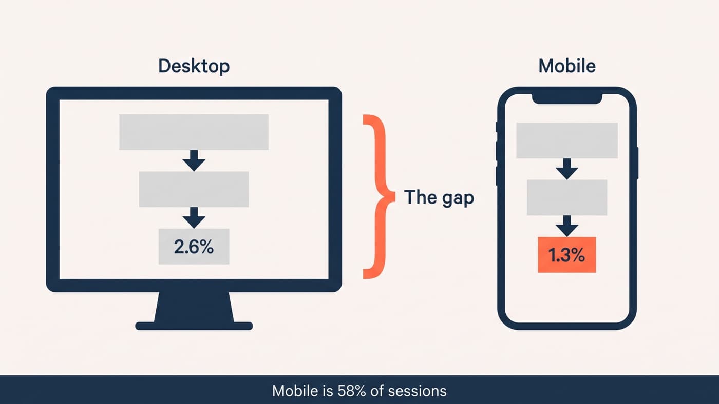
Mega menus do not translate. They depend on hover, on width, and on showing many things simultaneously, and a phone offers none of the three. The failure mode is a drawer built as a full accordion of the desktop panel, four levels deep, where every tap collapses something else and nobody can tell where they are.
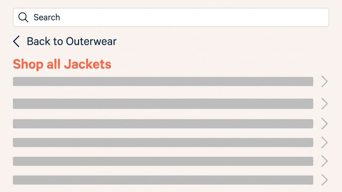
What works on a phone behaves like a stack: one level at a time, a slide transition that makes direction obvious, a back control that names the level it returns to (Back to Outerwear, not a bare arrow), and a Shop all row at the top of every level so a shopper can stop drilling the moment they have had enough. The rest of the mobile conversion picture applies on top of that.
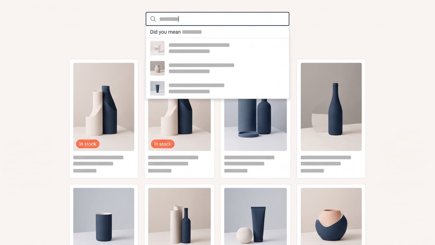
It is also worth accepting that on a phone, navigation and search compete and search frequently wins. Put the search field inside the drawer at the top rather than hiding it behind an icon in the header, and treat the two as one discovery system rather than as rival features owned by different people.
Testing navigation without burning traffic
Navigation is awkward to split test well. The header sits on every page, so a weak variant contaminates the whole store, and the effect tends to be diffuse rather than concentrated in one number. Do the cheap research first:
- Tree testing: give participants tasks (find a waterproof jacket for a child) against your labels alone, with no visual design at all, and count how many reach the right node.
- Card sorting with real customers, which tells you how they group your range rather than how your team files it.
- Search-term mining, which is free, continuous and comes from people already on the site failing to find things.
- Support-ticket language, which is where you learn the words customers reach for once navigation has already let them down.
- Then, if the traffic supports it, one structural A/B test at a time, with revenue per session as the primary metric and navigation clicks as a secondary.
Navigation is the part of an interface everybody uses and nobody praises. It gets rebuilt during a redesign and then left alone for three years while the catalogue changes underneath it, which is why auditing the menu against the range you actually stock is usually the highest-value hour available in ecommerce interface work. If your menu still lists a category you stopped stocking last year, that is the place to start.