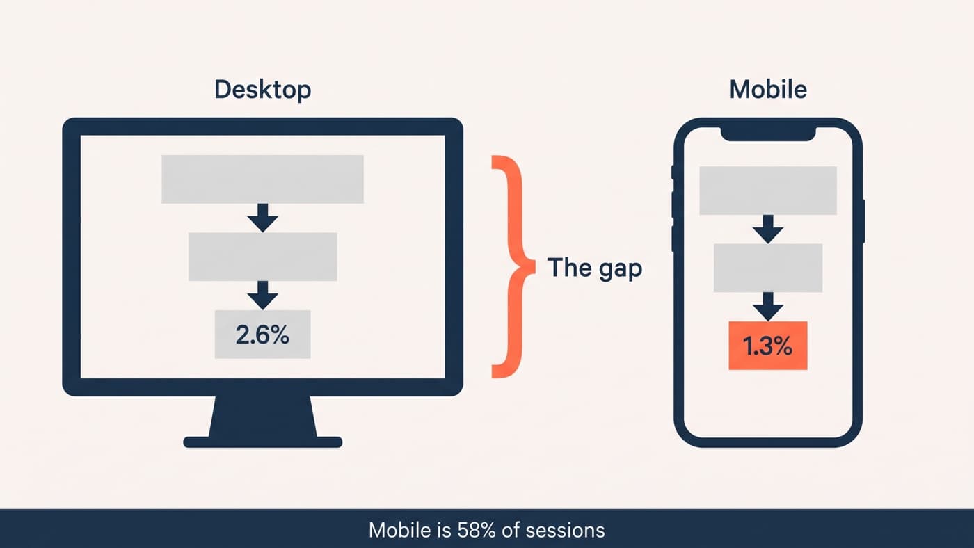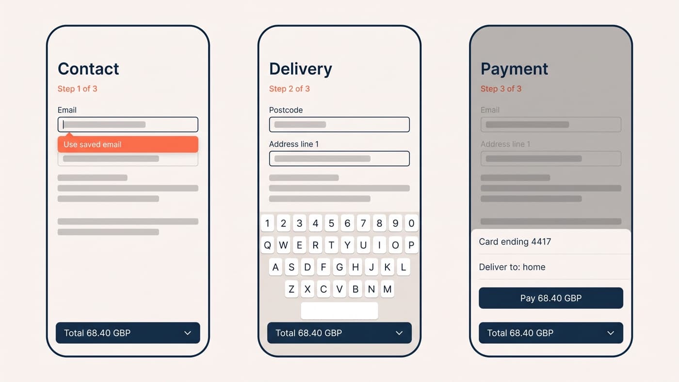
Mobile checkout fails in ways desktop checkout cannot. The keyboard covers half the screen, typing is slow and error-prone, the card is in another room, and the customer is usually somewhere they can be interrupted. Most of the gap closes with four things: the right keyboard, working autofill, an address lookup and a payment sheet.
None of those is a redesign. They are attributes, one integration and a decision about where the total sits, and they are the reason a mobile checkout can improve materially in a fortnight while the wider mobile conversion gap takes a quarter.
Why mobile checkout is a different problem, not a smaller one
The tempting model is that a phone is a narrow desktop and the fix is a single column. It is not. Three things change at once: the input device becomes a soft keyboard that occupies half the viewport, the pointing device becomes a thumb with a reach of a few centimetres, and the session becomes interruptible in a way a desktop session is not.
That changes which faults matter. A field ordered awkwardly costs a desktop customer a second and costs a phone customer a scroll, a keyboard switch and sometimes the field they had already filled. It also means the honest baseline is a mobile-only one: comparing your phone completion rate to your desktop completion rate flatters or damns you for reasons that have nothing to do with the checkout, which is visible in the published mobile against desktop measurements, where four publishers disagree about the size of the gap.
Keyboards, and the attributes that choose them
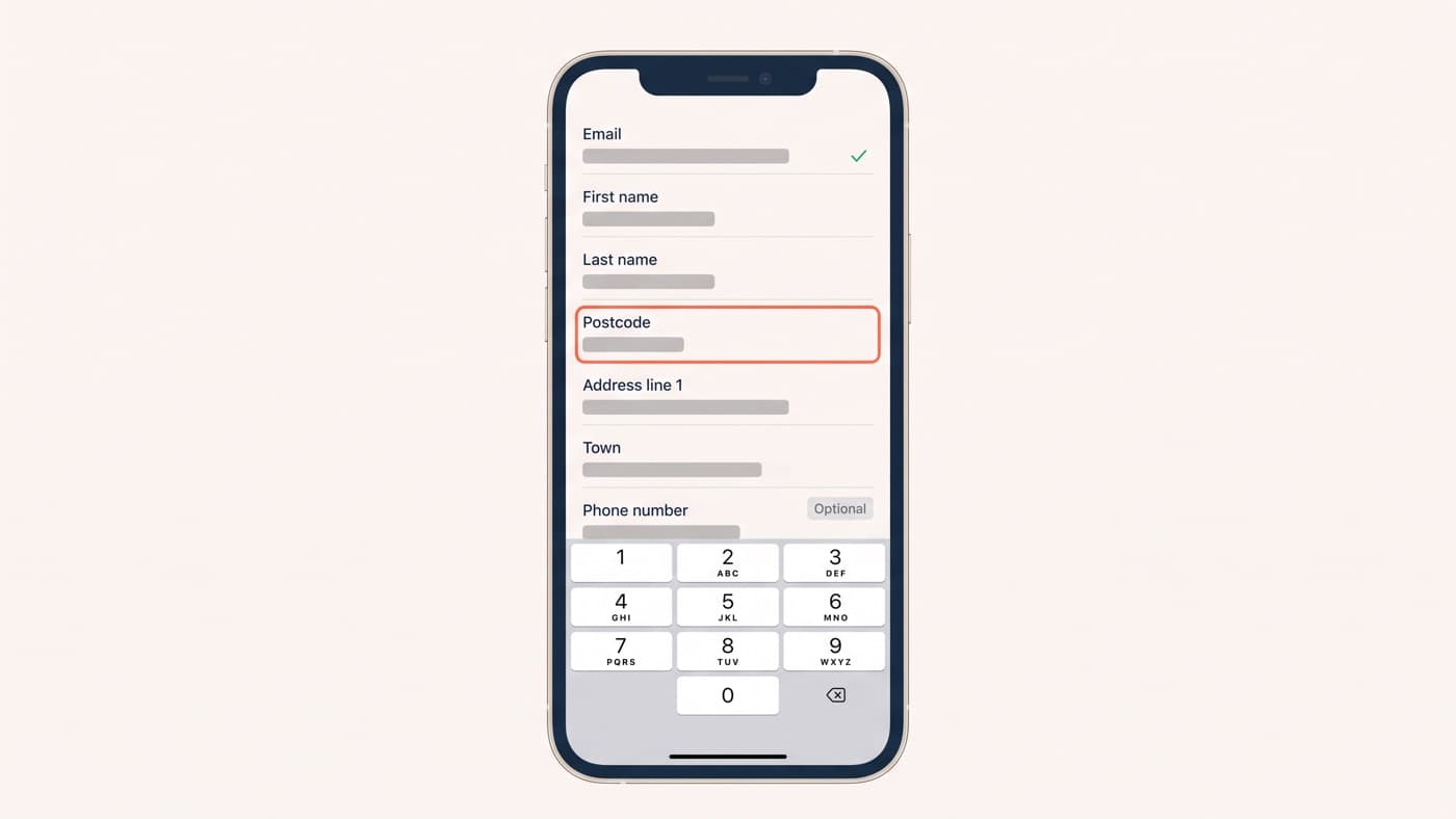
Every text field on a phone raises a keyboard, and which keyboard it raises is decided by two attributes most checkouts set once and never audit. Get them right and a card number is entered on a digit pad. Get them wrong and somebody hunts for numerals in a layout designed for prose, on the highest-value form you own.
The one genuinely counter-intuitive rule is that a card number must not be a number field. Google’s guidance is explicit: using type equals number "adds an up/down arrow to increment numbers, which makes no sense for data such as telephone, payment card or account numbers", so the correct combination is a text field with a numeric input mode. The same page is the source for the payment autofill tokens, at web.dev/articles/payment-and-address-form-best-practices.

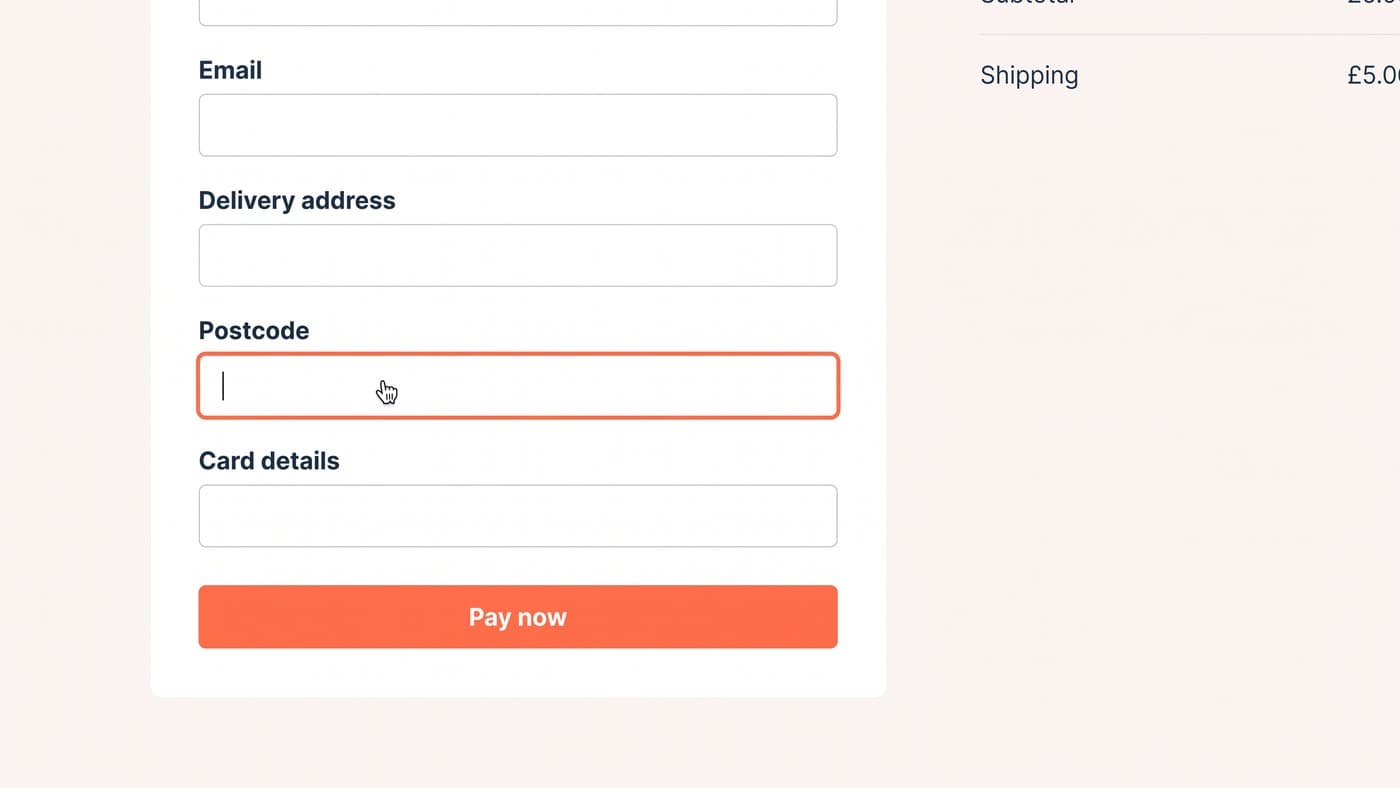
A postcode is the field people most often get wrong in the other direction. UK postcodes contain letters, so a numeric keypad is actively hostile there, and the right answer is a plain text field with the postal-code token rather than a clever one.
Autofill, and the tokens that switch it on
Autofill is the single largest saving available on a phone, because it replaces typing with a tap, and it is switched off by accident more often than it is switched on by design. The mechanism is the autocomplete attribute, which the specification describes as telling the browser "the type of information expected in the field", and the token names are fixed: given-name, family-name, address-line1, address-line2, address-level2, postal-code, country, tel and email. They are listed at developer.mozilla.org/docs/Web/HTML/Reference/Attributes/autocomplete.
Two details are worth more than the list. Invented tokens do not degrade gracefully, they simply do nothing, so a field named autocomplete equals address-1 is a field the browser will not fill and nobody will report. And one-time-code exists, meaning a verification field can be filled from the code the phone has just received by SMS rather than by the customer switching apps, reading six digits and switching back. That is the most annoying twenty seconds in any checkout and it is one attribute away from disappearing.
Address entry, the longest part of the form
Address is where the time goes on a phone, and where the abandonment goes with it. Five or six fields, each raising a keyboard, each scrolling the form, and one of them capable of failing validation for a reason the customer cannot see.
A lookup that turns a postcode into a picklist collapses that into two taps, and it is the highest-value integration on the page after the wallet buttons. Three rules travel with it. Always leave a route to enter the address manually, because new builds, business units and anything unusual will not be in the database. Never block the form while the lookup is thinking. And show the result as a normal, editable address afterwards rather than as an opaque line, since the customer needs to check it and delivery instructions have to go somewhere. Everything else about field count and validation timing is the same argument as form design anywhere else, only more expensive.
The sticky summary, and where the thumb is
On a desktop the order summary sits in a column beside the form and is simply always there. On a phone there is no beside, so it either follows the customer or it vanishes for the entire length of the flow, and a total that cannot be seen is a total that starts to be doubted, especially once delivery has been added to it.
The pattern that works is a collapsed bar carrying the total, persistent at the bottom, expanding on tap to the itemised list. Put the primary action in the same band, because the bottom of the screen is where the thumb already is, and keep the bar out of the way of the keyboard rather than layering it over the field somebody is typing into. That last failure is common enough to be worth checking on a real device before anything else on this list.
Payment sheets, and what they skip
A payment sheet is the browser or the operating system collecting payment and contact details on your behalf, and it exists precisely because forms are the problem. The web standard behind it says so in as many words, describing itself as meant "to reduce the steps needed to complete payment online, potentially doing away with checkout forms", at developer.mozilla.org/docs/Web/API/Payment_Request_API. In practice most stores meet it through their payment provider’s wallet buttons rather than the API directly, which is sensible, because the standard itself is not evenly supported across browsers.
Two things follow. Wallet buttons belong above the form, where a customer who has one never starts typing, rather than below it where they are a consolation prize. And a sheet returns a name, an address and a contact detail chosen by the customer, which may not be the address they meant, so the confirmation step still has to show what was returned rather than assuming it. A wallet order shipped to a five-year-old address is a support ticket the wallet gets blamed for.
Errors on a 375 pixel screen
Error handling is the part of a mobile checkout that is almost never designed, and it is where a recoverable mistake becomes an abandonment. On a narrow screen the message is frequently rendered somewhere the customer is not looking, or underneath the keyboard, or at the top of a form that has scrolled several screens away.
- Move focus to the first field that failed, so the phone scrolls there rather than leaving the customer to hunt.
- Put the message beside its field, above the keyboard line, not in a banner at the top of the page.
- Say what to do rather than what went wrong: enter the three digits on the back of the card, not invalid CVV.
- Validate on blur rather than on every keystroke, because a message that appears halfway through typing a postcode is wrong and irritating at the same time.
- Never clear a field the customer has already filled, and never clear the card fields on a declined payment unless the processor requires it.
- Keep the submit button reachable and its state honest, so a second tap on a pending payment cannot create a second order.
Almost everything above is a fix rather than a test. Attributes, autofill tokens, focus management and error copy are correctness, and holding them behind an experiment is a way of delaying the obvious. Save the testing budget for the questions that genuinely have two defensible answers, such as one page against several, or where the wallet buttons sit, and treat the rest as checkout work you would do anyway. The honest first step is to buy something from your own store on a phone, on mobile data, with a card you have not saved, which is ordinary interface work and takes about four minutes. If it goes badly, tell us what broke.