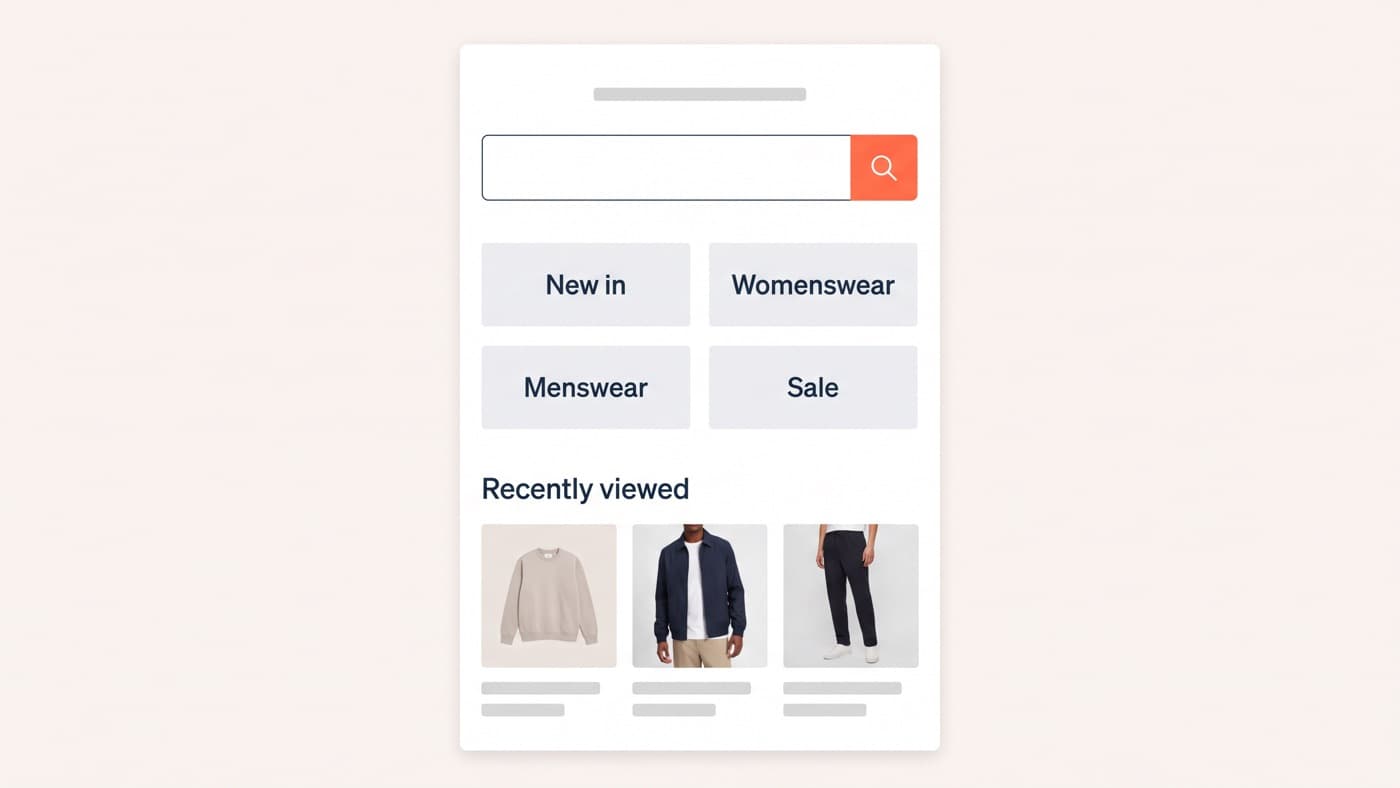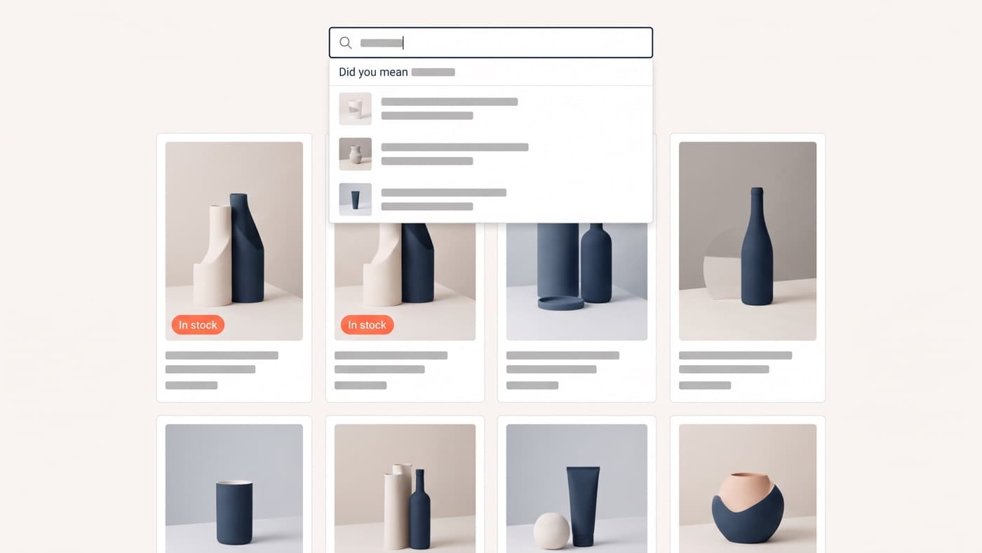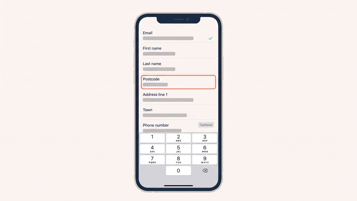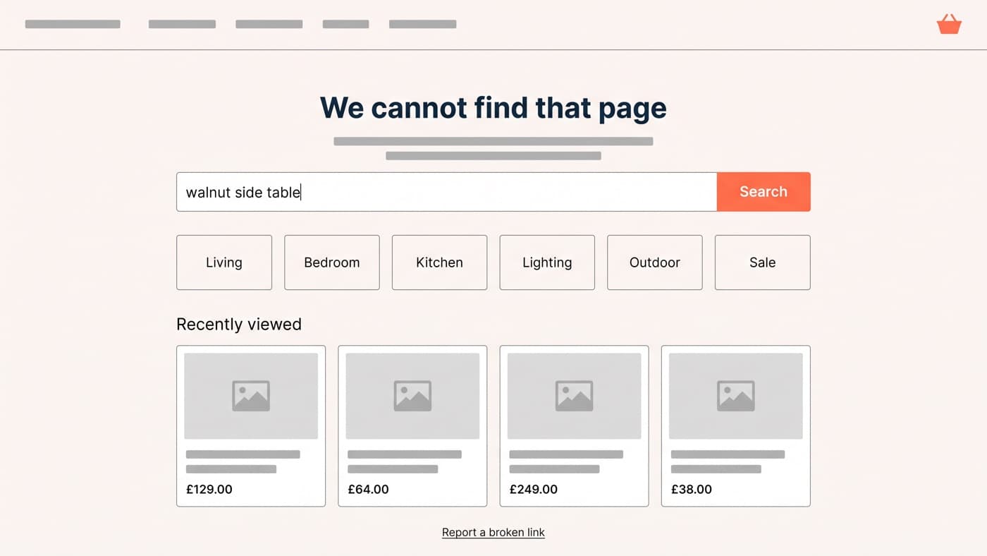
A good ecommerce 404 page does three things on one screen. It says plainly that the page is not there, it hands over a search field big enough for a product name, and it offers routes: four to six category tiles and a row of products with prices on them. What it must never do is return a 200 status or a cartoon and a link home.
Every store has one page that receives traffic it already paid for and offers nothing for sale. It is usually whatever the theme shipped, it usually contains an illustration of something falling over, and it is almost always the only template on the site nobody has ever opened a report on.
This article is about that one template and the near miss beside it, the out-of-stock product. The wider inventory of dead ends, meaning the empty cart, zero search results and the order-failure screen, belongs to the empty states article and is not repeated here.
What a good ecommerce 404 page contains
The visitor arriving here is not lost in the browsing sense. They followed a link, typed a URL or clicked an email from March, and they had something specific in mind. The page has one job, which is to get them back to a product without making them start again.
- A heading that names what happened in the store’s own voice, and no joke that delays the answer by a sentence.
- A search field, focused, wide enough to take a full product name, because the visitor can usually still tell you what they wanted.
- Four to six top-level category tiles, which cover the visitor whose intent was broader than one product.
- A row of recently viewed products with prices, falling back to best sellers or new arrivals for a first-time visitor.
- A report-a-broken-link control, which costs nothing and turns a dead end into a bug report somebody can close.
- The full site header, footer and basket, because stripping the chrome removes every route the visitor already knew about.
Then check it on a phone, which is where most of this traffic lands and where most 404 templates put the search field below the fold under a large graphic. A recovery screen that needs scrolling has already lost the argument it exists to win.
Five patterns, and when each one is wrong
Nothing in the list above is universal. Each pattern recovers a specific kind of visit, and two of them actively misfire on the wrong store, so it is worth being explicit about which is which before copying a screenshot from a design gallery.
| Pattern | Recovers | Wrong when |
|---|---|---|
| Search field | A visitor who can still name the product | Your site search returns nothing useful, in which case fix search before decorating the 404 |
| Category tiles | A broad intent on a large catalogue | The catalogue is small enough that the whole range fits on one collection page |
| Recently viewed row | A returning visitor mid-session, which is most 404 traffic from internal links | A first session, where best sellers or new arrivals do the same job honestly |
| Suggested match from the URL | A deleted or renamed product with an obvious successor | The guess is a guess, because a confidently wrong suggestion reads worse than none |
| Report a broken link | The link itself, so the next visitor never arrives here | Nobody owns the inbox it posts into |
The search row carries a dependency worth naming. A 404 that leads with search is only as good as the search behind it, and on plenty of stores the honest sequence is to fix site search first and rebuild the 404 second.
The out-of-stock page is the expensive one
It is not a 404 and it should never be turned into one. The visitor arrived with exactly the intent the store spends its budget buying, and deleting the page or bouncing it to a collection throws away the ranking and the intent in the same move.

The strongest pattern is also the least implemented. Baymard Institute reports that 68% of ecommerce sites do not allow users to place orders for temporarily out-of-stock products, and that when a site simply says an item is unavailable, 30% of users are likely to abandon and look for it elsewhere: baymard.com/blog/handling-out-of-stock-products. Where your operation can support it, selling with a stated delivery date beats every alternative on this page. A notify-me field is a supplement, not the answer.
Where it cannot, the page still owes the visitor three things: a dated expectation rather than a vague promise, a back-in-stock capture that asks for nothing beyond an email address, and the nearest genuine alternatives in the same category and price band rather than a generic best-sellers rail. And handle variants honestly. One colour out of stock should mark that option unavailable in place rather than hiding it, because a hidden option makes the shopper doubt they ever saw it.
Get the status code right before you get the design right
A designed 404 served with a 200 status is worse than an ugly one served correctly. Google’s documentation on HTTP status codes is direct about both halves: URLs returning a 4xx status are dropped from the index, and "if the content suggests an error for Google Search, an empty page or an error message, Search Console will show a soft 404 error" regardless of what the server claimed, at developers.google.com/search/docs/crawling-indexing/http-network-errors.
So three rules, in order. A missing page returns 404. Something deliberately and permanently withdrawn returns 410, which is the honest code and stops the crawler retrying. And nothing gets blanket-redirected to the homepage, because that pattern discards the only information the visit carried, which was the URL they asked for.
Finding your own dead ends
This is the part that turns a design exercise into a prioritised list, and it is narrower than instrumenting every failure screen. Here the question is only which URLs your store is currently 404ing, and where those visits came from. Three sources, in descending order of usefulness:
- The page indexing report in Search Console, which lists the not-found URLs Google has crawled and, on most of them, the pages still linking to them.
- Server access logs filtered to 404 responses, which catch everything Google never crawled: mistyped URLs, old campaign links, app deep links and anything behind a parameter.
- Your analytics page-path report filtered to the 404 template, with the referrer dimension attached, because the referrer decides which fix applies.
- A crawl of your own site, which finds internal links still pointing at deleted products. This is the cheapest category to fix and usually the largest.
The referrer is the whole point of the exercise. A 404 with an internal referrer is a bug in your own site and should be fixed at the link. One with an external referrer is a redirect you owe somebody, usually from a migration nobody finished. And one with no referrer at all is a typo or an old bookmark, which no redirect can help and which is precisely what the search field on the page is for.
Build it in this order
Status codes first, because a wrong one makes every later measurement lie. Then the 404 template itself, with search, categories and a product row above the fold on a phone. Then the out-of-stock rule, which is where the money is. Then the referrer report, which is the step that funds the next round by turning a template nobody looks at into a list of specific broken links with owners.
Error screens are the clearest test of whether a store treats interface design as a system or as a set of happy paths, because they only exist when something has gone wrong and they are always the last thing anybody reviews. If nobody at your company can say what your 404 currently shows on a phone, that is where to start.